Multidimensional Exploration
Feature Overview
Multidimensional Exploration is based on original Span and RUM data, aiming to let you explore and discover problems faster in novel ways.
Access Entry
In the left navigation bar, select All Apps, then click Multidimensional Explorer to access the lite application.
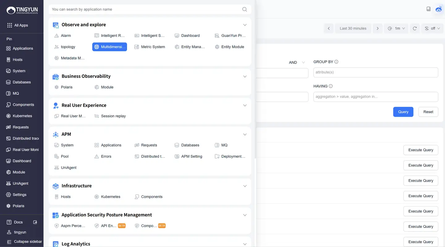
Alternatively, you can click the Multidimensional Exploration lite application in the left dock bar to access it directly.
Function Description
Query Builder
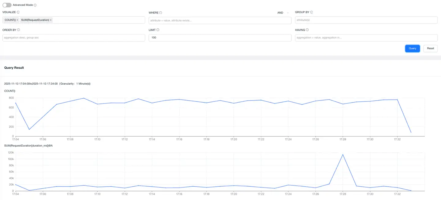
The Query Builder enables you to design custom queries for data extraction and subsequent analysis. Utilize this feature to interactively explore datasets within the platform.

Query Clauses
The Query Builder contains 5 clauses:
- VISUALIZE: Performs calculations and displays corresponding charts that change over time. Most VISUALIZE queries return line charts, while HEATMAP displays heat maps showing data distribution over time.
- WHERE: Filters based on fields or attributes.
- GROUP BY: Groups by fields or attributes.
- ORDER BY: Sorts results.
- LIMIT: Limits the number of returned results.
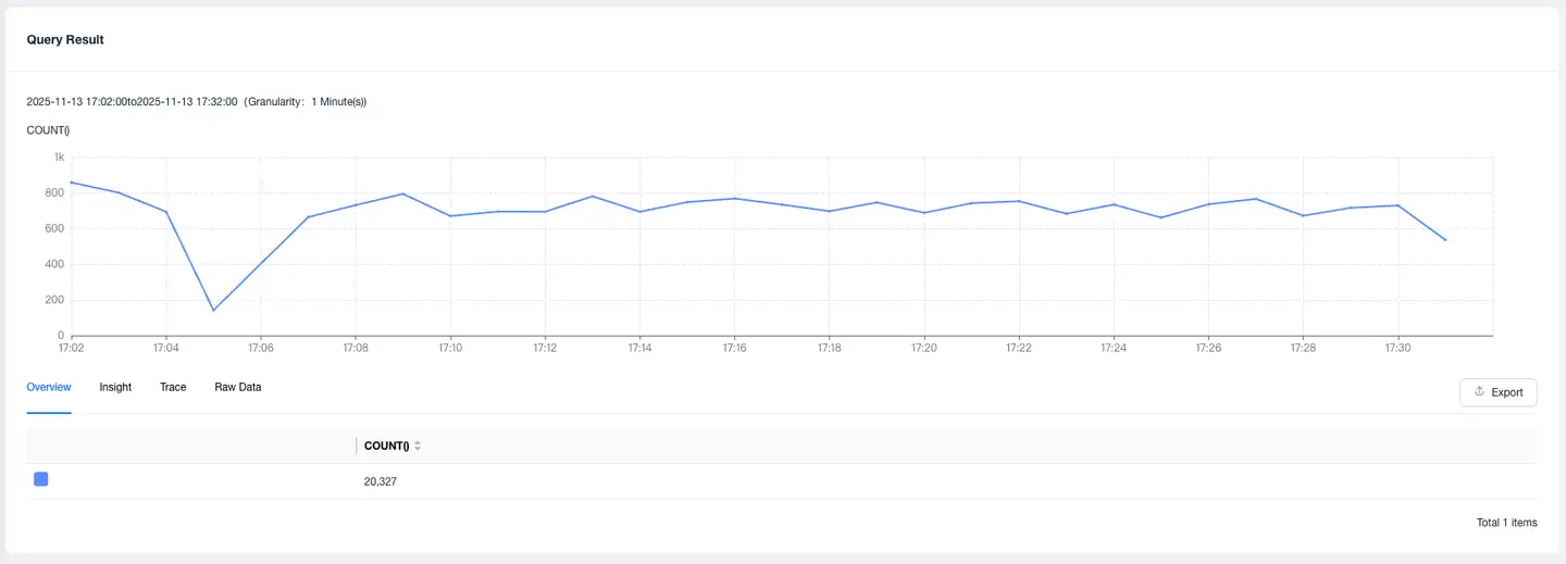
Enter query clauses, click Query to see query results.
Click Trace to find the slowest 1000 traces based on current query conditions. Click TraceID to jump to the trace detail page for comprehensive analysis.
Click Raw Data to retrieve a two-dimensional table of results matching your query conditions. This is commonly used for field queries of original SPAN data.
Notes:
- When multiple VISUALIZE clauses are entered, the system executes separate queries and displays each result as a distinct chart.
- With a GROUP BY clause, charts will display multiple lines (one per group), and summary tables will include one row per unique group.
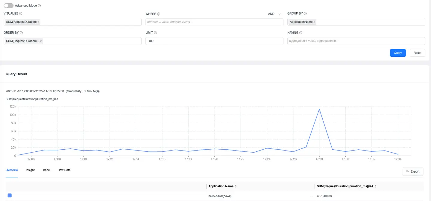
- If VISUALIZE is unspecified, the system defaults to a COUNT() query.
Click any input field in the Query Builder to edit clauses within it. Click the x icon to remove a field from the clause. The platform automatically suggests available fields and values as you edit each clause.

Changing Models and Datasets
Above the Query Builder, you can switch between different models and datasets.

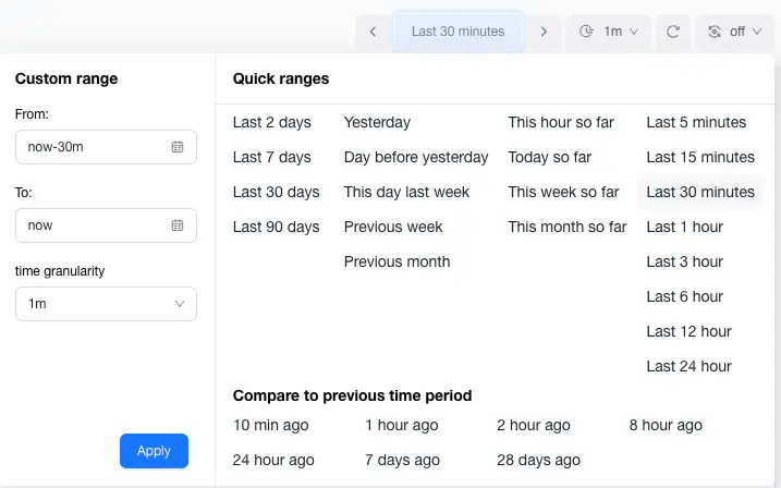
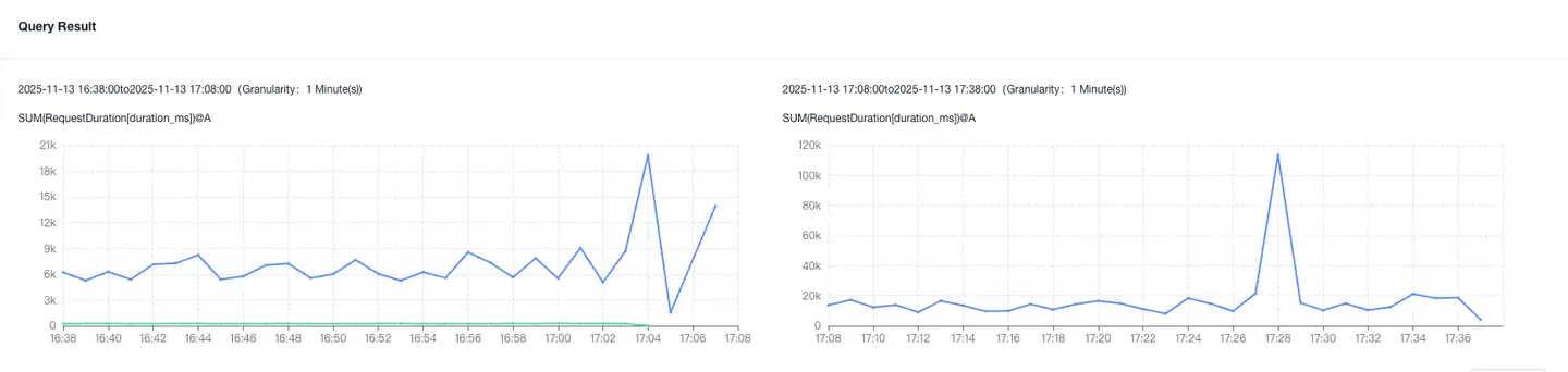
Changing Comparison Time Range
Use the time selector to modify the selected time range of data in the query. If you need to do comparative analysis with the same period, you can select the comparison analysis time period, as shown below.
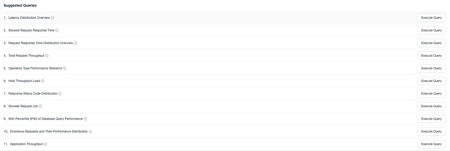
Common Query Patterns
The suggested queries provide some common query patterns that can be used to quickly perform exploration analysis.
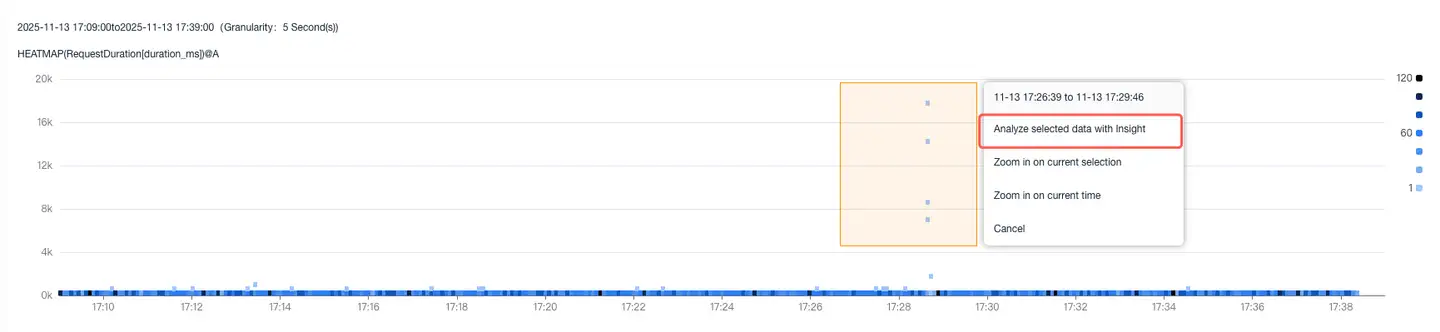
Heatmap
A heatmap is a graphical representation method that displays data distribution, density, or intensity through color depth or other visual effects.
The figure below shows the statistical distribution of the duration_ms field within the selected time period.

Each vertical column in this chart represents a histogram for that time period. The color indicates the number of events in that time period. The darker the color, the more visits occurred in that interval.
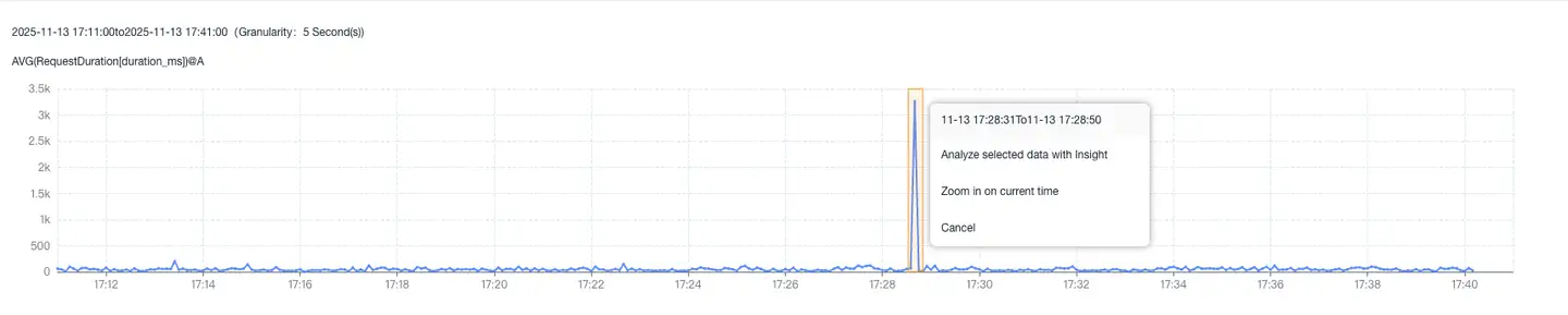
Moving the mouse over a time period displays the histogram for that specific time point, as shown in the figure below.

Esper
Esper is a practical function of the Multidimensional Exploration module that can quickly compare the similarities and differences between selected data and other data across various dimensions, achieving the effect of quickly locating root causes.
There are two ways to use Esper:
- Through heatmap
Circle select the slow points in the heatmap to analyze, click Use Esper to analyze selected data, which will analyze the differences between selected node data and unselected node data across various dimensions.
- Through grouped line charts:
Click on a line in the group, click Use Esper to analyze selected data in the popup, which will analyze the differences between selected group data and other group data across various dimensions.
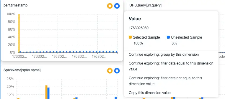
Esper analysis results are divided into two groups:
Dimensions: Specific attributes of data used to classify and filter data. Commonly used with Group by for grouping or where for exact filtering with equals or not equals.
Measures: Numerical values related to data that can be used for calculation, analysis, and comparison. Commonly used with where for range filtering and comparison with greater than or less than.
Each chart divides data into two groups:
Selected Area: Presented in yellow on the left, containing points from the selected area in the heatmap.
Unselected Area: Presented in blue on the right, containing all points outside the selected area.

The chart title is the field name.
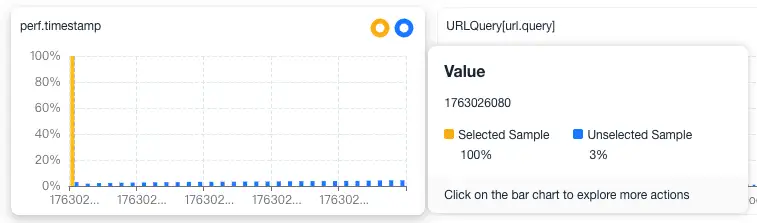
The donut chart in the upper right corner shows the frequency percentage of this field appearing in the data. Click to perform secondary exploration of this field.
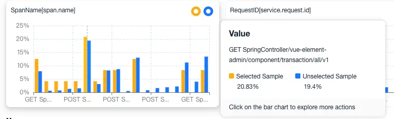
The bar chart shows the frequency of each value appearing. Hover over a value to see the comparison between selected and unselected for that value.
Click on a single value to perform the next exploration operation.