Chart Guide
Dashboard Chart Guide
The Dashboard module serves as the most flexible data visualization entry point in the observability system, supporting multiple approaches including chart assembly, custom variables, and query syntax to build data dashboards that adapt to various scenarios and meet the observation needs of different roles such as operations, development, product, and business teams.
Dashboard Home Overview
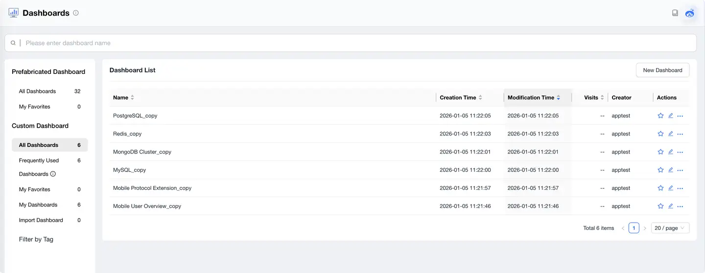
Upon entering the Dashboard module, users will default to the dashboard management list:
Main Functional Areas
- Dashboard Categories: Support viewing all dashboards, frequently used dashboards, my favorites, imported dashboards, personal creations, and other category views for quick location of target dashboards.
- Tag Filtering: Quickly focus on specific topics through tag filtering (e.g., data analysis, scenario demos).
- Pre-built Dashboards: System built-in templates that users can directly use or modify based on templates.
- Dashboard List Display:
- Shows each dashboard's name, creator, access count, creation time, and modification time.
- Supports sorting, fuzzy search, and pagination management.
- Each record supports quick actions on the right side (favorite, edit, copy, delete).
Creating New Dashboard
Click the "New Dashboard" button in the upper right corner to open the creation dialog.
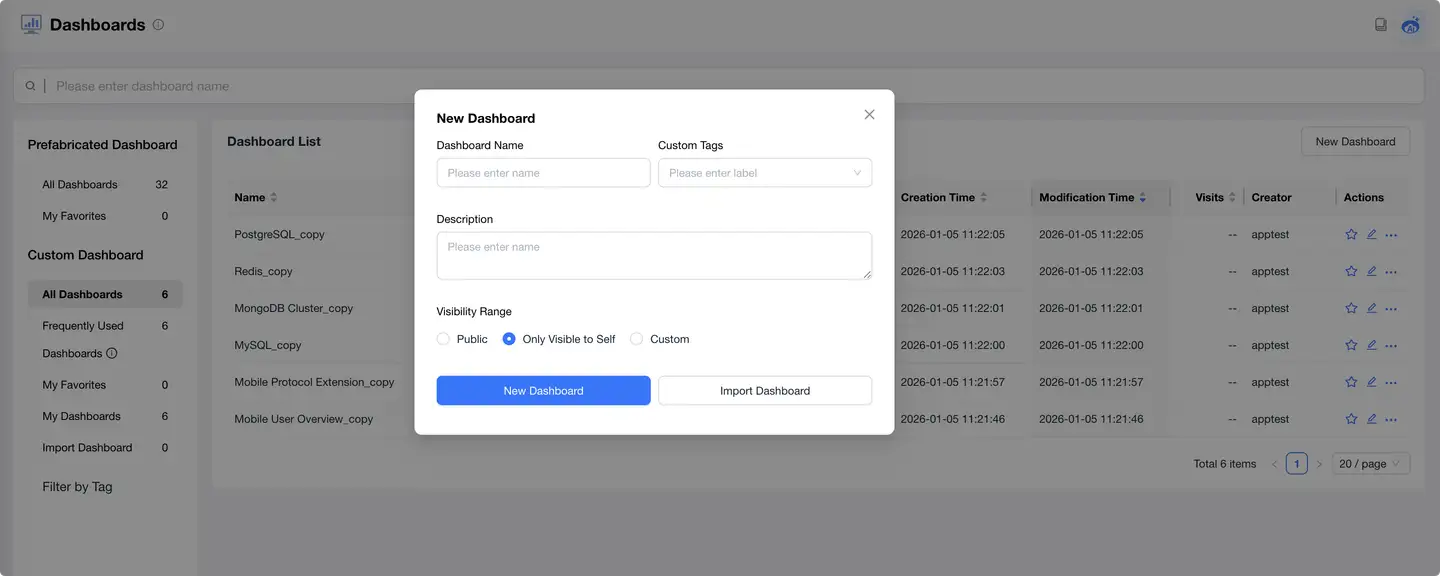
Supporting the following configurations:
- Dashboard Name: We recommend clearly reflecting the purpose, such as "Page Performance Dashboard" or "Request Exception Monitoring".
- Custom Tags: Used for categorization and quick filtering.
- Description: Fill in the dashboard goals or content description for collaborative use.
Users can choose:
- Create Blank Dashboard: Add charts from scratch.
- Import Dashboard: Import from local files, template center, or JSON files shared by others.
Building Your Dashboard
After successful creation, enter the dashboard canvas:
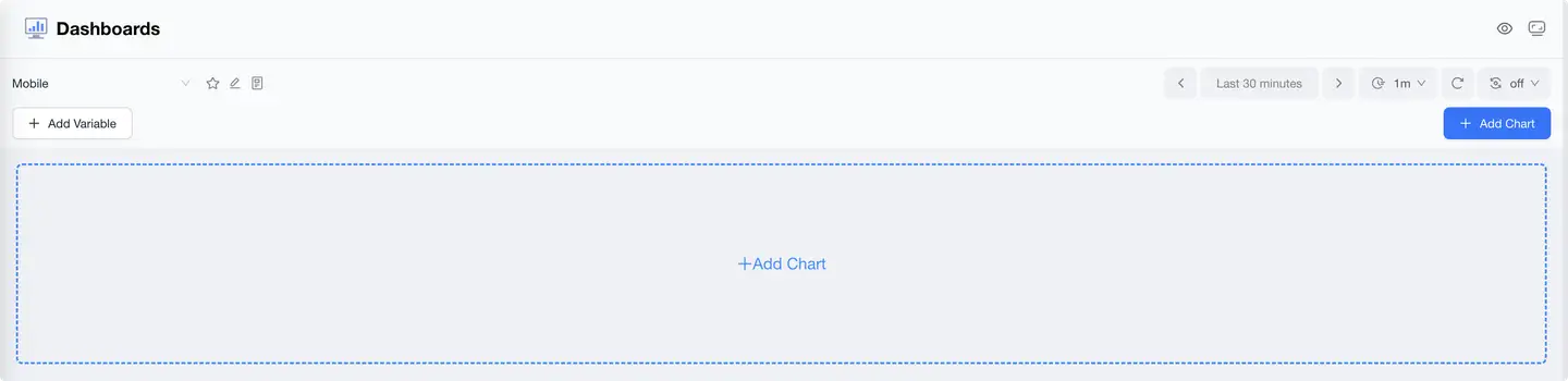
Operational Areas
- Dashboard Name Bar: Click to rename the dashboard.
- Add Variables: Used to configure top dropdown filters, see the "Variable Templates" section below.
- Add Chart: Click to enter the chart building process.
- Time Range Selector: Supports quick selection (today, last 5 minutes, last 1 hour, etc.) or custom ranges.
- Refresh Control: Set auto-refresh cycle, such as refreshing every minute.
Chart Addition and Configuration Process
Click "Add Chart" to start building data visualization modules, divided into four steps:
Step 1: Selecting Chart Type
Supported chart types include:
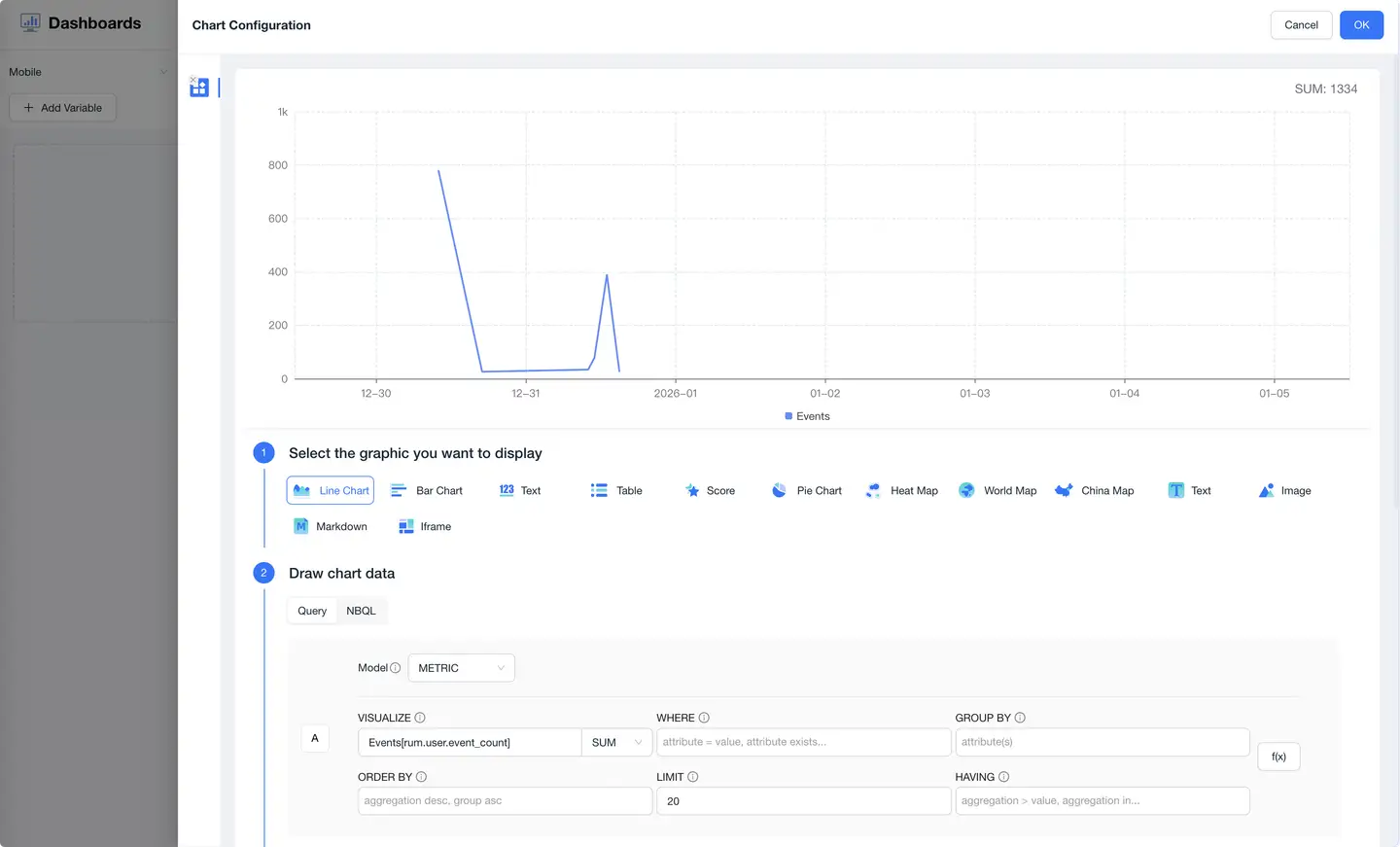
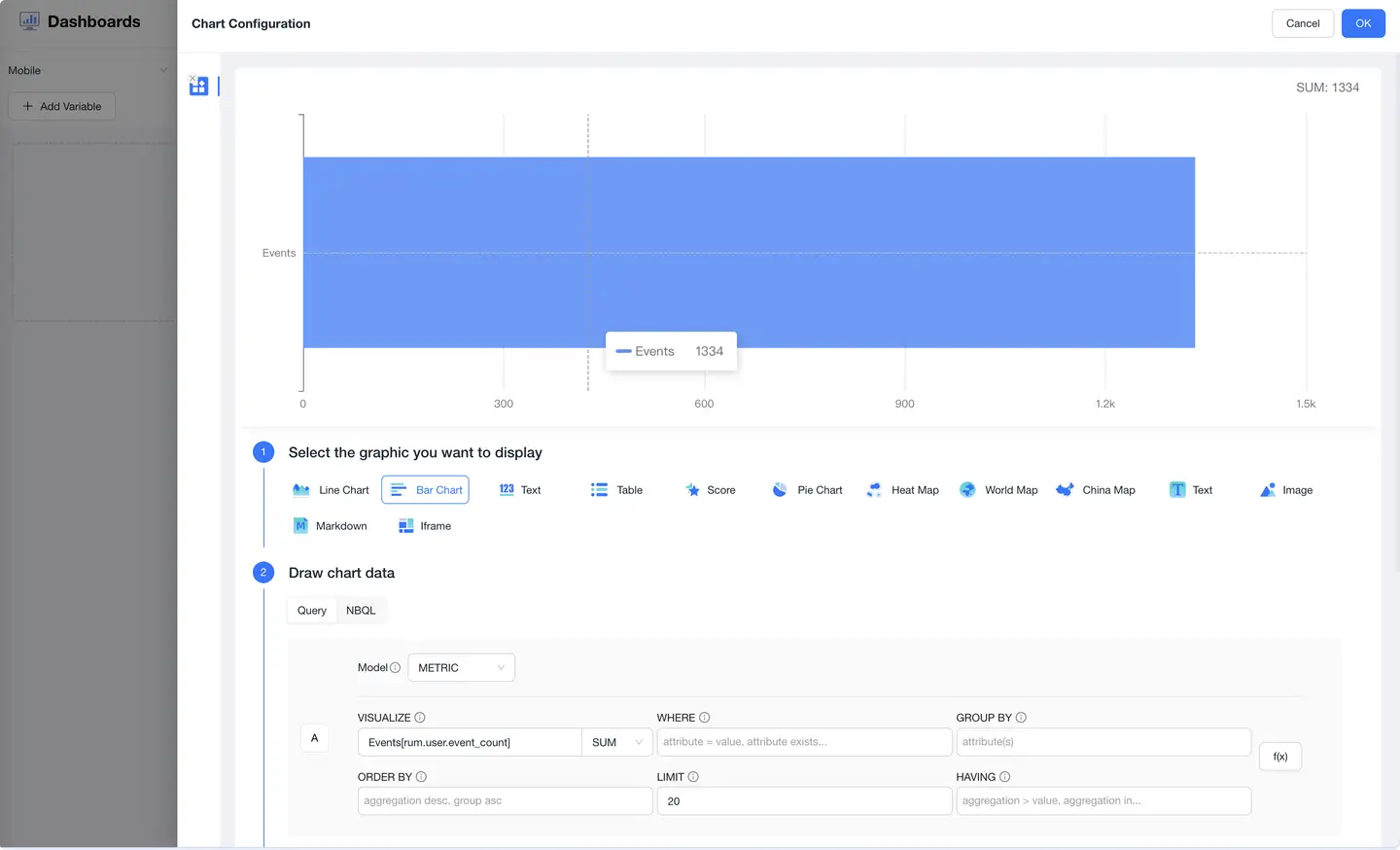
- Trend Chart: Time series curves that display metric trends over time.
- Bar Chart: Horizontal comparison of different category metrics.
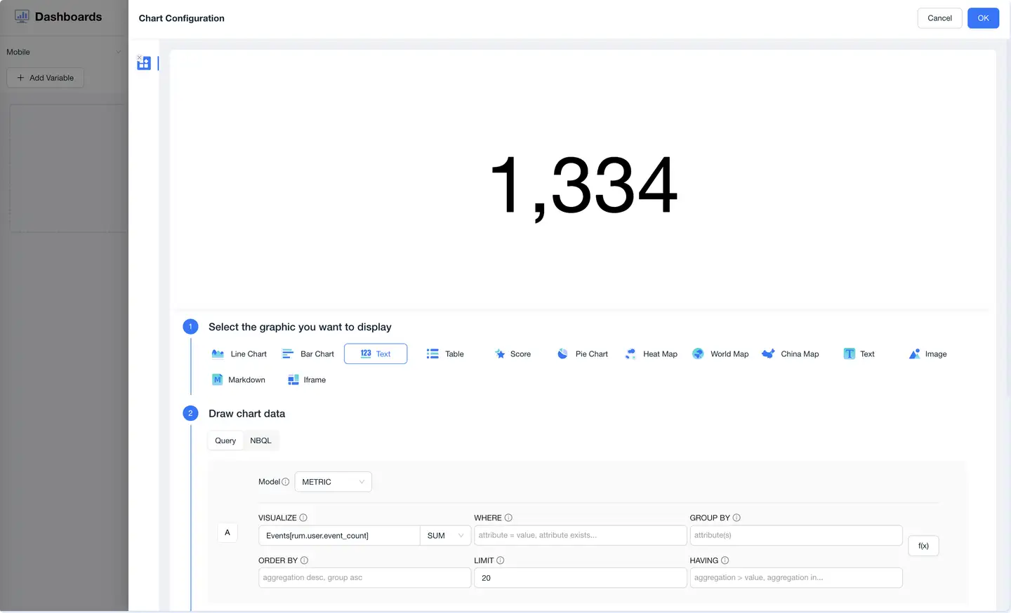
- Value Card: Prominently displays current core metrics.
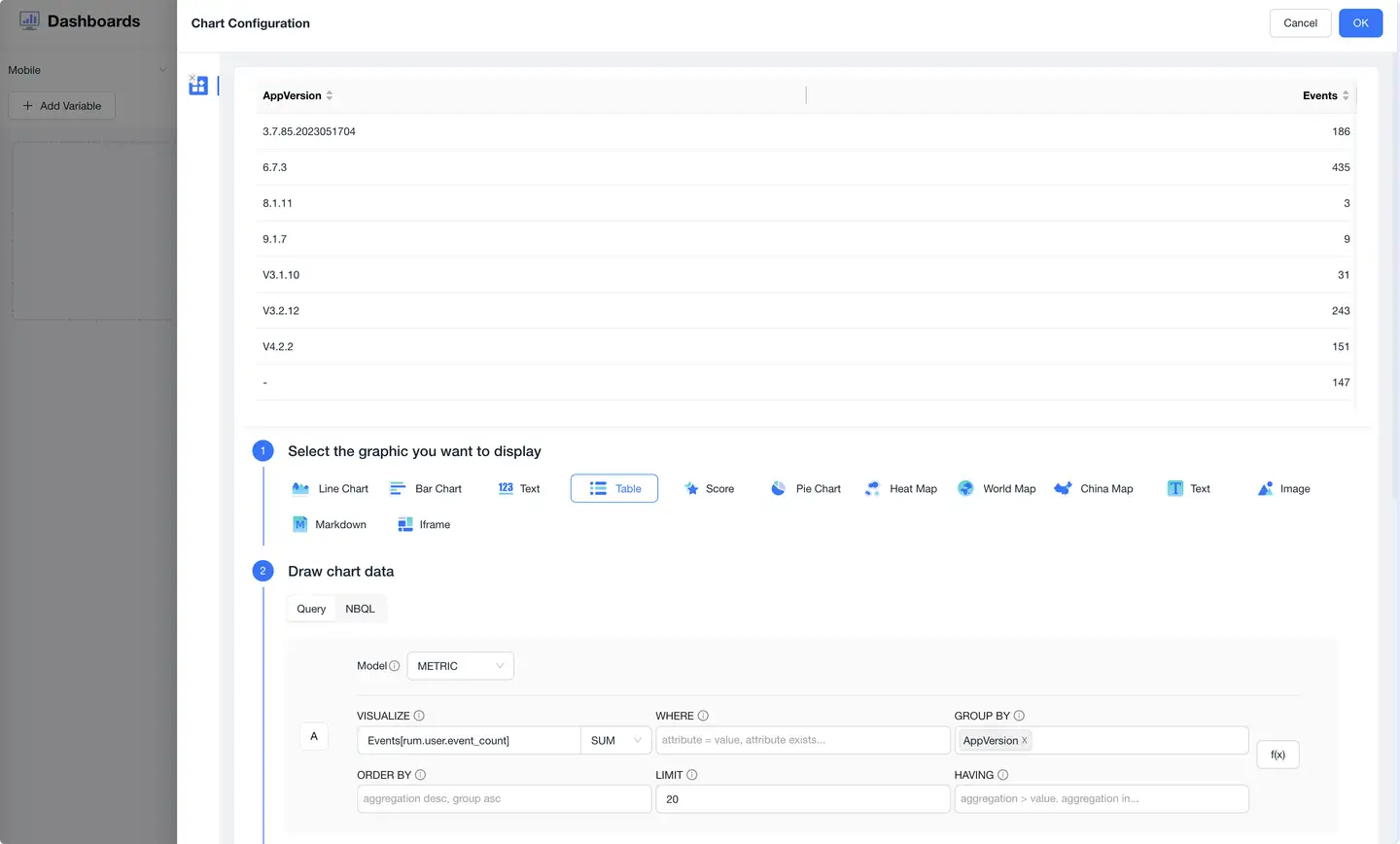
- List Chart: Presents multi-row, multi-column detailed data in table format.
Step 2: Configuring Data Query Logic
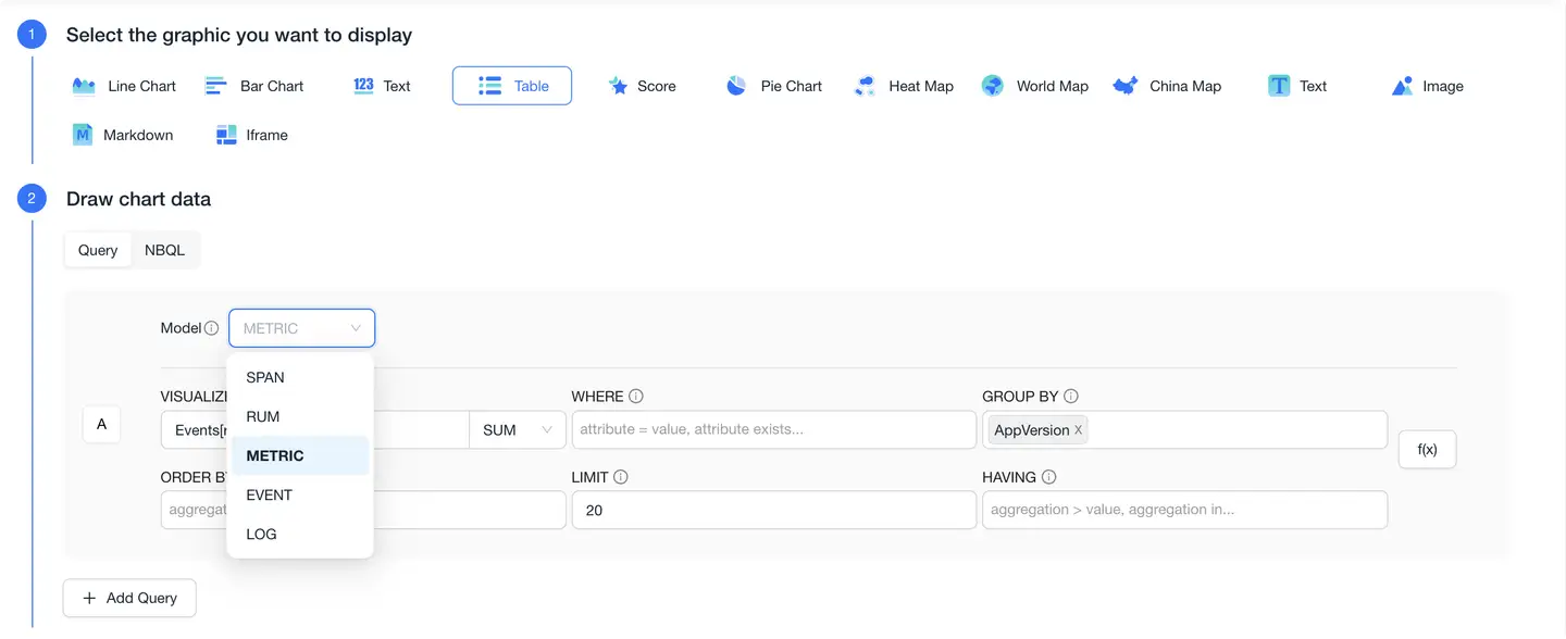
Charts support construction based on NBQL query language, meeting flexible data aggregation and analysis needs.
- Model Selection: Includes three types: SPAN (trace), RUM (frontend), and METRIC.
- Dataset Selection: Such as apm_apm-heatmap, rum_app_page.
- Query Fields: Supports functions like COUNT, AVG, PERCENTILE95, etc.
- Conditional Filtering: Supports WHERE / AND / GROUP BY / HAVING logic.
- Result Control: Set ORDER BY sorting and LIMIT to restrict the number of displayed items.
- Multi-Query Composition: Can configure multiple queries to compose complex charts (A/B queries).
Step 3: Configuring Chart Display Style Settings
-
Trend Chart Configuration
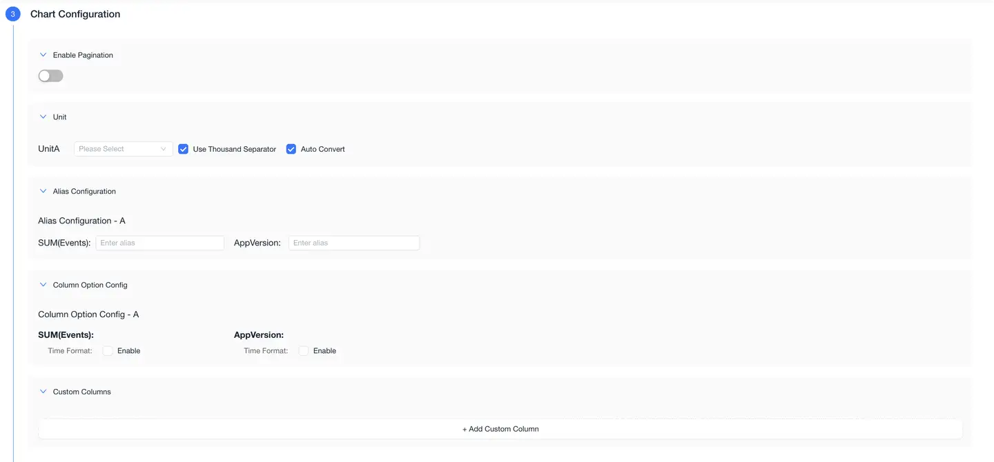
In this area, you can:
- Color Scheme: Select preset styles (such as classic).
- Legend Position: Top / Left / Bottom / Right / Hidden.
- Data Axis Configuration:
- Display metric A / B on the left or right Y-axis.
- Set units (supports auto-conversion and thousand separators).
- Marker Settings:
- Support adding marker lines or annotation text to charts.
- Y-axis Range:
- Support manual setting of minimum and maximum values for controlling coordinate zoom range.
-
Bar Chart Configuration

Chart display configuration:
- Supports selecting color schemes (such as classic).
- Legend Position: Can be set to top, right, bottom, left, or hidden.
- Unit Configuration:
- Supports setting axis units, metric A/B units.
- Can enable "Auto Conversion" and "Thousand Separator" options.
- Suitable for comparative analysis scenarios, such as: Top 10 page load times, user distribution by region.
-
Value Card Configuration
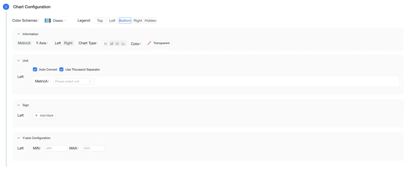
Chart display configuration:
- Can set value center alignment, left/right alignment, or top alignment.
- Unit Section:
- Can configure unit styles.
- Supports "Thousand Separator" and "Adaptive" font display.
- Color Settings:
- Can customize color display rules based on value ranges.
- Conditional formatting supports logical judgments (e.g., display in red when > certain value).
- Suitable for displaying core KPIs or large screen display scenarios, such as: real-time user count, current QPS.
-
List Chart Configuration
Chart display configuration:
- By default, displays query results in table format, suitable for displaying detailed data with rich dimensions.
- Unit Settings:
- Can set different display units for fields A/B.
- Also supports thousand separators and adaptive fonts.
- Commonly used to display slow API details, exception logs, user detail lists, etc.
Step 4: Naming Chart

Please set a clear name for the chart for easy identification and future collaborative maintenance, such as: "Active Users Trend", "Slow API List", etc.
Chart Display and Interactive Capabilities
After configuration is complete, the chart will load data and display in real-time:
The upper right corner of each chart supports the following operations:
- Copy: Quickly create a chart with the same structure.
- Zoom: View detailed chart content.
- Edit: Return to the chart configuration interface.
- Delete: Remove the chart from the dashboard.
Charts will dynamically refresh based on the time range or variables at the top.
Variable Template Configuration
Dashboards support building dynamic dashboard capabilities through "Variable Templates".
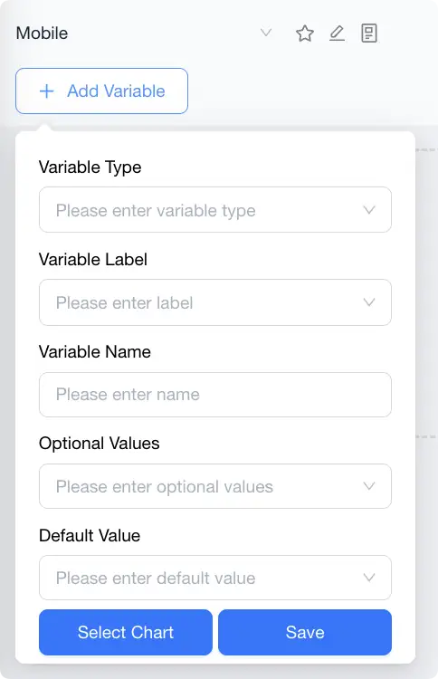
Feature Overview
- Use variables to replace hard-coded fields in queries, enabling chart and filter linkage.
- After configuring variables, users can switch variable values through top interactive components (dropdown boxes, etc.).
- Charts will automatically refresh data based on current variable values.
Configuration Options
- Variable Label: Used for variable grouping (e.g., region, version, application).
- Variable Name: Unique identifier, written in NBQL using
{variable_name}(note: remove the $ symbol). - Optional Values: Supports static enumeration or dynamic API retrieval.
- Default Value: The value used when loading by default.
Typical Application Scenarios
- View request failure rates by different App IDs.
- Quickly compare metric differences between test environments and production environments.
- Provide unified templates for multi-tenant SaaS.