Feature Overview
My VisBoard
On the My VisBoard page, you can perform the following operations:
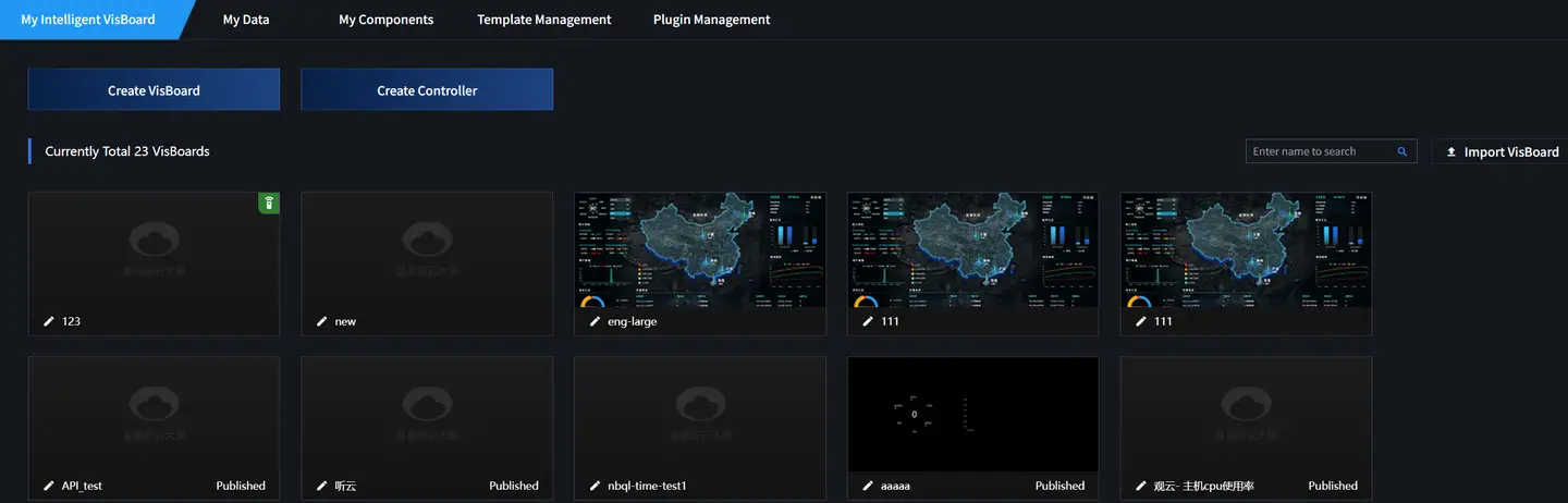
Creating VisBoard
-
Log in to the Guanyun Platform.
-
In the left navigation bar, select All Apps, then choose VisBoard from the pop-up lite applications list.
-
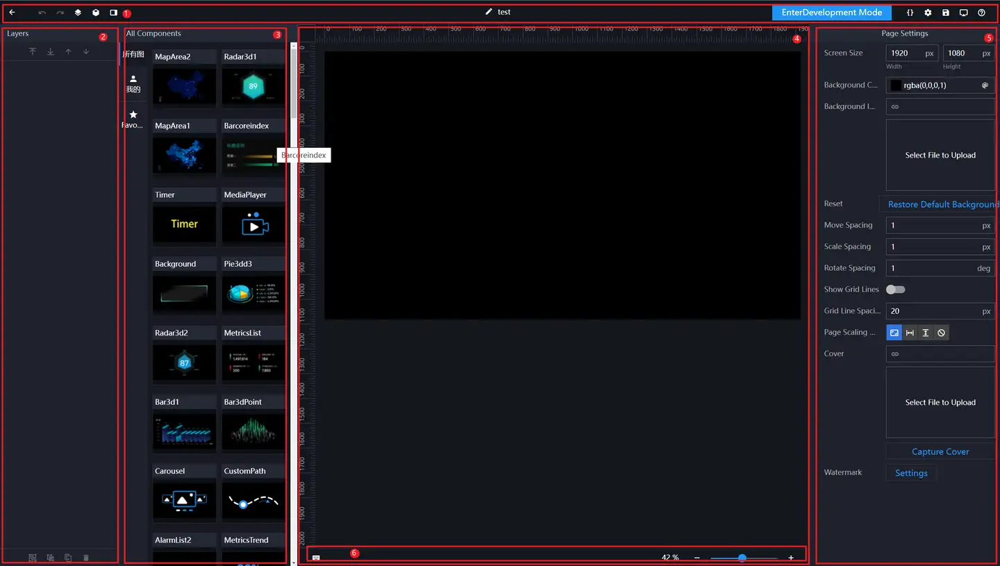
On the My VisBoard page, Click Create.
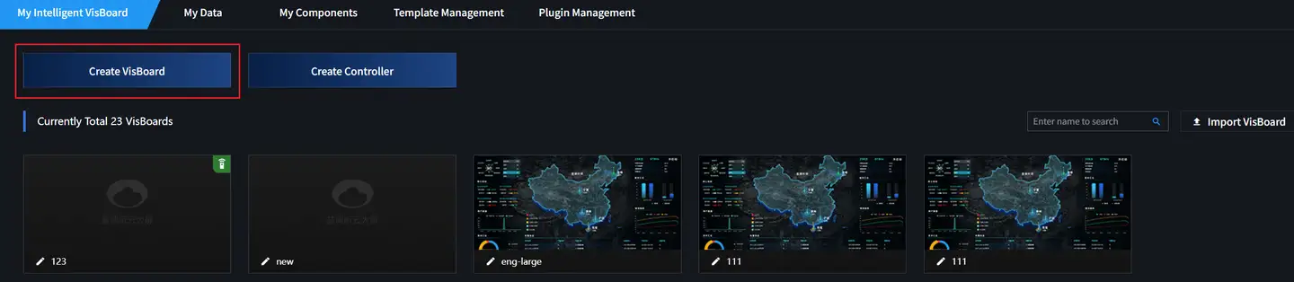
-
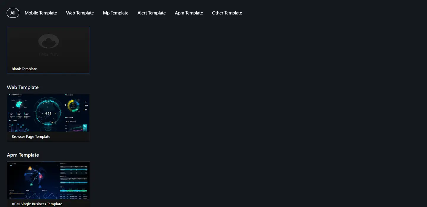
Select a suitable template and click Create.
-
In the pop-up dialog, enter the VisBoard name and Click OK.

-
After successful creation, you will be redirected to the VisBoard editing page.
-
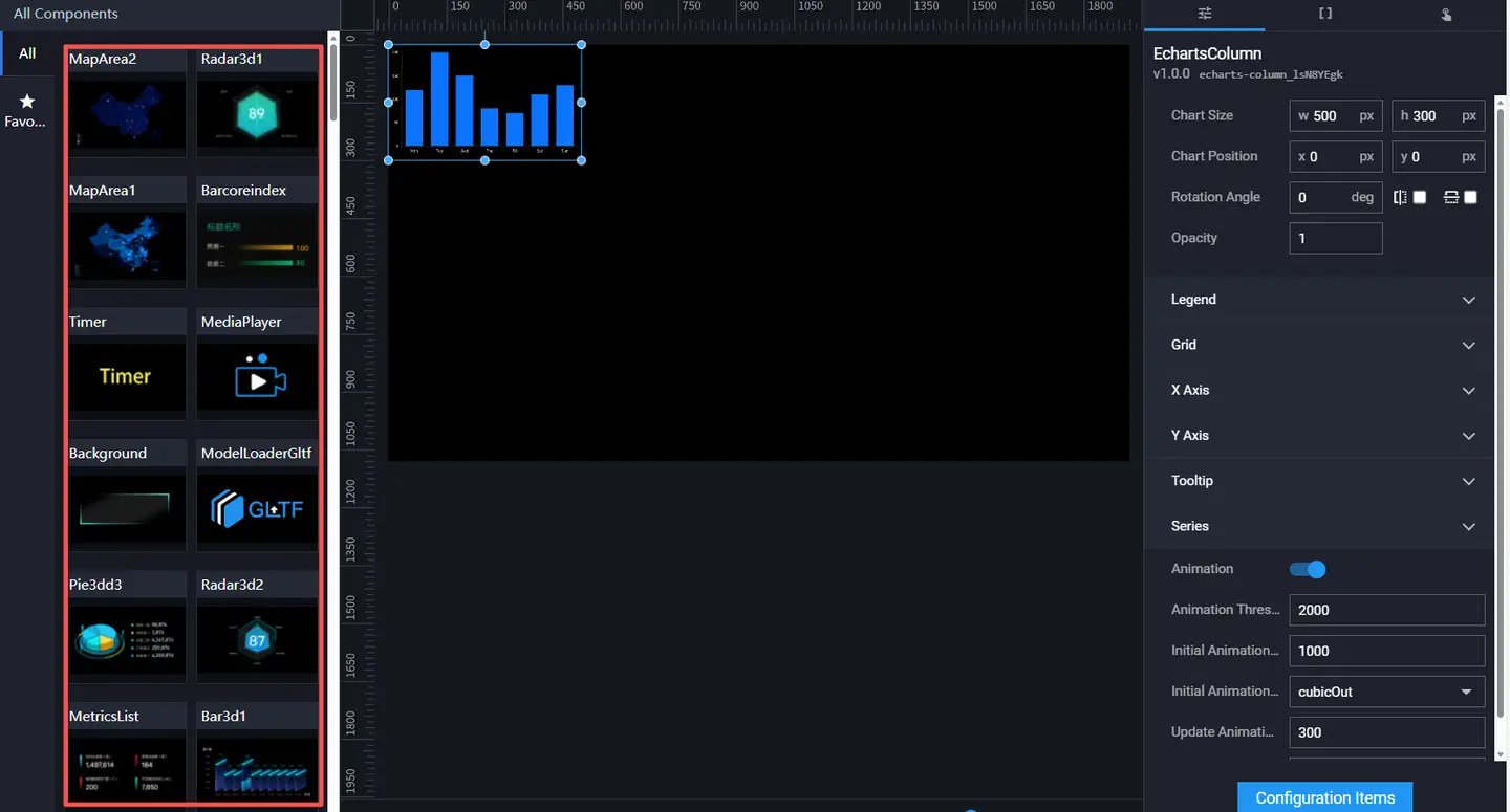
Click on the target component in the component list to add it to the canvas area. Dragging the component achieves the same effect. Different components will be located in different layers.
-
Next, you can perform layer management in the left layer panel, and configure component styles, component data, and component interactions in the right component configuration panel. For details, please refer to the Component Guide.

-
Click the save icon in the top toolbar to complete the VisBoard configuration.

Editing VisBoard
-
Log in to the Guanyun Platform.
-
In the left navigation bar, select All Apps, then choose VisBoard from the pop-up lite applications list.
-
On the "My VisBoard" page, select a VisBoard and click the Edit icon.

-
On the VisBoard editing page, modify the component layout and configuration, or add/delete components. For details, see Visual Editing.
After editing, you can preview the VisBoard to check the effect.
Copying VisBoard
Using the VisBoard copy function, you can create similar VisBoards based on an existing one, or use it as a development/test environment for modifications and updates without affecting the production VisBoard.
-
Log in to the Guanyun Platform.
-
In the left navigation bar, select All Apps, then choose VisBoard from the pop-up lite applications list.
-
On the "My VisBoard" page, select a VisBoard and click the Copy icon.

After successful copying, the system automatically generates a VisBoard with the same name. You can rename it and continue to adjust the layout and configuration.
Previewing VisBoard
On the "My VisBoard" page, select a VisBoard and click Preview to preview the VisBoard. After previewing and confirming the effect, you can publish the VisBoard to the online environment for others to view online.

Publishing VisBoard
The publish function provides two ways to share the VisBoard:
-
Public Sharing (Default)
-
Encrypted Sharing
-
On the "My VisBoard" page, select a VisBoard and click the Publish icon.

-
In the pop-up dialog, configure whether to enable encrypted sharing and the validity period.
-
After enabling encrypted sharing, an 8-digit random password is generated by default. You can also set one manually. Click the Refresh icon on the right to regenerate a random password.

-
Set the validity period of the sharing. The default sharing validity period is 1 day. You can set it according to your needs. If you want to share permanently, you can set the validity period value very large, such as 10000.
-
-
Click OK.
After successful publication, the lower right corner of the VisBoard displays "Published". Click the Publish icon again to copy the sharing link and send it to others. If encrypted sharing is enabled, the recipient can access the VisBoard by entering the random password. Click Unpublish to immediately cancel the publication.

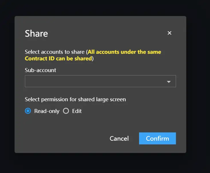
Sharing VisBoard
-
On the "My VisBoard" page, select a VisBoard and click the Share icon.

-
In the pop-up "Share" dialog, select the sub-account and read/write permissions.
You can enter keywords in the sub-account selection box to filter. If Read-only is selected, the recipient can only view the VisBoard; if Edit is selected, the recipient can modify the VisBoard.
-
Click OK.
Exporting VisBoard
On the "My VisBoard" page, select a VisBoard and click the Export icon to export it as a ZIP package.

Importing VisBoard
On the "My VisBoard" page, click Import VisBoard in the upper right corner, then select the previously exported VisBoard ZIP file.
Deleting VisBoard
On the "My VisBoard" page, select a VisBoard and click the Delete icon to delete it.

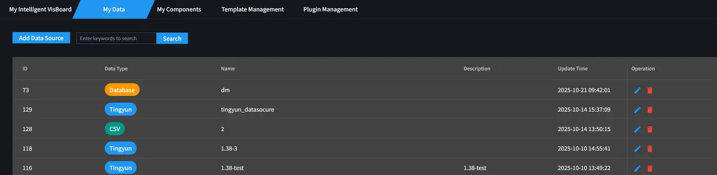
My Data
On the "My Data" page, you can perform the following operations:
-
Add Data Source
- CSV
-
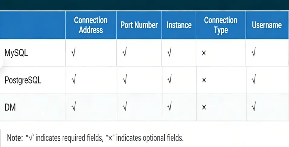
Database
-
MySQL
-
PostgreSQL
-
DM
-
- Tingyun
- Edit Data Source
- Delete Data Source
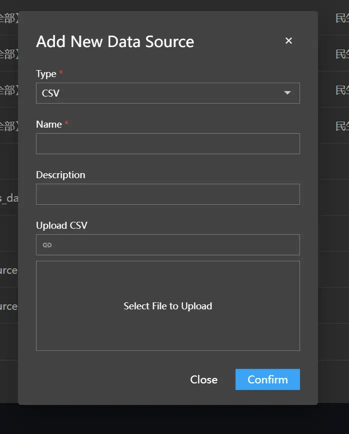
Adding CSV File
-
On the "My Data" page, click Add Data Source in the upper left corner.
-
From the Type drop-down list, select CSV.
-
Enter the name and description, then upload the CSV file. After uploading, the path of the CSV file is displayed in the text box above.
-
Click OK.
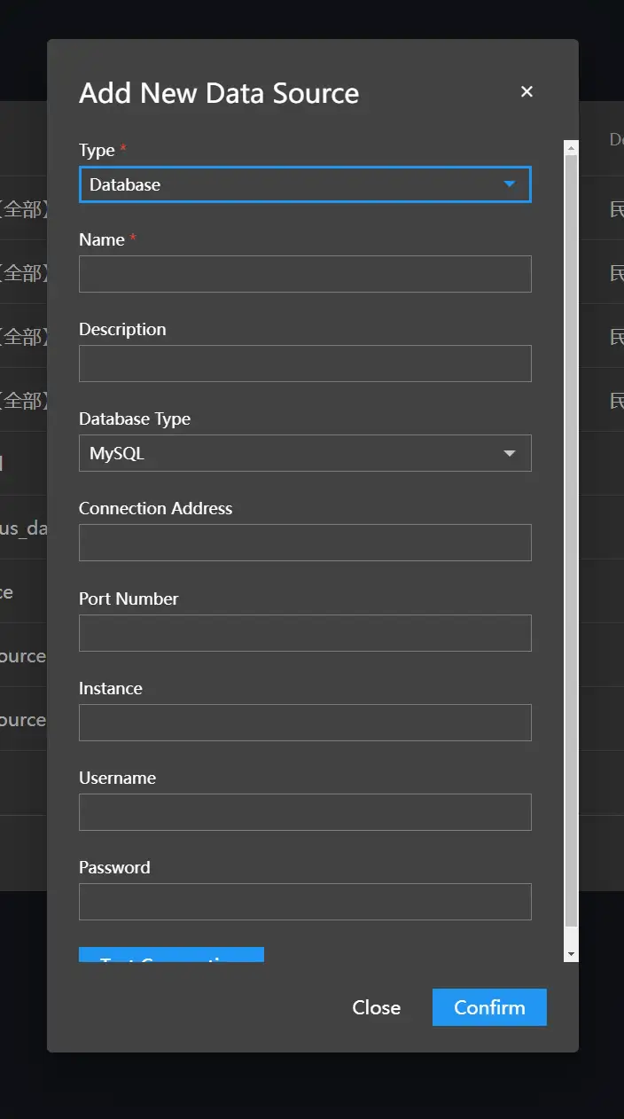
Adding Database
-
On the "My Data" page, click Add Data Source in the upper left corner.
-
From the Type drop-down list, select Database.
-
Fill in the database information.
-
Click Test Connection to verify the connection.

-
Click OK.
Adding Tingyun Data Source
-
On the "My Data" page, click Add Data Source in the upper left corner.
-
From the Type drop-down list, select Tingyun.
-
From the Request Method drop-down list, select GET or POST.
-
In the "Request Address" text box, fill in the interface that needs to be requested.
-
According to the different request methods you choose, fill in the corresponding request parameter values in the "Request Parameters" and "Request Body" below.

-
Click OK.
Editing Data Source
On the "My Data" page, click the "Edit" icon in the "Operation" column to modify the data source information.
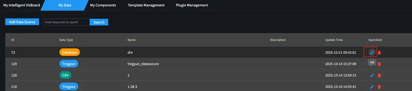
Deleting Data Source
On the "My Data" page, click the "Delete" icon in the "Operation" column to delete the current data source.

Visual Editing
Editor Overview
-
Top Toolbar
-
Layer Panel
-
Component List
-
Canvas
-
Page Configuration (Grid spacing is the minimum movement unit of components on the page)
-
Bottom Toolbar
-
Component Configuration Panel
-
Style Configuration
-
Data Configuration
-
Interaction Configuration
-
Canvas Editing
Adding Components
In the canvas editor, you can add components in the following two ways:
-
Hold down the mouse and drag the component directly to the canvas.
-
Click the component directly.
Selecting Components
-
Click the component to select it, hold down the Shift key to add selection.
-
Directly drag to select single or multiple components.

Modifying Basic Properties of Components


-
Translation
-
Scaling
-
Rotation
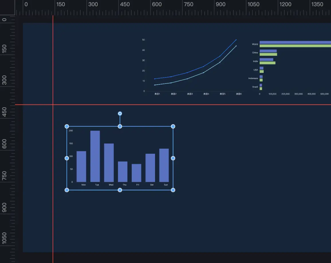
Using Rulers
The canvas provides a ruler line function.
-
Move the mouse to the left or top ruler, hold down the mouse and drag directly to the canvas to generate a ruler line.
-
Hold down the ruler line and drag it outside the canvas to delete a ruler line.
-
Dragging a component can snap to the ruler line.
Canvas Zooming and Panning
-
Modify the canvas display ratio through the bottom toolbar (the canvas ratio will adapt when the page layout changes).

-
When the canvas is expanded and scroll bars appear, hold down the Spacebar to pan the canvas.
Favorite Components
Supports favoriting frequently used components that are configured.
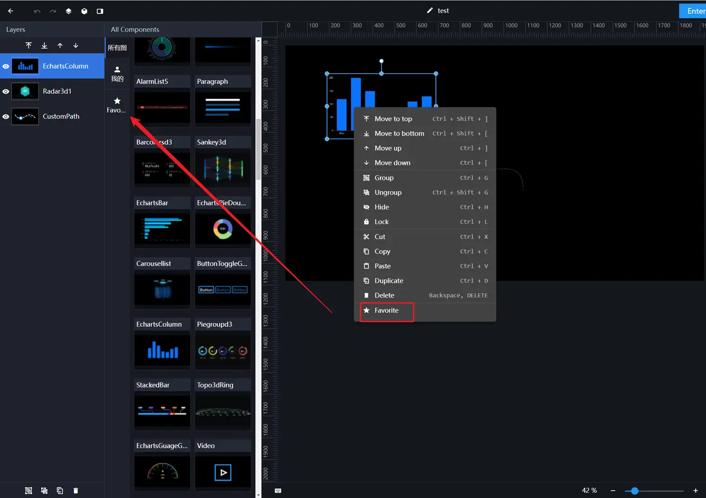
-
Right-click the component and select "Favorite" from the function list.
-
The favorited components will enter the left favorites menu. You can click or drag the components under the favorites menu to the right canvas for shared use.
-
When favoriting a component, the current component's configuration items (configuration properties, data items) are also favorited simultaneously.
-
Click the "Delete" button under the favorites menu to cancel the favorite.

Layer Management
Use the layer panel or right-click the component after selecting it on the canvas to operate layers.
Moving Layer
Click to select a layer, hold down the Ctrl key to select multiple layers. There are two ways to move layers:
-
Select a layer, click the "Bring to Front", "Send to Back", "Bring Forward" or "Send Backward" icons above the "Layer Bar" to adjust the layer where the component is located.

-
Right-click the component in the "Canvas", select "Bring to Front", "Send to Back", "Bring Forward" or "Send Backward" in the menu to also adjust the layer where the component is located.

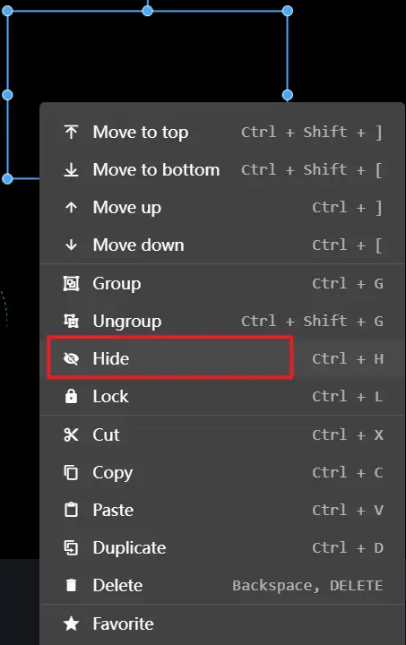
Hiding Layer
There are two ways to hide layers:
-
In the layer panel, click the "Eye" icon to toggle the hidden and displayed state.

-
Right-click the component in the "Canvas", select "Hide", and the layer will be hidden. To display the layer, you need to select it in the layer panel.
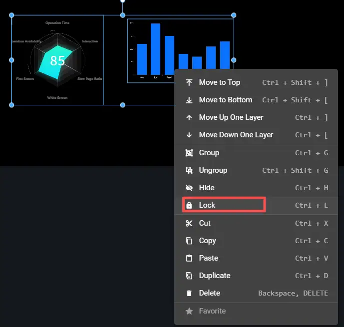
Locking Layer
There are two ways to lock layers:
-
Hover the mouse over the layer, and a "Lock" icon will appear on the right. Click this icon to lock the layer. Click the lock icon again to unlock it.

-
Right-click the component in the "Canvas", select "Lock". To unlock the layer, you must select it in the "Layer Panel".
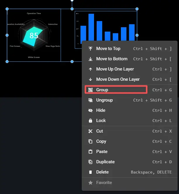
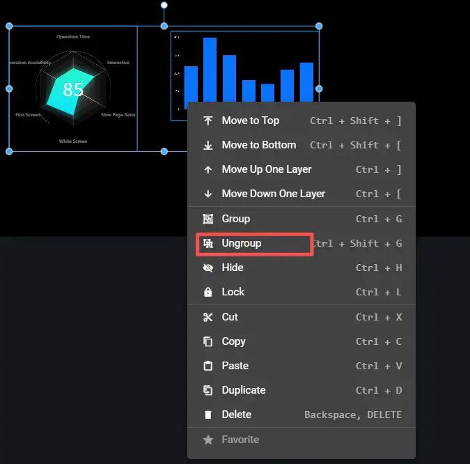
Grouping
There are two ways to group layers:
-
Select one or more layers, click the "Group" button below the "Layer Bar".

-
Select multiple components in the "Canvas" by dragging, right-click and select "Group".
Ungrouping
There are two ways to ungroup layers:
-
Select the grouped layer, click the "Ungroup" button below the "Layer Bar".

-
Select the grouped components in the canvas, right-click and select "Ungroup."
Renaming Layer
Double-click the layer name to enter edit mode, where you can edit the layer name.

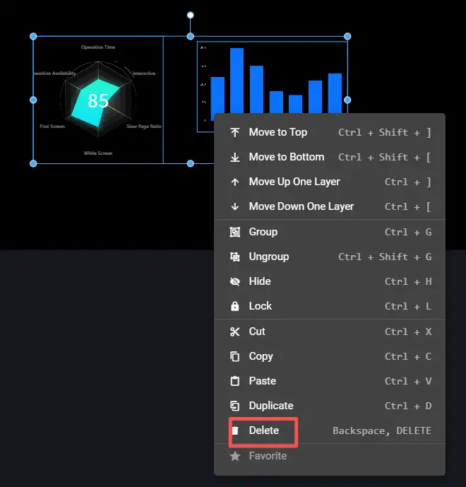
Deleting Layer
There are two ways to delete layers:
-
Select one or more layers, click the "Delete" button below the "Layer Bar".

-
Select one or more components in the "Canvas", right-click and select "Delete".
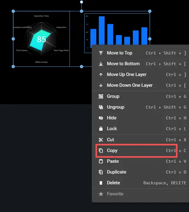
Copying Layer
There are two ways to copy layers:
-
Select one or more layers, click the "Copy" button below the "Layer Bar".

-
Select one or more components in the "Canvas", right-click and select "Copy".
Configuration Bar Introduction
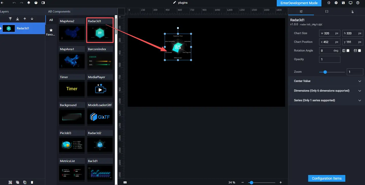
Click any component in the canvas, and the component configuration bar will automatically pop up on the right side of the page, containing three panels: "Style", "Data", and "Interaction".

-
Style Configuration
-
Data Configuration
-
Interaction Configuration
Component Style
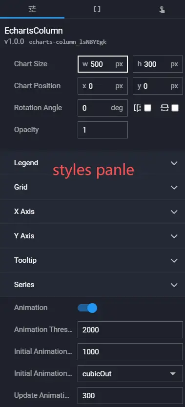
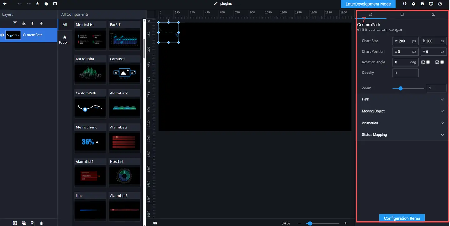
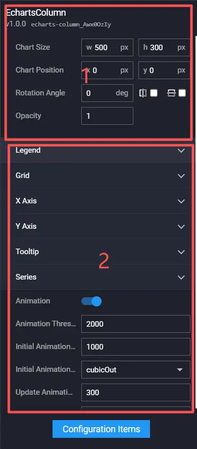
In the "Style" panel, you can configure the component's "Chart Size", "Chart Position", "Rotation Angle", "Opacity" and other attribute styles. Among them, "Chart Size", "Chart Position", "Rotation Angle" and "Opacity" apply to all components. For configuration methods, please refer to Basic Properties. Other attribute styles are different for each component and belong to private configurations. Please refer to the configuration instructions of each component.
- Basic Properties
- Private Configuration
Basic Properties
In the "Interaction" panel, you can adjust the component's size, position, rotation angle, and opacity.

- Chart Size: Includes the width and height of the component, in px.
- Chart Position: Includes the X-coordinate and Y-coordinate of the component, in px. The X-coordinate is the pixel distance from the upper left corner of the component to the left boundary of the page, and the Y-coordinate is the pixel distance from the upper left corner of the component to the upper boundary of the page.
- Rotation Angle: Rotate around the center point of the component, in degrees deg.
- Manually enter the angle value to control the rotation angle of the component.
- Check the
 icon to control the left-right flip style of the component.
 - Check the
 icon to control the up-down flip style of the component.
- Opacity: The value range is 0~1. When it is 0, the chart is hidden; when it is 1, the chart is fully displayed. The default is 1.
Component Data
In the "Data" panel, you can configure the data source, configure field mapping, configure data filters, etc. For details, please refer to Configuring Component Data.
Component Interaction
In the "Interaction" panel, you can configure interaction events between components. For details, please refer to Configuring Component Interaction.
Focus Management
Focus management can effectively improve the interactive operation of the VisBoard Pro product. Use Tab and Shift + Tab to quickly switch the cursor position.
Example One
-
Select the component to focus the right configuration bar (click the configuration bar once).
-
Press the Tab key, and the style configuration bar will be highlighted.

-
Press the left and right keys to switch the focus.

Example Two
-
Select the component and focus on the right configuration bar.
-
Use Tab and Shift + Tab to switch form controls.

Example Three
-
Select the component and focus on the accordion control.

-
Press the spacebar to expand the panel.

Example Four
-
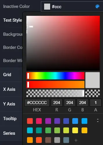
Select the component and focus on the color control.

-
Press the spacebar to open the color editor.
Example Five
-
Focus on the title bar.

-
Press the Tab key to observe the focus effect.
Configuring Component Data
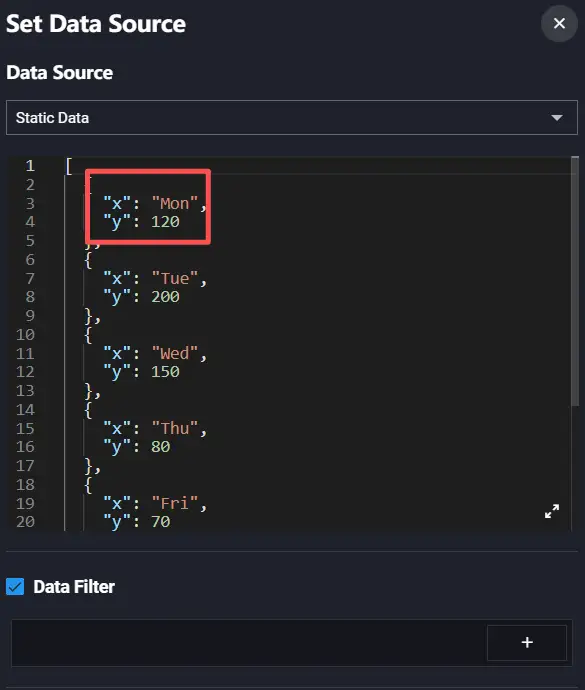
Using Static Data
-
Select the component in the canvas.
-
In the "Data" panel of the right configuration bar, click "Configure Data Source".
-
After modifying the static data value, you can see the data in the component change.
Using API Data
The following tutorial uses API data as an example to explain some basic concepts.
Using API Data Source
-
Select the component in the canvas.
-
In the "Data" panel of the right configuration bar, click "Configure Data Source".
-
Select "API" from the data source list.

-
Select the request method, fill in the API address and all request parameters.
If there are cross-domain or token issues, you need to check "Initiate request from server".

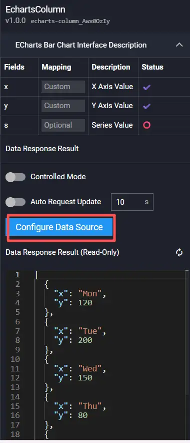
-
View the return result style of the data source at the "Data Response Result" below.
Field Mapping
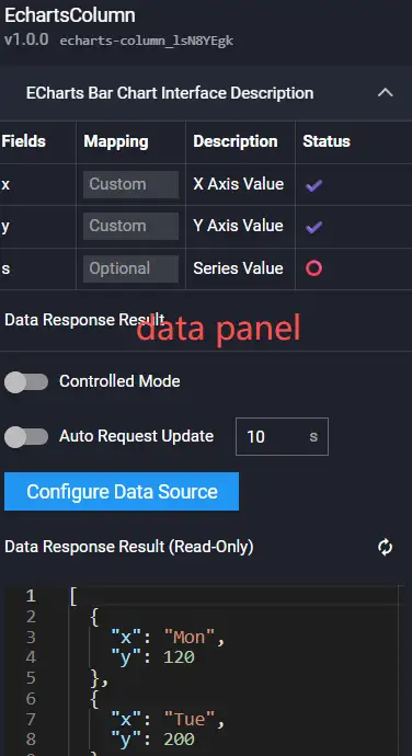
Field mapping represents the mapping relationship between chart data and list data. Generally, the system can automatically match the categories and values in the data source to complete data mapping. If the data is complex, you need to manually enter fields to complete data mapping. After successful data mapping, the status column will automatically display Match Successful.
-
Observe the fields required by the chart.

-
Observe the returned data.

-
Set the mapping relationship.


Data Series
The above data actually has two sets of values, with types Lon and Bor respectively. We need to set "Series Mapping" and specify the corresponding series value in the chart.
-
In the "Data" panel of the right configuration bar, set series mapping.

-
In the "Style" panel of the right configuration bar, click the "Data Column" area and set the name of Series 1 to Lon.

-
Click the plus icon in the upper right corner to add a new series, and set the name of Series 2 to Bor.

-
Observe the chart.

Controlled Mode
Controlled mode indicates whether the component requests the interface when loading initially.
-
Enable "Controlled Mode" in the "Data" panel.

-
Preview the VisBoard; the component does not render data.

Auto Request Update
Since the component uses controlled mode, you need to set "Auto Request Update" or "Interaction Events" to drive the component to re-render.
-
In the "Data" panel, enable auto request update and set the time interval to 5s.

-
Preview the VisBoard and wait for 5s to observe the component changes.
Using CSV Data
-
Select the component in the canvas.
-
In the "Data" panel of the right configuration bar, click "Configure Data Source".
-
Select "CSV" from the data source list.

-
Select a piece of data from the CSV data list (created from "My Data"), and you can view the data at the "Data Response Result" below.
Using Database
-
Select the component in the canvas.
-
In the "Data" panel of the right configuration bar, click "Configure Data Source".
-
Select "Database" from the data source list.

-
Select a piece of data from the database list (created from "My Data").
-
Enter the SQL statement.
Using Tingyun Data Source
-
Select the component in the canvas.
-
In the "Data" panel of the right configuration bar, click "Configure Data Source".
-
Select "Tingyun" from the data source list.

-
Select a piece of data from the data list (created from "My Data").
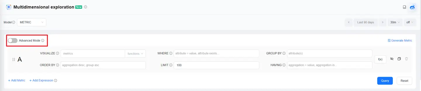
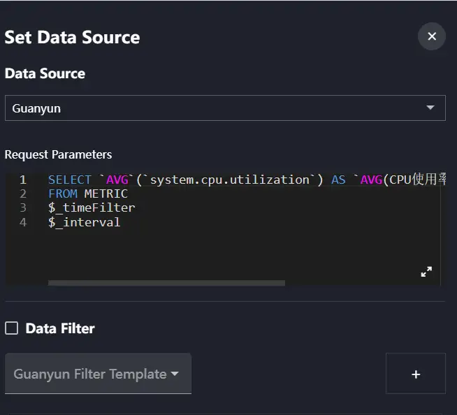
Using Guanyun Data Source
-
Configure the query statement in the "Multidimensional Exploration" of the Guanyun platform, and click "Advanced Mode".
-
In the advanced mode, click the "Copy" button in the lower right corner to copy the statement.

-
Select the component in the canvas.
-
In the "Data" panel of the right configuration bar, click "Configure Data Source".
-
Select "Guanyun" from the data source list.
-
Paste the copied NBQL statement in the request parameters.
Data Filter
Adding Filter
In the "Configure Data Source" panel, click the add button at "Data Filter" to create a filter.

Deleting Filter
Click the delete button to delete a filter.

Writing Filter Function
Example: Take the first three pieces of data from the data list.

Creating Multiple Filters
The VisBoard editor allows creating multiple filters. The data of the latter filter is the output value of the previous filter.

Configuring Component Interaction
Interaction Events
One-to-One Interaction 1
The following uses ECharts bar chart and title two components as an example to introduce interaction configuration.
-
Add "Echarts Bar Chart" and "Title" components, then select the ECharts bar chart.

-
Configure interaction events in the "Interaction" panel.

-
Process the data passed from the bar chart to the title component.

-
Preview the VisBoard and observe the component changes.
One-to-One Interaction 2
Components can interact with themselves.
-
Add a "Date Time" component.

-
Enable timed callback in the style panel.

-
Configure interaction events in the interaction panel.

-
Preview the VisBoard and observe the component changes.
One-to-Many Interaction
-
Add "Echarts Bar Chart" and two "Title" components.

-
Add interaction events in the "Interaction" panel.

Multiple identical components can be distinguished by id.

-
Configure the second interaction event as toggle show/hide.
-
Preview the VisBoard and observe the component changes.
Many-to-One Interaction
-
Add "Echarts Bar Chart", "Echarts Line Chart" and "Title" components.

-
Configure the linkage between the bar chart and the title, and the line chart and the title respectively.


-
Preview the VisBoard and observe the component changes.
Auxiliary Interaction Components
Auxiliary interaction components have no conventional styles and are mainly used to assist other components in doing some interaction linkages. Select "Interaction" in the component list to view interaction components.
Timer
The "Timer" can achieve delayed timing, delayed loop timing, and fixed-point timing.
Usage scenarios:
-
Click a button to execute an action after a delay.
-
Execute an action when a certain time point is reached.
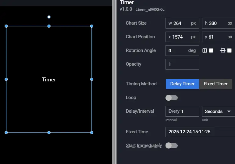
| Configuration Item | Description |
|---|---|
| Timing Method | Supports Delayed Timing and Fixed-point Timing. |
| Whether to Loop | Whether to loop, only supports delayed timing, loops according to the Delay Interval configuration. |
| Delay Interval | Can set the interval and unit. |
| Fixed Time | Valid when Fixed-point Timing is selected, set the specific time point. |
| Event | Description |
|---|---|
| When the timing point is reached | Throws an event when the timing point is reached. |
| Action | Description |
|---|---|
| Start Timer | Starts the timer. |
| Stop Timer | Stops the timer. |
Page Navigation
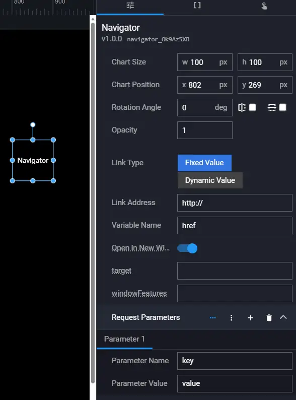
| Configuration Item | Description |
|---|---|
| Link Type | Fixed Value: Fixedly open a certain link. Dynamic Value: Dynamically open a certain link based on component data. |
| Link Address | The link address of the jump page. |
| Variable Name | The object key passed to this component by the upstream component when dynamically opening a link. |
| Open in New Window | Whether to open the link in a new tab page. |
| Request Parameters | Request parameters on the link, support dynamic addition and deletion. |
| Action | Description |
|---|---|
| Open Page | Opens the configured link address. |
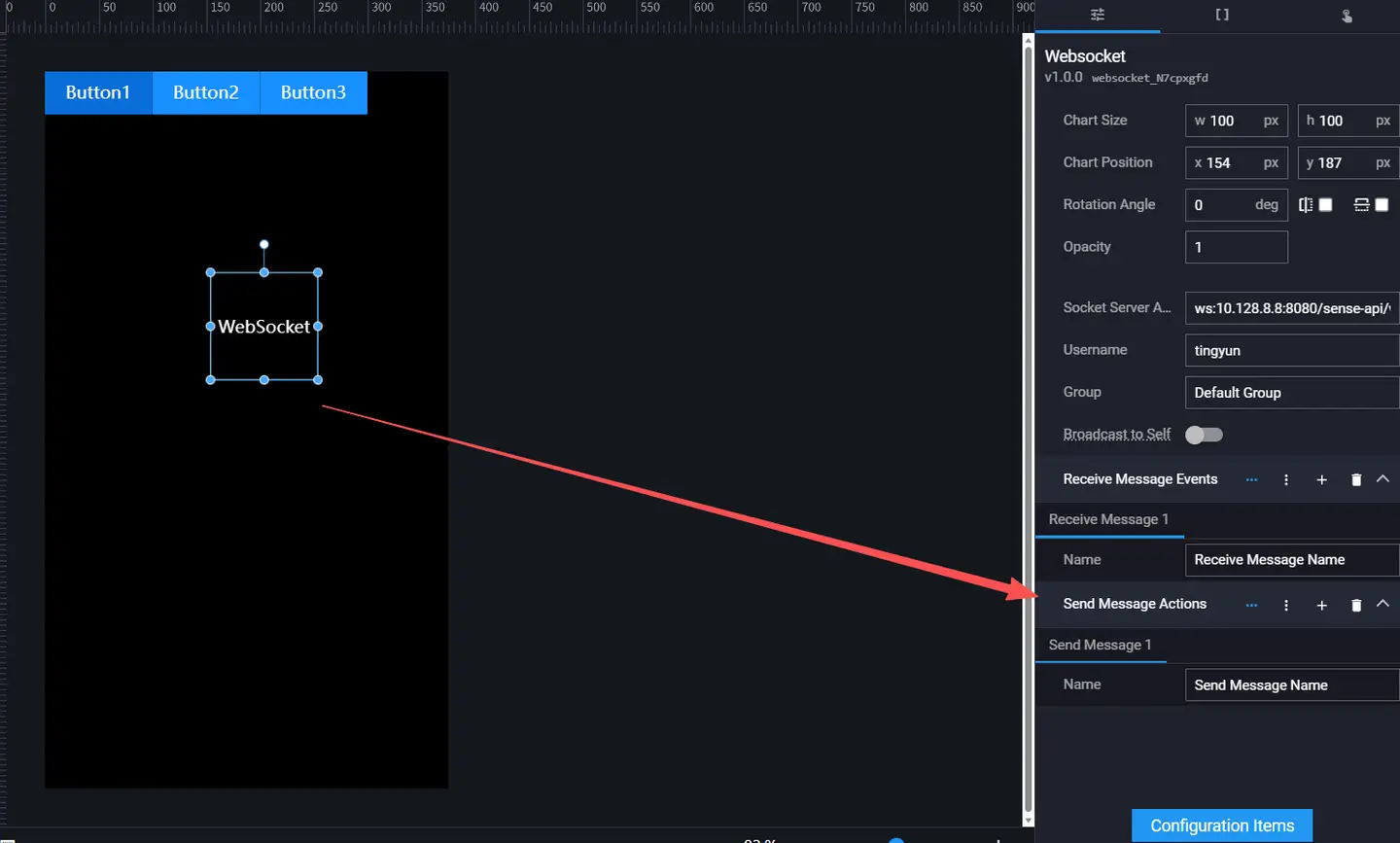
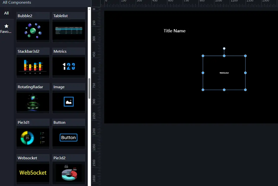
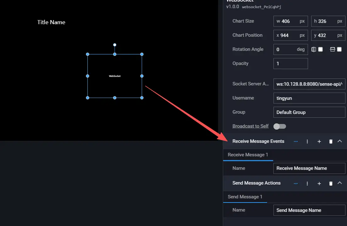
WebSocket
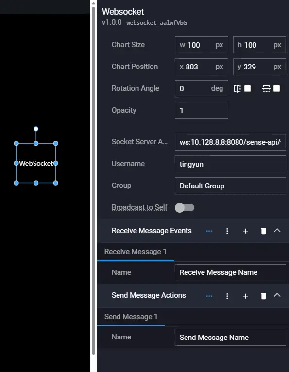
| Configuration Item | Description |
|---|---|
| Socket Service Address | The socket backend service address, automatically filled by default according to the current environment. |
| Username | Current username, automatically filled by default according to the current environment. |
| Group | Group name; the grouping of two interactive VisBoards must be consistent. |
| Receive Message Events | Configure receiving messages, support dynamic addition and deletion. |
| Send Message Actions | Configure sending messages, support dynamic addition and deletion. |
Events: Dynamically generated based on the receive message configuration.
Actions: Dynamically generated based on the send message configuration.
Terminal Interaction
Creating Control Center VisBoard
-
Click Create Controller.

-
In the pop-up dialog, enter the VisBoard name, select the device type and resolution, or manually input a custom device resolution.

-
Click OK.
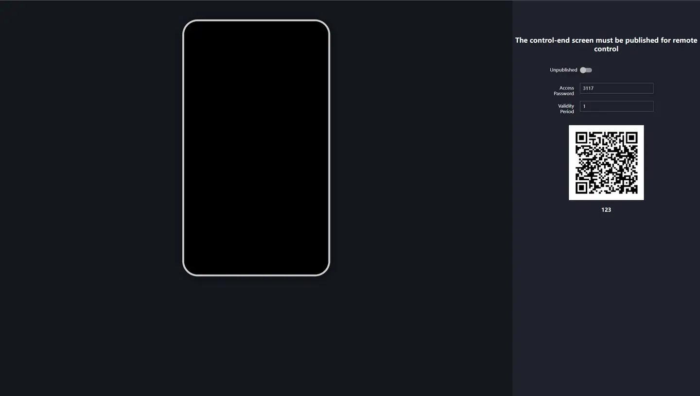
Previewing Control Center VisBoard
The preview page of the control center VisBoard is divided into two parts: the preview area on the left and the QR code scanning area on the right. You can also set the access password and validity period.
Note: Scanning the QR code for preview is only available after the screen is published.
Setting Multi-Screen Interaction
User interaction requirement: Click the button group on the control center VisBoard to change the title of the main screen.
VisBoard establishes WebSocket services for different screens, associates the components that need to interact with the WebSocket component, thereby achieving linkage between the control center VisBoard and the main screen.

Editing Control Center VisBoard
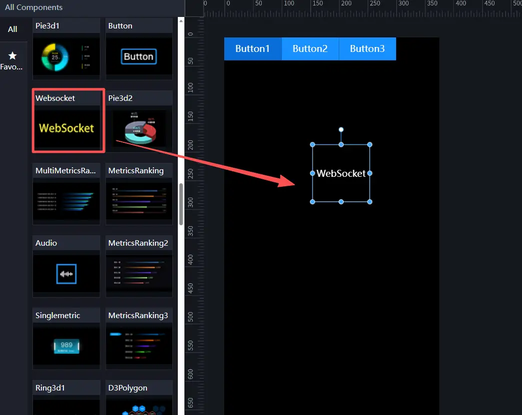
-
Add a "Button Group" component and a "WebSocket" component.
-
Change the WebSocket configuration. For the control center VisBoard, you need to set the "Send Message Action" of WebSocket.
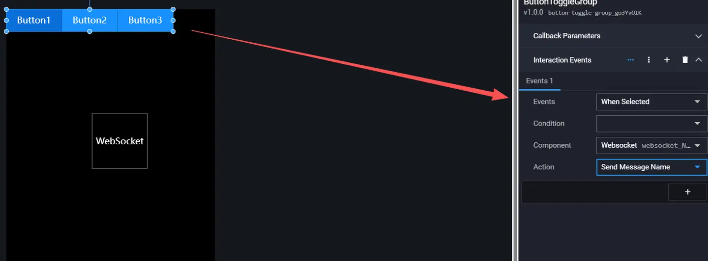
-
Set the selection event of the button group to associate with the WebSocket's send message action [Button Selected].
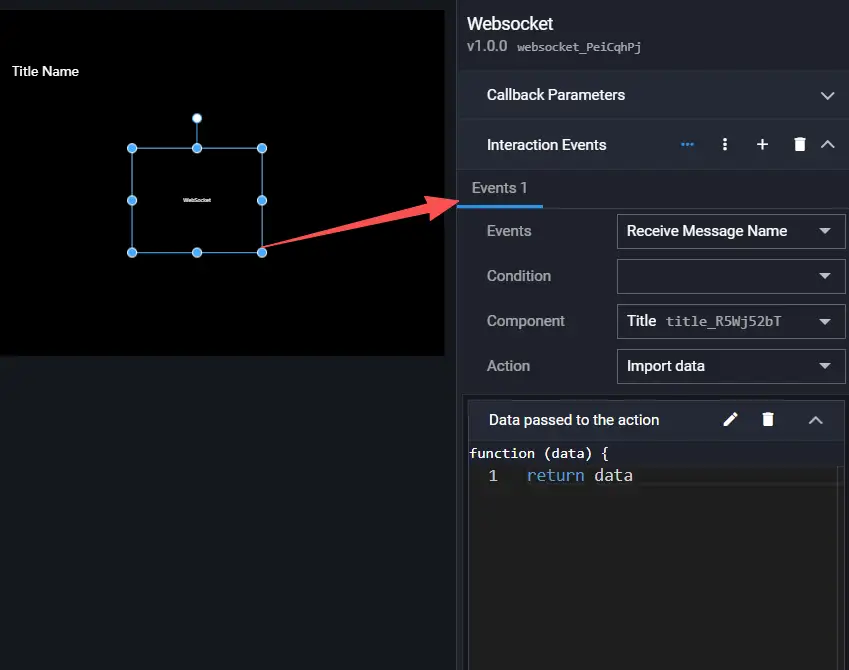
Editing Controlled VisBoard
-
Add a "Title" component and a "WebSocket" component.
-
Set the receive message event of the WebSocket component. The "Receive Message Name" must be consistent with the "Send Message Name" of the control end.
-
Set the interaction event of the WebSocket component to associate with the "Import Data" of the title component.
Previewing Interaction

Note: The WebSocket component is a pure interaction component and does not need to be displayed on the screen during preview. You can move the component outside the canvas in the editor.