Component Development Guide
Quick Start
This article mainly introduces the development process of custom components.
Environment Setup
-
Frontend development requires Node environment, recommended Node 14 or higher. After installation, execute
node -vcommand in the command line interface to check the current installed version. -
Package manager recommends using
yarn, useyarn -vto check the version. -
Download the component development template mycoms.zip file and extract it.
-
Execute
yarnto install project dependencies.
Project Directory
The project directory is as follows:
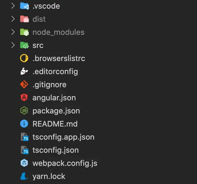
The current template is a simplified Angular project, currently does not support other technology stacks for development, but you can install your preferred libraries as long as you follow the component development specifications.
Creating New Components
The template includes two example components by default. You can create new components through automatic generation or manual execution.
-
Automatic Generation
Use Angular's CLI tool to quickly create a new component, steps as follows.
-
Use VSCode's Angular Schematics plugin.
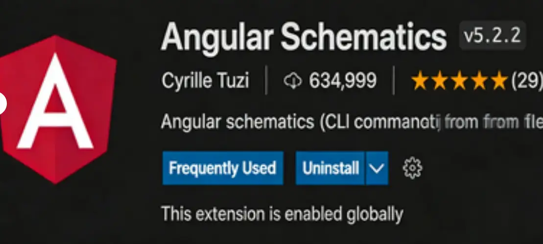
-
Right-click and select Angular: Generate a component.
-
-
Manual Execution
Manually enter the command to generate the component.
ng g component demo3 --change-detection OnPush --skip-tests
After the component is created, add the path of the new component in package.json.
"exposes": {
    "Demo1": "./src/app/demo1/demo1.component.ts",
    "Demo2": "./src/app/demo2/demo2.component.ts",
    "Demo3": "./src/app/demo3/demo3.component.ts"
 }
Starting the Project
Run npm run start command to start the current project, default port is 3000, you can modify the port number in package.json.
"start": "ng serve --port=3000",
Previewing Components
Accessing http://localhost:3000 shows an empty page. The simplest way is to add the component to app.component.html, for example:
<app-demo1></app-demo1>
However, this method cannot test component configuration items and event interactions.
Component Packaging
Run npm run pack to package the component. The packaged component package (default in dist directory) must be compressed into a zip file before uploading.
Online Debugging
Since there is no independent component development platform yet, we need to use the large screen editor to debug components. Specific operations are as follows:
-
On the My Components page, add a new record.
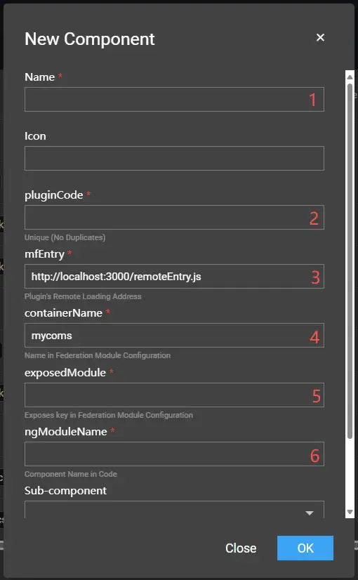
- 1: Plugin name (custom).
- 2: Plugin unique code (custom, generally the lowercase form of the exported component name, e.g., demo1).
- 3: Main entry for the development environment (local service + filename in package.json).
- 4: Component container name (name in package.json, e.g., mycoms).
- 5: Exported component (key in exposes in package.json, e.g., Demo3).
- 6: Component name (class name of the new component, e.g., Demo3Component).
-
After successful addition, the newly added component will be displayed in the My menu.
-
Change the online address `xxx/screen/design/918` to `xxx/screen/dev/918` (change design to dev) to enter the online debugging environment. At this time, dragging the component to the canvas loads the local component, allowing you to debug component configuration, data, and interactions.
Development Specifications
This article mainly introduces project files and essential component attributes.
File Overview
For package.json, only the following attributes need attention.
{
  "name": "mycoms",
  "version": "1",
  "description": "My Component Package",
  "filename": "remoteEntry.js",
  "exposes": {
    "Demo1": "./src/app/demo1/demo1.component.ts",
    "Demo2": "./src/app/demo2/demo2.component.ts"
  },
  …
}
The component template is a single package with multiple components. Each time a new component is created, the path of the component to be exported must be manually defined in exposes.
The component directory is as follows:

Default components are separated into html, css, and ts.
Component Attributes
| Attribute | Type | Description | |
|---|---|---|---|
| Base | attr | ComponentAttr | Basic attributes of the component, including width, height, opacity, flip, etc. |
| Style | config | GuiConfigs | GUI configuration items for component styles. |
| options | ComponentOptions | Default values for component styles, GUI form can change options. | |
| Data | apis | ComponentApis | API configuration for component data, including processing methods and field definitions. |
| data | ComponentData | Static data of the component, also initialization data. | |
| Interaction | events | ComponentEvents | Events that the component can trigger. |
| actions | ComponentActions | Actions (functions) that the component can execute. |
Component Hooks
| Hook Function | Type | Description |
|---|---|---|
| init | () => void | Called when the component is initialized. |
| destroy | () => void | Called when the component is destroyed. |
| render | (data: any, options?: any) => void | Component's data rendering method, defined in the apis attribute. |
| updateOptions | (options: any) => void | Called when GUI configuration items are updated. |
| resize | (width?: number, height?: number) => void | Called when the component size changes. |
Configuration Controls
This article mainly introduces the usage specifications of GUI controls.
Basic Usage
GUI is essentially a dynamic form system that renders component configuration items through JSON data. GUI has many control types, which can be combined to construct any data structure. Each control has a unique type.
The following is a basic configuration example.
config: GuiConfigs = {
  width: {
    name: 'Width',
    type: 'number',
    default: 1920,
    description: '',
    suffix: 'px',
  },
  height: {
    name: 'Height',
    type: 'number',
    default: 1080,
    description: '',
    suffix: 'px',
  },
};
Rendering effect:

Through the above GUI configuration, the following options can be obtained:
{
  width: 1920,
  height: 1080,
}
GUI configuration is mainly organized in object data format, which effectively prevents duplicate keys. The key in the configuration corresponds to the key in options. As long as the form control is modified, the value of options will be updated immediately (text input controls only update when the focus is lost).
Control Overview
| Category | type | Description |
|---|---|---|
| Basic Controls | text | Text input box, string type. |
| number | Number input box, number type. | |
| select | Dropdown selection box, single selection only. | |
| combobox | Combination dropdown box, supports single selection, multiple selection, search, etc. | |
| radio | Radio button. | |
| checkbox | Checkbox, array type. | |
| buttonToggle | Button toggle, supports single and multiple selection, can set text, icons, images. | |
| switch | Switch, boolean type. | |
| slider | Slider, number type. | |
| fill | Color control, supports solid colors and gradients. | |
| hidden | Hidden input box, input type is hidden. | |
| image | Image upload. | |
| video | Video upload. | |
| codearea | Code editor. | |
| Composite Controls | group | Group, object type. |
| inline | Inline group, object type. | |
| tabs | Tab group, array type. | |
| menu | Menu, object type. |
Note: Some controls have the same data output format, mainly differing in UI display effects, such as select and radio. Generally, if the number of options is less than 5, radio is preferred; in other scenarios, the two can be used interchangeably.
For specific control usage methods, please refer to Control Details.
Control Details
Text
Configuration items:
| Field | Meaning | Type | Required |
|---|---|---|---|
| type | Control type | string | Yes |
| name | Label name | string | Yes |
| default | Default value | string | No |
| prefix | Prefix text | string | No |
| suffix | Suffix text | string | No |
Example:
config: GuiConfigs = {
  text: {
    name: 'Text',
    type: 'text',
    default: 'I am the default value',
    prefix: 'Prefix',
    suffix: 'Suffix',
  },
};

Number
Configuration items:
| Field | Meaning | Type | Required |
|---|---|---|---|
| type | Control type | string | Yes |
| name | Label name | string | Yes |
| default | Default value | string | No |
| prefix | Prefix text | string | No |
| suffix | Suffix text | string | No |
| min | Minimum value | number | No |
| max | Maximum value | number | No |
| step | Step value | number | No |
Example:
config: GuiConfigs = {
  number: {
    name: 'Number',
    type: 'number',
    default: '123',
    prefix: '$',
    suffix: '.00',
  },
};

Select
Configuration items:
| Field | Meaning | Type | Required |
|---|---|---|---|
| type | Control type | string | Yes |
| name | Label name | string | Yes |
| default | Default value | string | No |
| prefix | Prefix text | string | No |
| suffix | Suffix text | string | No |
| options | Options list | array | No |
| useFont | Whether to render font | boolean | No |
Example:
config: GuiConfigs = {
  font: {
    name: 'Font',
    type: 'select',
    default: 'SimSun',
    options: [
      { value: 'Microsoft Yahei', label: 'Microsoft Yahei' },
      { value: 'SimHei', label: 'SimHei' },
      { value: 'SimSun', label: 'SimSun' },
      { value: 'fangsong', label: 'Fangsong' },
      { value: 'KaiTi', label: 'KaiTi' },
      { value: 'Arial', label: 'Arial' },
      { value: 'fantasy', label: 'Fantasy' },
],
    useFont: true,
  },
};


Combobox
Configuration items:
| Field | Meaning | Type | Required |
|---|---|---|---|
| type | Control type | string | Yes |
| name | Label name | string | Yes |
| default | Default value | string | No |
| prefix | Prefix text | string | No |
| suffix | Suffix text | string | No |
| options | Options list | array | No |
| multiple | Whether multiple selection | boolean | No |
| bindValue | value mapping | string | No |
| bindLabel | label mapping | string | No |
Single selection example:
config: GuiConfigs = {
  search: {
    name: 'Search',
    type: 'combobox',
    options: [
      { value: 1, label: 'Apple' },
      { value: 2, label: 'Lemon' },
      { value: 3, label: 'Lime' },
      { value: 4, label: 'Orange', disabled: true },
      { value: 5, label: 'Strawberry' },
    ],
  },
};

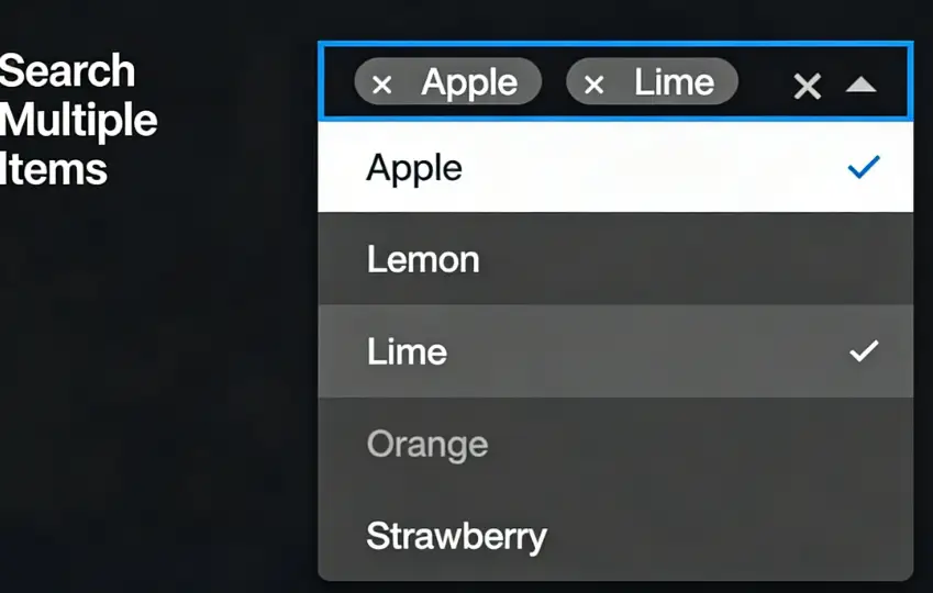
Multiple selection example:
config: GuiConfigs = {
  search: {
    name: 'Search Multiple',
    type: 'combobox',
    multiple: true,
    options: [
      { value: 1, label: 'Apple' },
      { value: 2, label: 'Lemon' },
      { value: 3, label: 'Lime' },
      { value: 4, label: 'Orange', disabled: true },
      { value: 5, label: 'Strawberry' },
    ],
  },
};
Radio
Configuration items:
| Field | Meaning | Type | Required |
|---|---|---|---|
| type | Control type | string | Yes |
| name | Label name | string | Yes |
| default | Default value | string | No |
| options | Options list | array | No |
Example:
config: GuiConfigs = {
  alignRadio: {
    name: 'Alignment',
    type: 'radio',
    default: 'left',
    options: [
      { label: 'Left Align', value: 'left', col: 50 },
      { label: 'Center Align', value: 'center', col: 50 },
      { label: 'Right Align', value: 'right', col: 50 },
    ],
  },
};

Checkbox
Configuration items:
| Field | Meaning | Type | Required |
|---|---|---|---|
| type | Control type | string | Yes |
| name | Label name | string | Yes |
| default | Default value | string | No |
| options | Options list | array | No |
Example:
config: GuiConfigs = {
  checkbox: {
    name: 'Checkbox',
    type: 'checkbox',
    options: [
      { value: 'option1', label: 'Option One' },
      { value: 'option2', label: 'Option Two' },
      { value: 'option3', label: 'Option Three' },
      { value: 'option4', label: 'Option Four' },
    ],
  },
};

ButtonToggle
Configuration items:
| Field | Meaning | Type | Required |
|---|---|---|---|
| type | Control type | string | Yes |
| name | Label name | string | Yes |
| default | Default value | string | No |
| options | Options list | array | No |
| useIcon | Whether to use icons | boolean | No |
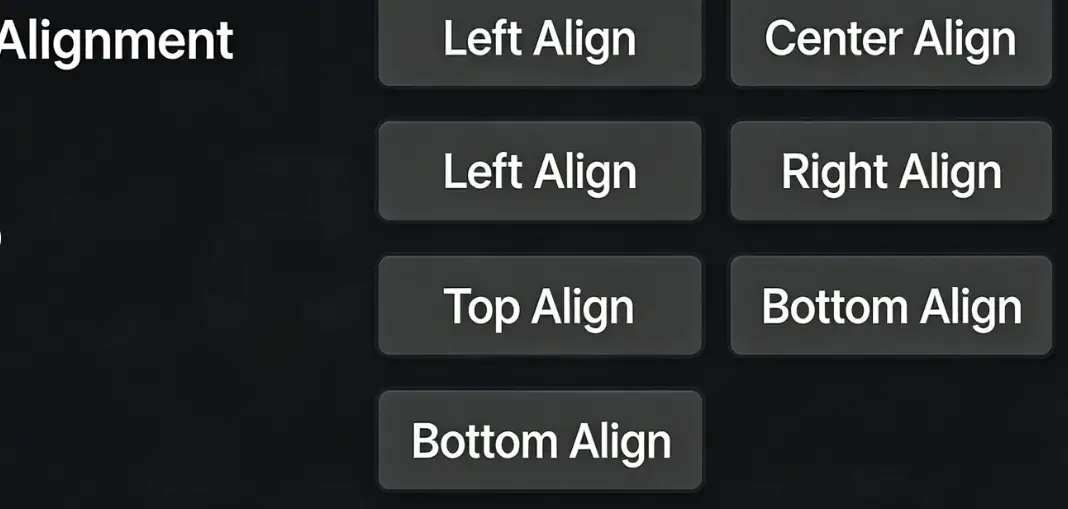
Text Button Example
config: GuiConfigs = {
  align: {
    name: 'Alignment',
    type: 'buttonToggle',
    options: [
      { value: 'left', label: 'Left Align', col: 50 },
      { value: 'center', label: 'Center Align', col: 50 },
      { value: 'right', label: 'Right Align', col: 50 },
      { value: 'top', label: 'Top Align', col: 50 },
      { value: 'bottom', label: 'Bottom Align', col: 50 },
    ],
  },
};
Icon Button Example
Icon library: https://materialdesignicons.com/
config: GuiConfigs = {
  alignIcon: {
    name: 'Alignment',
    type: 'buttonToggle',
    useIcon: true,
    options: [
      { value: 'left', label: 'Left', src: 'format_align_left' },
      { value: 'center', label: 'Center', src: 'format_align_center' },
      { value: 'right', label: 'Right', src: 'format_align_right' },
    ],
  },
};

Image Button Example
config: GuiConfigs = {
  direction: {
    name: 'Move Direction',
    type: 'buttonToggle',
    useIcon: true,
    options: [
      {
        value: 'left',
        label: 'Left',
        src: 'https://img.icons8.com/stickers/2x/chevron-left.png',
      },
      {
        value: 'right',
        label: 'Right',
        src: 'https://img.icons8.com/stickers/2x/chevron-right.png',
      },
      {
        value: 'up',
        label: 'Up',
        src: 'https://img.icons8.com/stickers/2x/chevron-up.png',
      },
      {
        value: 'down',
        label: 'Down',
        src: 'https://img.icons8.com/stickers/2x/chevron-down.png',
      },
    ],
  },
};

Switch
Configuration items:
| Field | Meaning | Type | Required |
|---|---|---|---|
| type | Control type | string | Yes |
| name | Label name | string | Yes |
| default | Default value | string | No |
Example:
config: GuiConfigs = {
  switch: {
    name: 'Switch',
    type: 'switch',
  },
};

Slider
Configuration items:
| Field | Meaning | Type | Required |
|---|---|---|---|
| type | Control type | string | Yes |
| name | Label name | string | Yes |
| default | Default value | string | No |
| prefix | Prefix text | string | No |
| suffix | Suffix text | string | No |
| min | Minimum value | number | No |
| max | Maximum value | number | No |
| step | Step value | number | No |
Example:
config: GuiConfigs = {
  slider: {
    name: 'Opacity',
    type: 'slider',
    step: 0.1,
    min: 0,
    max: 1,
  },
};

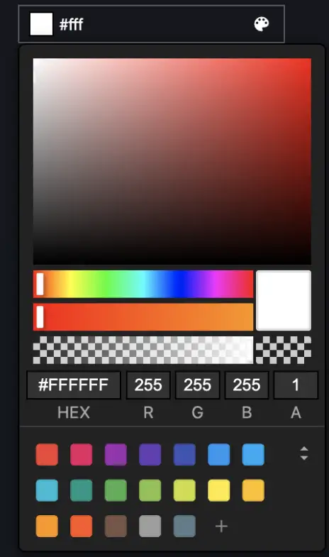
Fill
Configuration items:
| Field | Meaning | Type | Required | Remarks |
|---|---|---|---|---|
| type | Control type | string | Yes | |
| name | Label name | string | Yes | |
| default | Default value | string | No | |
| mode | Fill mode | 'flat' | 'gradient' | No |
Solid Color Fill
Example:
config: GuiConfigs = {
  flat: {
    name: 'Solid Color Fill',
    type: 'fill',
    default: '#fff,
  },
};
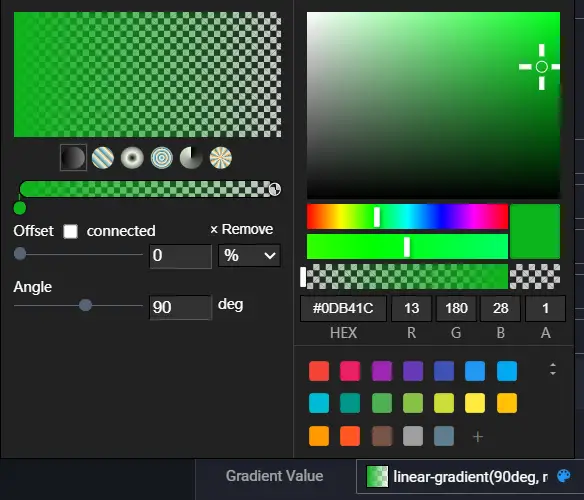
Gradient Fill
The default value of the gradient control is CSS syntax, supporting linear gradients, radial gradients, and conic gradients.
Note: If you want to use gradients in charts, you may need to manually parse the gradient values. A better approach is to use combinations of different controls.
Example:
config: GuiConfigs = {
  gradient: {
    name: 'Gradient Fill',
    type: 'fill',
    mode: 'gradient',
    default: 'linear-gradient(90deg, white 0%, black 100%)',
  },
};
Hidden
Configuration items:
| Field | Meaning | Type | Required |
|---|---|---|---|
| type | Control type | string | Yes |
| name | Label name | string | Yes |
| default | Default value | any | No |
Example:
config: GuiConfigs = {
  hiddenInput: {
    name: 'Hidden Value',
    type: 'hidden',
    default: 100,
  },
};
Image
Configuration items:
| Field | Meaning | Type | Required |
|---|---|---|---|
| type | Control type | string | Yes |
| name | Label name | string | Yes |
| default | Default value | string | No |
Example:
config: GuiConfigs = {
  image: {
    name: 'Upload Cover',
    type: 'image',
    default: 'https://interactive-examples.mdn.mozilla.net/media/cc0-images/grapefruit-slice-332-332.jpg',
  },
};

Video
Configuration items:
| Field | Meaning | Type | Required |
|---|---|---|---|
| type | Control type | string | Yes |
| name | Label name | string | Yes |
| default | Default value | string | No |
Example:
config: GuiConfigs = {
  video: {
    name: 'Upload Video',
    type: 'video',
    default: 'https://interactive-examples.mdn.mozilla.net/media/cc0-videos/flower.mp4',
  },
};

Codearea
The Codearea control is based on monaco-editor.
Configuration items:
| Field | Meaning | Type | Required | Remarks |
|---|---|---|---|---|
| type | Control type | string | Yes | |
| name | Label name | string | Yes | |
| default | Default value | string | No | |
| height | Editor height | string | No | |
| editorOptions | Editor configuration options | object | No | Official Documentation |
Example:
config: GuiConfigs = {
  codearea: {
    name: 'Code Editor',
    type: 'codearea',
    height: '200px',
    editorOptions: {
      language: 'javascript',
    },
  },
};

Group
Group is used to combine multiple controls together, the control UI is accordion style.
Configuration items:
| Field | Meaning | Type | Required |
|---|---|---|---|
| type | Control type | string | Yes |
| name | Label name | string | Yes |
| children | Child components | object | No |
Example:
config: GuiConfigs = {
  group: {
    name: 'Group',
    type: 'group',
    children: {
      display: {
        name: 'Display',
        type: 'switch',
        default: true,
      },
      stepper: {
        name: 'Stepper',
        type: 'slider',
        default: 1,
      },
    },
  },
};

Data:
{
  group:{
    display: true,
    stepper: 1
  }
}
Inline
Inline is used for inline grouping, components can specify col to set width.
Configuration items:
| Field | Meaning | Type | Required |
|---|---|---|---|
| type | Control type | string | Yes |
| name | Label name | string | Yes |
| children | Child components | object | No |
Example:
config: GuiConfigs = {
  inline: {
    type: 'inline',
    name: 'Inline Group',
    children: {
      width: {
        name: 'Width',
        type: 'number',
        default: 1920,
        suffix: 'px',
        col: 50,
      },
      height: {
        name: 'Height',
        type: 'number',
        default: 1080,
        suffix: 'px',
        col: 50,
      },
      angle: {
        name: 'Angle',
        type: 'select',
        default: '0',
        options: [
          { value: '0', label: 'Horizontal' },
          { value: '45', label: 'Diagonal' },
          { value: '90', label: 'Vertical' },
        ],
        col: 50,
      },
      amount: {
        name: 'Amount',
        type: 'number',
        default: 0,
        min: 0,
        step: 1,
        col: 50,
      },
    },
  },
};

Data:
{
  inline:{
    width: 1920,
    height: 1080,
    angle: '0',
    amount: 0
  }
}
Tabs
Tabs are used to display arrays and implement dynamic addition and deletion of anonymous arrays. They can be nested arbitrarily to achieve very complex data structures.
Configuration items:
| Field | Meaning | Type | Required | Remarks |
|---|---|---|---|---|
| type | Control type | string | Yes | May need to be used with the tab type. |
| name | Label name | string | Yes | |
| children | Child components | object | array | No |
| template | Template for dynamic addition/deletion | object | No | |
| addable | Whether addition/deletion is allowed | boolean | No |
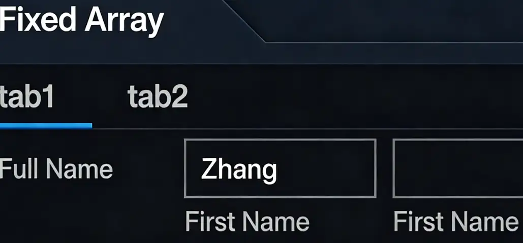
Basic Array
Each item in the array is different.
Example:
config: GuiConfigs = {
  tabs: {
    name: 'Fixed Array',
    type: 'tabs',
    default: [
      {
        fullname: {
          firstName: 'Zhang',
          lastName: 'San',
        },
      },
      { switch: true },
    ],
    children: [
      {
        name: 'tab1',
        type: 'tab',
        children: {
          fullname: {
            name: 'Full Name',
            type: 'inline',
            children: {
              firstName: {
                type: 'text',
                name: 'First Name',
                col: 50,
              },
              lastName: {
                type: 'text',
                name: 'Last Name',
                col: 50,
              },
            },
          },
        },
      },
      {
        name: 'tab2',
        type: 'tab',
        children: {
          switch: {
            name: 'Switch',
            type: 'switch',
          },
        },
      },
    ],
  },
};
Data:
{
  tabs: [
	{
		fullname: {
		firstName: 'Zhang',
		lastName: 'San'
	  }
	},
	{
		switch: true
	}
  ]
}
Dynamic Array
If the array items are all the same, you can use the dynamic addition/deletion configuration. The name in the template supports EJS expressions.
Example:
config: GuiConfigs = {
  tabs: {
    name: 'Dynamic Array',
    type: 'tabs',
    default: [
      { seriesName: 'Primary Industry' },
      { seriesName: 'Secondary Industry' }
    ],
    template: {
      name: 'Series <%= i + 1 %>',
      children: {
        seriesName: {
          type: 'text',
          name: 'Series Name',
        },
      },
    },
  },
};

Data:
{
  tabs: [
	{
		seriesName: 'Primary Industry'
	},
	{
		seriesName: 'Secondary Industry'
	}
  ]
}
Basic Array (Basic Data)
Example:
config: GuiConfigs = {
  tabs: {
    name: 'Basic Array (Basic Data)',
    type: 'tabs',
    children: [
      {
        type: 'text',
        name: 'Series Name',
      },
      {
        type: 'switch',
        name: 'Switch',
      },
    ],
  },
};
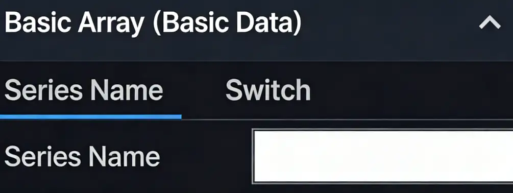
Data:
{
	tabs: ['123', true]
}
Dynamic Array (Basic Data)
Example:
config: GuiConfigs = {
  tabs: {
    name: 'Dynamic Array (Basic Data)',
    type: 'tabs',
    default: ['123', '456'],
    template: {
      name: 'Series <%= i + 1 %>',
      type: 'text',
    },
  },
};

Data:
{
	tabs: ['123', '456']
}
Nested Basic Array (Basic Data)
Example:
config: GuiConfigs = {
  tabs: {
    name: 'Nested Basic Array (Basic Data)',
    type: 'tabs',
    children: [
      {
        type: 'tabs',
        name: 'level1',
        children: [
          {
            type: 'text',
            name: 'level2',
          },
          {
            type: 'number',
            name: 'level2',
          },
        ],
      },
      {
        type: 'switch',
        name: 'Switch',
      },
    ],
  },
};
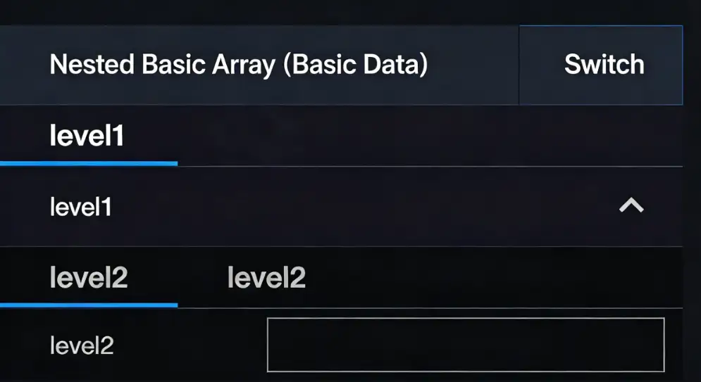
Data:
{
  tabs: [
	[1, 2],
	true
  ]
}
Nested Dynamic Array (Basic Data)
Example:
config: GuiConfigs = {
  tabs: {
    name: 'Nested Dynamic Array (Basic Data)',
    type: 'tabs',
    default: [['123']],
    template: {
      name: 'level1 <%= i + 1%>',
      type: 'tabs',
      template: {
        name: 'level2 <%= i + 1%>',
        type: 'text',
      },
    },
  },
};

Data:
{
  tabs: [
	['123', '456'],
	['123', '456'],
  ]
}
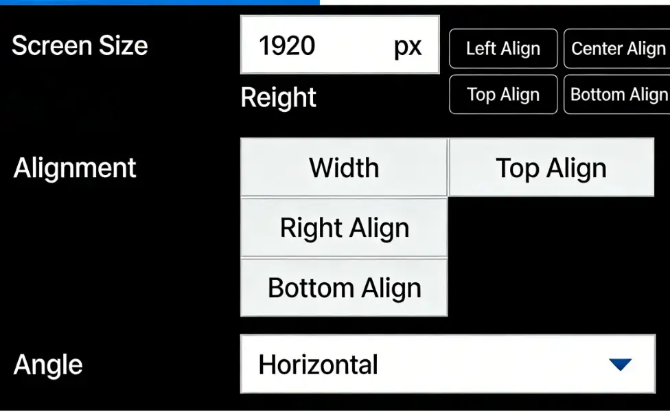
Menu
Menu is a higher-level grouping component that supports infinite levels, mainly used to organize data, with fewer usage scenarios.
| Field | Meaning | Type | Required | Remarks |
|---|---|---|---|---|
| type | Control type | string | Yes | Needs to be used with the menuItem type. |
| name | Label name | string | Yes | |
| children | Child components | object | No |
Example:
config: GuiConfigs = {
  menu: {
    name: 'Menu',
    type: 'menu',
    children: {
      menuA: {
        name: 'Menu A',
        type: 'menuItem',
        children: {
          size: {
            type: 'inline',
            name: 'Screen Size',
            children: {
              width: {
                name: 'Width',
                type: 'number',
                default: 1920,
                suffix: 'px',
                col: 50,
              },
              height: {
                name: 'Height',
                type: 'number',
                default: 1080,
                suffix: 'px',
                col: 50,
              },
            },
          },
          align: {
            name: 'Alignment',
            type: 'buttonToggle',
            options: [
              { value: 'left', label: 'Left Align', col: 50 },
              { value: 'center', label: 'Center Align', col: 50 },
              { value: 'right', label: 'Right Align', col: 50 },
              { value: 'top', label: 'Top Align', col: 50 },
              { value: 'bottom', label: 'Bottom Align', col: 50 },
            ],
          },
          angle: {
            name: 'Angle',
            type: 'select',
            default: '0',
            options: [
              { value: '0', label: 'Horizontal', src: 'horizontal' },
              { value: '45', label: 'Diagonal', src: 'incline' },
              { value: '90', label: 'Vertical', src: 'vertical' },
            ],
          },
        },
      },
      menuB: {
        name: 'Menu B',
        type: 'menu',
        children: {
          menuB1: {
            name: 'Menu B1',
            type: 'menuItem',
            children: {
              text: {
                name: 'Text',
                type: 'text',
                default: 'Hello',
              },
              slider: {
                name: 'Opacity',
                type: 'slider',
                step: 0.1,
                min: 0,
                max: 1,
              },
            },
          },
          menuB2: {
            name: 'Menu B2',
            type: 'menuItem',
            children: {
              display: {
                name: 'Display',
                type: 'switch',
                default: true,
              },
              stepper: {
                name: 'Stepper',
                type: 'number',
                default: 1,
              },
            },
          },
        },
      },
    },
  },
};

Data:
{
  menu: {
	menuA: {
          align: "left",
		  angle: "0",
		  size: {
            height: 1080
			width: 1920,
		}
	},
	menuB: {
         menuB1: {
            slider: 1,
			text: "Hello"
		},
		menuB2: {
            display: true,
			stepper: 1
		}
	}
  }
}