Component Guide
Basic
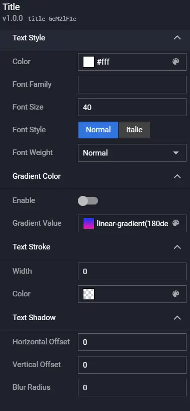
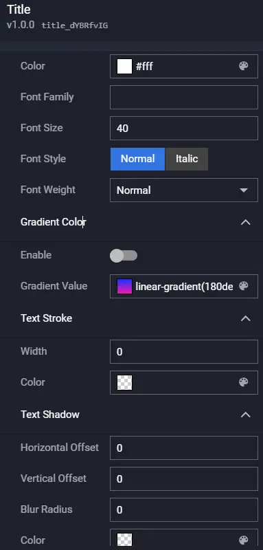
Title
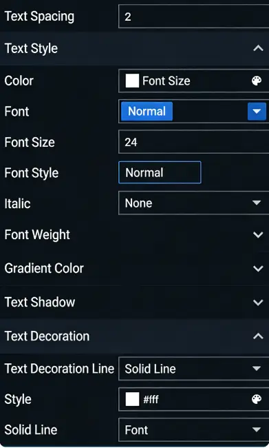
The Title is a type of basic component that supports customizing the content, style (supports text gradient), hyperlinks, etc. It is commonly used to display the titles of various modules in a visualization application.
Preview:

Configuration
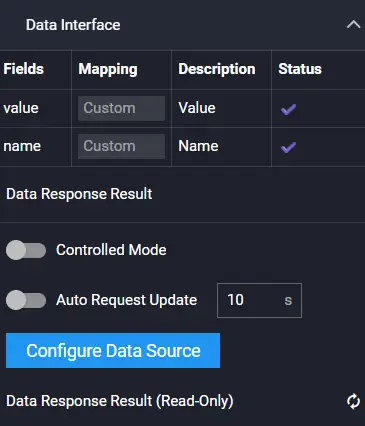
Data
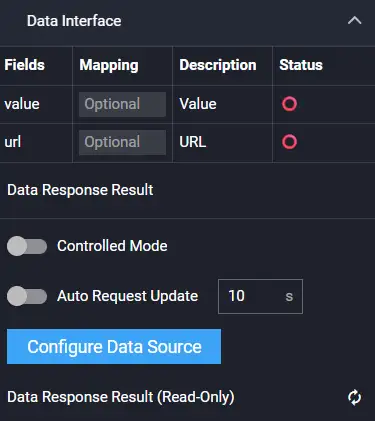
Sample data:
[
  {
    "value": "I am the title name",
    "url": ""
  }
]
| Field | Description |
|---|---|
| value | (Optional) The content of the title. If present, it overrides the title name in the configuration; if empty, the title name from the configuration is read and displayed. |
| url | (Optional) The hyperlink address to jump to after clicking the title. If present, it overrides the URL in the Hyperlink Configuration item. |
Interaction
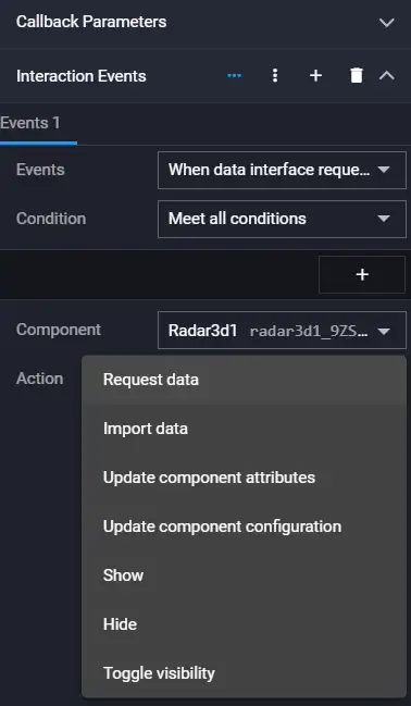
| Action | Description |
|---|---|
| Request Data | Re-requests data from the server. The config and options parameters thrown by upstream components are merged with the current request parameters and options parameters respectively, achieving dynamic changes to request parameters and configuration. |
| Import Data | Processes data according to the component's data access format and imports it into the component, triggering a redraw. |
| Update Component Config | Dynamically updates the component's configuration. |
| Show | Shows the component. |
| Hide | Hides the component. |
| Toggle Show/Hide | Toggles the visibility of the component. |
Multi-line Text
Multi-line Text is a type of basic component that supports customizing the text content, style (supports text gradient), scroll configuration, etc. It is commonly used to display paragraph text content in visualization applications.
Preview:
Configuration
Data

Sample data:
[
{
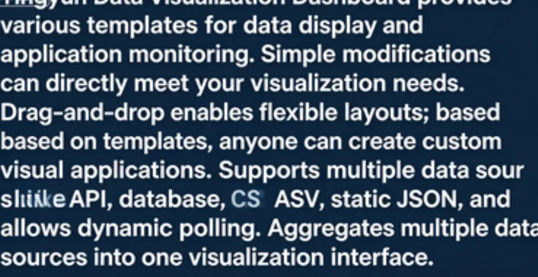
"value": "Tingyun Data Visualization Large Screen provides comprehensive data display, application performance monitoring, and various scenario templates. With minor modifications, it can directly serve your visualization needs. Flexible visualization layouts can be achieved through drag-and-drop. Anyone can unleash their creativity on top of the templates to implement their own visualization applications. It supports multiple data sources such as API, database, CSV, static JSON, and supports dynamic polling. Multiple data sources can be aggregated into one visualization interface."
}
]
| Field | Description |
|---|---|
| value | (Optional) The paragraph content. If present, it overrides the paragraph content in the configuration; if empty, the paragraph content from the configuration is read and displayed. |
Interaction
| Action | Description |
|---|---|
| Request Data | Re-requests data from the server. The config and options parameters thrown by upstream components are merged with the current request parameters and options parameters respectively, achieving dynamic changes to request parameters and configuration. |
| Import Data | Processes data according to the component's data access format and imports it into the component, triggering a redraw. |
| Update Component Config | Dynamically updates the component's configuration. |
| Show | Shows the component. |
| Hide | Hides the component. |
| Toggle Show/Hide | Toggles the visibility of the component. |
Marquee
Marquee is a type of basic component that supports customizing text content, style (supports text gradient), scroll configuration, etc. It can display overflowing text from the component in the form of a marquee animation in the visualization application.
Preview:

Configuration
Data
Sample data:
[
  {
    "value": "Tingyun Data Visualization Large Screen provides comprehensive data display, application performance monitoring, and various scenario templates. With minor modifications, it can directly serve your visualization needs. Flexible visualization layouts can be achieved through drag-and-drop. Anyone can unleash their creativity on top of the templates to implement their own visualization applications. It supports multiple data sources such as API, database, CSV, static JSON, and supports dynamic polling. Multiple data sources can be aggregated into one visualization interface."
  }
]
| Field | Description |
|---|---|
| value | (Optional) The marquee content. If present, it overrides the content in the configuration; if empty, the content from the configuration is read and displayed. |
Interaction
| Action | Description |
|---|---|
| Request Data | Re-requests data from the server. The config and options parameters thrown by upstream components are merged with the current request parameters and options parameters respectively, achieving dynamic changes to request parameters and configuration. |
| Import Data | Processes data according to the component's data access format and imports it into the component, triggering a redraw. |
| Update Component Config | Dynamically updates the component's configuration. |
| Show | Shows the component. |
| Hide | Hides the component. |
| Toggle Show/Hide | Toggles the visibility of the component. |
Date Time
Date Time is a type of basic component that supports customizing the icon style and text style of the date and time. It can display the current time in a visualization application, helping you reasonably control the presentation time of the visualization application or a specific module within it.
Preview:

Configuration
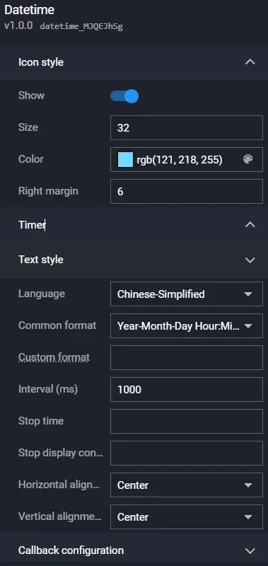
Timer:
| Parameter | Description |
|---|---|
| Text Style | Sets the font, font size, font color, and font weight of the timer text. Supports gradient. |
| Format | Sets the display format of the timer text. Default is yyyy-MM-dd HH:mm:ss, representing the "year-month-day hour:minute:second" time format in 24-hour format. If hh:mm:ss, it represents 12-hour format. |
| Interval Time | Sets the interval time for the component's time change, in ms. |
| Stop Time | This configuration item can set when the timer's time stops and no longer changes. Must be consistent with the time format configured in the Format configuration item. |
| Stop Display Content | Sets the content displayed after the timer's time stops. Only takes effect if Stop Time is configured. Must be consistent with the time format configured in the Format configuration item. |
| Horizontal Align | The alignment style of the date and time in the horizontal direction. Options: Left Align, Center Horizontally, and Right Align. |
| Vertical Align | The alignment style of the date and time in the vertical direction. Options: Top Align, Center Vertically, and Bottom Align. |
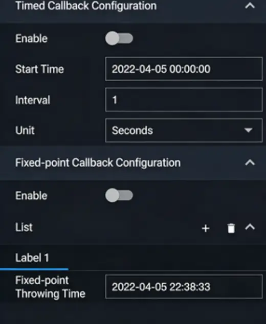
Callback Configuration
| Parameter | Description |
|---|---|
| Timed Callback Setting | How often to throw a callback value, in ms. |
| Fixed Point Callback Setting | The time point when the callback value is thrown. Supports string values representing dates. |
Data
This component does not require data input and uses the system's current time by default.
Interaction
| Event | Description |
|---|---|
| Timed Callback Event | When enabled, the system automatically throws a callback value when the current time changes by the specified time period. By default, the time (current time) field value is thrown. |
| Fixed Point Callback Event | When enabled, the system automatically throws a callback value when the time reaches the set time. By default, the time (current time) field value is thrown. |
| Action | Description |
| Update Component Config | Dynamically updates the component's configuration. |
| Show | Shows the component. |
| Hide | Hides the component. |
| Toggle Show/Hide | Toggles the visibility of the component. |
Timer
The Timer has no content and can interact with other components through timed callback events and fixed point callback events.
Configuration
Data
This component does not require data input and uses the system's current time by default.
Interaction
| Event | Description |
|---|---|
| Timed Callback Event | When enabled, the system automatically throws a callback value when the current time changes by the specified time period. By default, the time (current time) field value is thrown. |
| Fixed Point Callback Event | When enabled, the system automatically throws a callback value when the time reaches the set time. By default, the time (current time) field value is thrown. |
| Action | Description |
| Update Component Config | Dynamically updates the component's configuration. |
| Show | Shows the component. |
| Hide | Hides the component. |
| Toggle Show/Hide | Toggles the visibility of the component. |
Decoration
Decoration
Decoration supports adding preset decorative elements to the visualization application or a specific module of it, making the visualization application display more aesthetically pleasing.
Preview:

Configuration

Data
This component does not require data input.
Interaction
| Action | Description |
|---|---|
| Update Component Config | Dynamically updates the component's configuration. |
| Show | Shows the component. |
| Hide | Hides the component. |
| Toggle Show/Hide | Toggles the visibility of the component. |
Border
Border supports adding preset borders to the visualization application or a specific module of it, making the visualization application display more aesthetically pleasing.
Preview:

Configuration

Data
This component does not require data input.
Interaction
| Action | Description |
|---|---|
| Update Component Config | Dynamically updates the component's configuration. |
| Show | Shows the component. |
| Hide | Hides the component. |
| Toggle Show/Hide | Toggles the visibility of the component. |
Background
Background supports customizing the color (supports gradient), border (supports gradient and animation), etc., of the background block. It supports adding custom background blocks to the visualization application or a specific module of it, making the visualization application display more aesthetically pleasing.
Preview:

Configuration

Data
This component does not require data input.
Interaction
| Action | Description |
|---|---|
| Update Component Config | Dynamically updates the component's configuration. |
| Show | Shows the component. |
| Hide | Hides the component. |
| Toggle Show/Hide | Toggles the visibility of the component. |
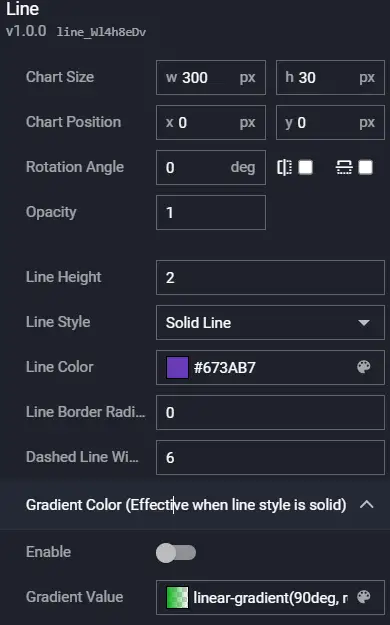
Line
Line supports customizing the color, style (supports dashed lines), gradient, etc., of the line. It supports adding custom lines to the visualization application or a specific module of it, making the visualization application display more aesthetically pleasing.
Preview:

Configuration
Data
This component does not require data input.
Interaction
| Action | Description |
|---|---|
| Update Component Config | Dynamically updates the component's configuration. |
| Show | Shows the component. |
| Hide | Hides the component. |
| Toggle Show/Hide | Toggles the visibility of the component. |
Particle Decoration
Particle Decoration supports configuring particle color and size, making the visualization application display more aesthetically pleasing.
Preview:

Configuration

Data
This component does not require data input.
Interaction
| Action | Description |
|---|---|
| Update Component Config | Dynamically updates the component's configuration. |
| Show | Shows the component. |
| Hide | Hides the component. |
| Toggle Show/Hide | Toggles the visibility of the component. |
Halo
Halo supports customizing the size, color, and style of the halo, making the visualization application display more aesthetically pleasing.
Preview:

Configuration

Data
This component does not require data input.
Interaction
| Action | Description |
|---|---|
| Update Component Config | Dynamically updates the component's configuration. |
| Show | Shows the component. |
| Hide | Hides the component. |
| Toggle Show/Hide | Toggles the visibility of the component. |
Domain Force Ball
Domain Force Ball allows color customization, making the visualization application display more aesthetically pleasing.
Preview:
Configuration

Data
This component does not require data input.
Interaction
| Action | Description |
|---|---|
| Update Component Config | Dynamically updates the component's configuration. |
| Show | Shows the component. |
| Hide | Hides the component. |
| Toggle Show/Hide | Toggles the visibility of the component. |
Ring Decoration
Ring Decoration supports scaling and color configuration, making the visualization application display more aesthetically pleasing.
Preview:

Configuration

Data
This component does not require data input.
Interaction
| Action | Description |
|---|---|
| Update Component Config | Dynamically updates the component's configuration. |
| Show | Shows the component. |
| Hide | Hides the component. |
| Toggle Show/Hide | Toggles the visibility of the component. |
Earth Decoration
The Earth Decoration component makes the visualization application display more aesthetically pleasing.
Preview:

Configuration
This component currently has no configuration.
Data
This component does not require data input.
Interaction
| Action | Description |
|---|---|
| Update Component Config | Dynamically updates the component's configuration. |
| Show | Shows the component. |
| Hide | Hides the component. |
| Toggle Show/Hide | Toggles the visibility of the component. |
3D Earth
3D Earth supports color configuration, making the visualization application display more aesthetically pleasing.
Preview:

Configuration

Data
This component does not require data input.
Interaction
| Action | Description |
|---|---|
| Update Component Config | Dynamically updates the component's configuration. |
| Show | Shows the component. |
| Hide | Hides the component. |
| Toggle Show/Hide | Toggles the visibility of the component. |
3D Earth 2
3D Earth 2 makes the visualization application display more aesthetically pleasing.
Preview:

Configuration
This component currently has no configuration.
Data
This component does not require data input.
Interaction
| Action | Description |
|---|---|
| Update Component Config | Dynamically updates the component's configuration. |
| Show | Shows the component. |
| Hide | Hides the component. |
| Toggle Show/Hide | Toggles the visibility of the component. |
3D Earth 3
3D Earth 3 makes the visualization application display more aesthetically pleasing.
Preview:
Configuration
This component currently has no configuration.
Data
This component does not require data input.
Interaction
| Action | Description |
|---|---|
| Update Component Config | Dynamically updates the component's configuration. |
| Show | Shows the component. |
| Hide | Hides the component. |
| Toggle Show/Hide | Toggles the visibility of the component. |
Media
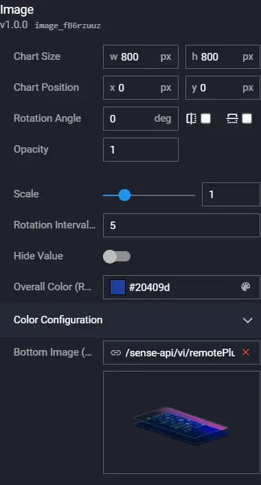
Image
Image is a type of media component that supports customizing the image URL address and jump link. It can add custom background images to visualization applications and other components.
Preview:

Configuration
Data

| Field | Description |
|---|---|
| img | (Optional) Sets the image to display, overriding the image configuration. If this field is empty, the image from the configuration is used for display. |
| url | (Optional) Sets the URL of the page to jump to after clicking, overriding the configuration in Hyperlink. If this field is empty, the Hyperlink from the configuration is read for the jump. |
Interaction
| Action | Description |
|---|---|
| Request Data | Re-requests data from the server. The config and options parameters thrown by upstream components are merged with the current request parameters and options parameters respectively, achieving dynamic changes to request parameters and configuration. |
| Import Data | Processes data according to the component's data access format and imports it into the component, triggering a redraw. |
| Update Component Config | Dynamically updates the component's configuration. |
| Show | Shows the component. |
| Hide | Hides the component. |
| Toggle Show/Hide | Toggles the visibility of the component. |
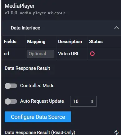
Video
Video supports customizing the video URL address, video playback properties, etc., and supports video formats such as mp4. It can add a video player to the visualization application to play your videos.
Preview:

Configuration

Data
| Field | Description |
|---|---|
| url | (Optional) Sets the video address, overriding the video address in the configuration. If this field is empty, the video address from the configuration is used for display. |
Interaction
| Action | Description |
|---|---|
| Request Data | Re-requests data from the server. The config and options parameters thrown by upstream components are merged with the current request parameters and options parameters respectively, achieving dynamic changes to request parameters and configuration. |
| Import Data | Processes data according to the component's data access format and imports it into the component, triggering a redraw. |
| Update Component Config | Dynamically updates the component's configuration. |
| Show | Shows the component. |
| Hide | Hides the component. |
| Toggle Show/Hide | Toggles the visibility of the component. |
Audio
Audio is a type of media component that supports customizing the audio URL address, audio playback settings, volume settings, etc. It can add an audio player to the visualization application to play your audio.
Preview:

Configuration

Data

| Field | Description |
|---|---|
| url | (Optional) Sets the audio address, overriding the audio address in the configuration. If this field is empty, the audio address from the configuration is used. |
Interaction
| Action | Description |
|---|---|
| Request Data | Re-requests data from the server. The config and options parameters thrown by upstream components are merged with the current request parameters and options parameters respectively, achieving dynamic changes to request parameters and configuration. |
| Import Data | Processes data according to the component's data access format and imports it into the component, triggering a redraw. |
| Update Component Config | Dynamically updates the component's configuration. |
| Show | Shows the component. |
| Hide | Hides the component. |
| Toggle Show/Hide | Toggles the visibility of the component. |
Iframe
Iframe supports customizing the URL address of the embedded page, whether it can be closed, close button style, etc.
Preview:

Configuration

Data

| Field | Description |
|---|---|
| url | (Optional) Sets the link of the embedded page, overriding the link in the configuration. If this field is empty, the link from the configuration is used. |
Interaction
| Action | Description |
|---|---|
| Request Data | Re-requests data from the server. The config and options parameters thrown by upstream components are merged with the current request parameters and options parameters respectively, achieving dynamic changes to request parameters and configuration. |
| Import Data | Processes data according to the component's data access format and imports it into the component, triggering a redraw. |
| Update Component Config | Dynamically updates the component's configuration. |
| Show | Shows the component. |
| Hide | Hides the component. |
| Toggle Show/Hide | Toggles the visibility of the component. |
Carousel
Carousel images support customizing carousel images, carousel animation effects, etc., enabling the display of multiple images in a rotating playback effect within a visualization application.
Preview:
Configuration

Data
| Field | Description |
|---|---|
| url | Sets the image link, overriding the configuration -- Image -- Image List -- Image Address. If this field is empty, the link from the configuration is used. |
| description | (Optional) The description content of the image. |
Interaction
| Action | Description |
|---|---|
| Request Data | Re-requests data from the server. The config and options parameters thrown by upstream components are merged with the current request parameters and options parameters respectively, achieving dynamic changes to request parameters and configuration. |
| Import Data | Processes data according to the component's data access format and imports it into the component, triggering a redraw. |
| Update Component Config | Dynamically updates the component's configuration. |
| Show | Shows the component. |
| Hide | Hides the component. |
| Toggle Show/Hide | Toggles the visibility of the component. |
Carousel Large Screen
Carousel Large Screen supports customizing the carousel large screen addresses, carousel animation effects, etc., enabling the display of multiple large screens in a rotating playback effect within a visualization application.
Preview:
Configuration
Data

| Field | Description |
|---|---|
| url | Sets the large screen address, overriding the configuration -- Large Screen -- Large Screen List -- Large Screen Address. If this field is empty, the large screen address from the configuration is used. |
| description | (Optional) The description content of the large screen. |
Interaction
| Action | Description |
|---|---|
| Request Data | Re-requests data from the server. The config and options parameters thrown by upstream components are merged with the current request parameters and options parameters respectively, achieving dynamic changes to request parameters and configuration. |
| Import Data | Processes data according to the component's data access format and imports it into the component, triggering a redraw. |
| Update Component Config | Dynamically updates the component's configuration. |
| Show | Shows the component. |
| Hide | Hides the component. |
| Toggle Show/Hide | Toggles the visibility of the component. |
Metric
Metric
Metric includes metric name, prefix, number (includes number animation), and suffix. It is commonly used to represent business metrics.
Preview:

Configuration
Data
| Field | Description |
|---|---|
| name | (Optional) Sets the metric name, overriding the configuration -- Name Configuration -- Name. If this field is empty, the name from the configuration is used. |
| value | Sets the metric value. |
| prefix | (Optional) Sets the metric prefix, overriding the configuration -- Flip Card Configuration -- Prefix -- Content. If this field is empty, the content from the configuration is used. |
| suffix | (Optional) Sets the metric suffix, overriding the configuration -- Flip Card Configuration -- Suffix -- Content. If this field is empty, the content from the configuration is used. |
Interaction
| Event | Description |
|---|---|
| On Value Change | When the value in the metric component changes, an event is sent, throwing the current value value. |
| Action | Description |
| Request Data | Re-requests data from the server. The config and options parameters thrown by upstream components are merged with the current request parameters and options parameters respectively, achieving dynamic changes to request parameters and configuration. |
| Import Data | Processes data according to the component's data access format and imports it into the component, triggering a redraw. |
| Update Component Config | Dynamically updates the component's configuration. |
| Show | Shows the component. |
| Hide | Hides the component. |
| Toggle Show/Hide | Toggles the visibility of the component. |
Metric Trend
Metric Trend includes metric trend name, icon, number (includes number animation), and number suffix. It is commonly used to represent changes in business metric trends.
Preview:

Configuration
Data
| Field | Description |
|---|---|
| value | The current value of the metric. |
| base | The base value for comparison of the metric. |
Interaction
| Event | Description |
|---|---|
| On Value Change | When the trend value in the metric trend component changes, an event is sent, throwing the current metric value value and base value base. |
| Action | Description |
| Request Data | Re-requests data from the server. The config and options parameters thrown by upstream components are merged with the current request parameters and options parameters respectively, achieving dynamic changes to request parameters and configuration. |
| Import Data | Processes data according to the component's data access format and imports it into the component, triggering a redraw. |
| Update Component Config | Dynamically updates the component's configuration. |
| Show | Shows the component. |
| Hide | Hides the component. |
| Toggle Show/Hide | Toggles the visibility of the component. |
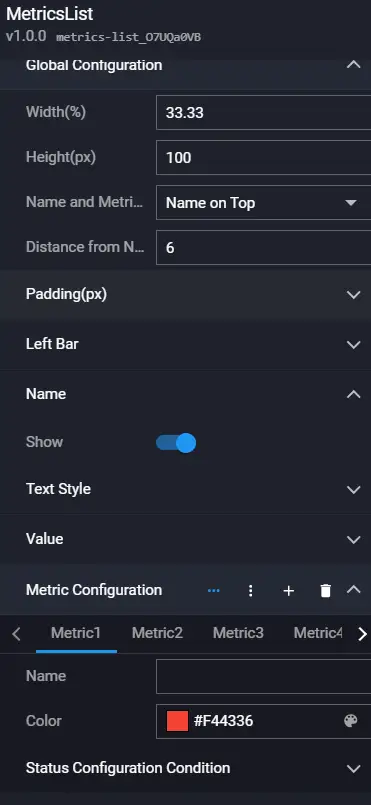
Metric List
Metric List is a list of multiple metrics. Each metric includes a metric decoration bar (can change color according to the value range), metric name, number (includes number animation), and metric unit. It is commonly used to represent multiple business metrics.
Preview:

Configuration
Data
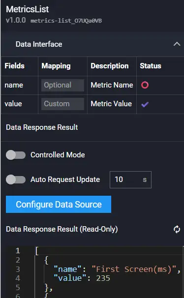
| Field | Description |
|---|---|
| name | (Optional) Sets the metric name, overriding the configuration -- Metric Configuration -- Name. If this field is empty, the name from the configuration is used. |
| value | The metric value. |
Interaction
| Event | Description |
|---|---|
| On Click | When a metric is clicked, an event is sent, throwing the current metric name name and value value. |
| On Mouse Enter | When the mouse enters a metric, an event is sent, throwing the current metric name name and value value. |
| On Mouse Leave | When the mouse leaves a metric, an event is sent, throwing the current metric name name and value value. |
| On Value Change | When the value in the metric list component changes, an event is sent, throwing the changed metric name name and value value. |
| Action | Description |
| Request Data | Re-requests data from the server. The config and options parameters thrown by upstream components are merged with the current request parameters and options parameters respectively, achieving dynamic changes to request parameters and configuration. |
| Import Data | Processes data according to the component's data access format and imports it into the component, triggering a redraw. |
| Update Component Config | Dynamically updates the component's configuration. |
| Show | Shows the component. |
| Hide | Hides the component. |
| Toggle Show/Hide | Toggles the visibility of the component. |
ECharts
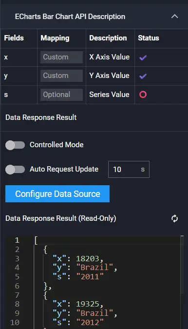
ECharts Bar Chart
ECharts Bar Chart supports global configuration and bar gradient.
Preview:

Configuration

Data
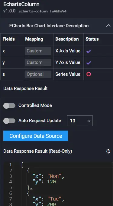
| Field | Description |
|---|---|
| x | x-axis coordinate value |
| y | y-axis coordinate value |
| s | Series |
Interaction
| Event | Description |
|---|---|
| On Click Bar | When a bar is clicked, an event is sent, throwing relevant information (e.g., value) of the current bar. |
| On Mouse Enter Bar | When the mouse enters a bar, an event is sent, throwing relevant information (e.g., value) of the current bar. |
| On Mouse Leave Bar | When the mouse leaves a bar, an event is sent, throwing relevant information (e.g., value) of the current bar. |
| Action | Description |
| Request Data | Re-requests data from the server. The config and options parameters thrown by upstream components are merged with the current request parameters and options parameters respectively, achieving dynamic changes to request parameters and configuration. |
| Import Data | Processes data according to the component's data access format and imports it into the component, triggering a redraw. |
| Update Component Config | Dynamically updates the component's configuration. |
| Show | Shows the component. |
| Hide | Hides the component. |
| Toggle Show/Hide | Toggles the visibility of the component. |
ECharts Line Chart
ECharts Line Chart supports global configuration and line area gradient.
Preview:

Configuration

Data
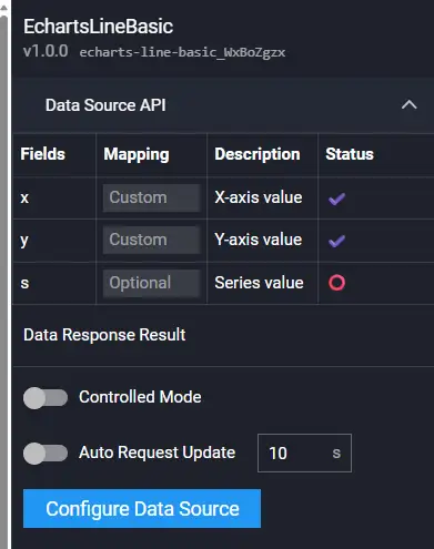
| Field | Description |
|---|---|
| x | x-axis coordinate value |
| y | y-axis coordinate value |
| s | Series |
Interaction
| Event | Description |
|---|---|
| On Click Point | When a point is clicked, an event is sent, throwing relevant information (e.g., value) of the current point. |
| On Mouse Enter Point | When the mouse enters a point, an event is sent, throwing relevant information (e.g., value) of the current point. |
| On Mouse Leave Point | When the mouse leaves a point, an event is sent, throwing relevant information (e.g., value) of the current point. |
| Action | Description |
| Request Data | Re-requests data from the server. The config and options parameters thrown by upstream components are merged with the current request parameters and options parameters respectively, achieving dynamic changes to request parameters and configuration. |
| Import Data | Processes data according to the component's data access format and imports it into the component, triggering a redraw. |
| Update Component Config | Dynamically updates the component's configuration. |
| Show | Shows the component. |
| Hide | Hides the component. |
| Toggle Show/Hide | Toggles the visibility of the component. |
ECharts Bar Chart (Horizontal)
ECharts Bar Chart (Horizontal) supports global configuration and bar gradient.
Preview:

Configuration

Data
| Field | Description |
|---|---|
| x | x-axis coordinate value |
| y | y-axis coordinate value |
| s | Series |
Interaction
| Event | Description |
|---|---|
| On Click Bar | When a bar is clicked, an event is sent, throwing relevant information (e.g., value) of the current bar. |
| On Mouse Enter Bar | When the mouse enters a bar, an event is sent, throwing relevant information (e.g., value) of the current bar. |
| On Mouse Leave Bar | When the mouse leaves a bar, an event is sent, throwing relevant information (e.g., value) of the current bar. |
| Action | Description |
| Request Data | Re-requests data from the server. The config and options parameters thrown by upstream components are merged with the current request parameters and options parameters respectively, achieving dynamic changes to request parameters and configuration. |
| Import Data | Processes data according to the component's data access format and imports it into the component, triggering a redraw. |
| Update Component Config | Dynamically updates the component's configuration. |
| Show | Shows the component. |
| Hide | Hides the component. |
| Toggle Show/Hide | Toggles the visibility of the component. |
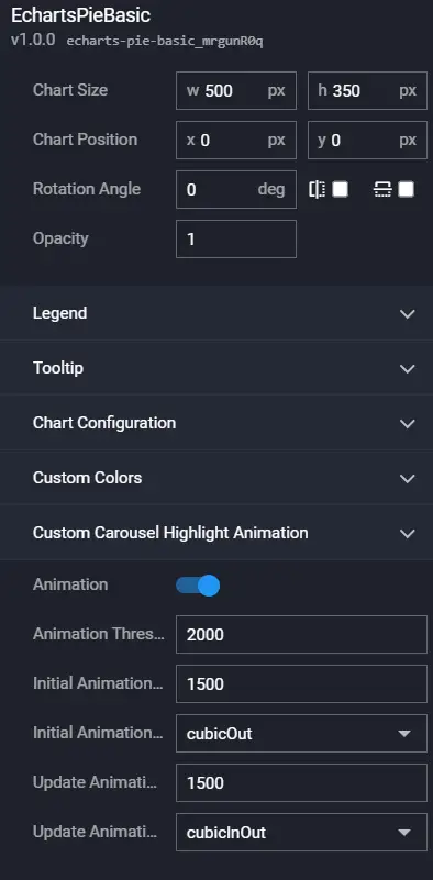
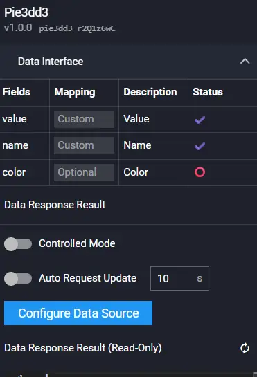
ECharts Pie Chart
ECharts Pie Chart supports global configuration, gradient, and customized carousel highlight animation.
Preview:

Configuration
Data
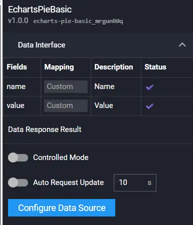
| Field | Description |
|---|---|
| name | Sector name |
| value | Sector value |
Interaction
| Event | Description |
|---|---|
| On Click Sector | When a sector is clicked, an event is sent, throwing relevant information (e.g., value) of the current sector. |
| On Mouse Enter Sector | When the mouse enters a sector, an event is sent, throwing relevant information (e.g., value) of the current sector. |
| On Mouse Leave Sector | When the mouse leaves a sector, an event is sent, throwing relevant information (e.g., value) of the current sector. |
| Action | Description |
| Request Data | Re-requests data from the server. The config and options parameters thrown by upstream components are merged with the current request parameters and options parameters respectively, achieving dynamic changes to request parameters and configuration. |
| Import Data | Processes data according to the component's data access format and imports it into the component, triggering a redraw. |
| Update Component Config | Dynamically updates the component's configuration. |
| Show | Shows the component. |
| Hide | Hides the component. |
| Toggle Show/Hide | Toggles the visibility of the component. |
ECharts Doughnut Chart
ECharts Doughnut Chart supports global configuration, gradient, and customized carousel highlight animation.
Preview:

Configuration
Refer to ECharts Pie Chart.
Data
Refer to ECharts Pie Chart.
Interaction
Refer to ECharts Pie Chart.
ECharts Rose Chart
ECharts Rose Chart supports global configuration, gradient, and customized carousel highlight animation.
Preview:

Configuration
Refer to ECharts Pie Chart.
Data
Refer to ECharts Pie Chart.
Interaction
Refer to ECharts Pie Chart.
ECharts Scatter Chart
ECharts Scatter Chart supports global configuration and ripple effects.
Preview:

Configuration

Data
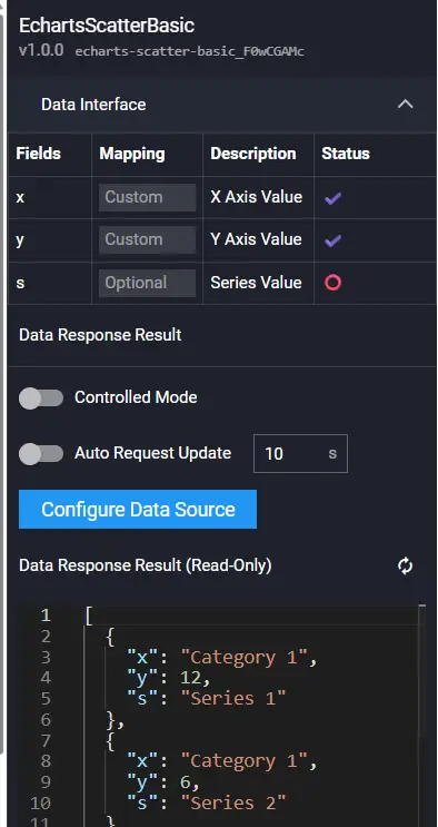
| Field | Description |
|---|---|
| x | x-axis coordinate value |
| y | y-axis coordinate value |
| s | Series |
Interaction
Refer to ECharts Line Chart.
ECharts Bubble Chart
ECharts Bubble Chart supports global configuration and ripple effects.
Preview:

Configuration
Refer to ECharts Scatter Chart.
Data
Refer to ECharts Scatter Chart.
Interaction
Refer to ECharts Scatter Chart.
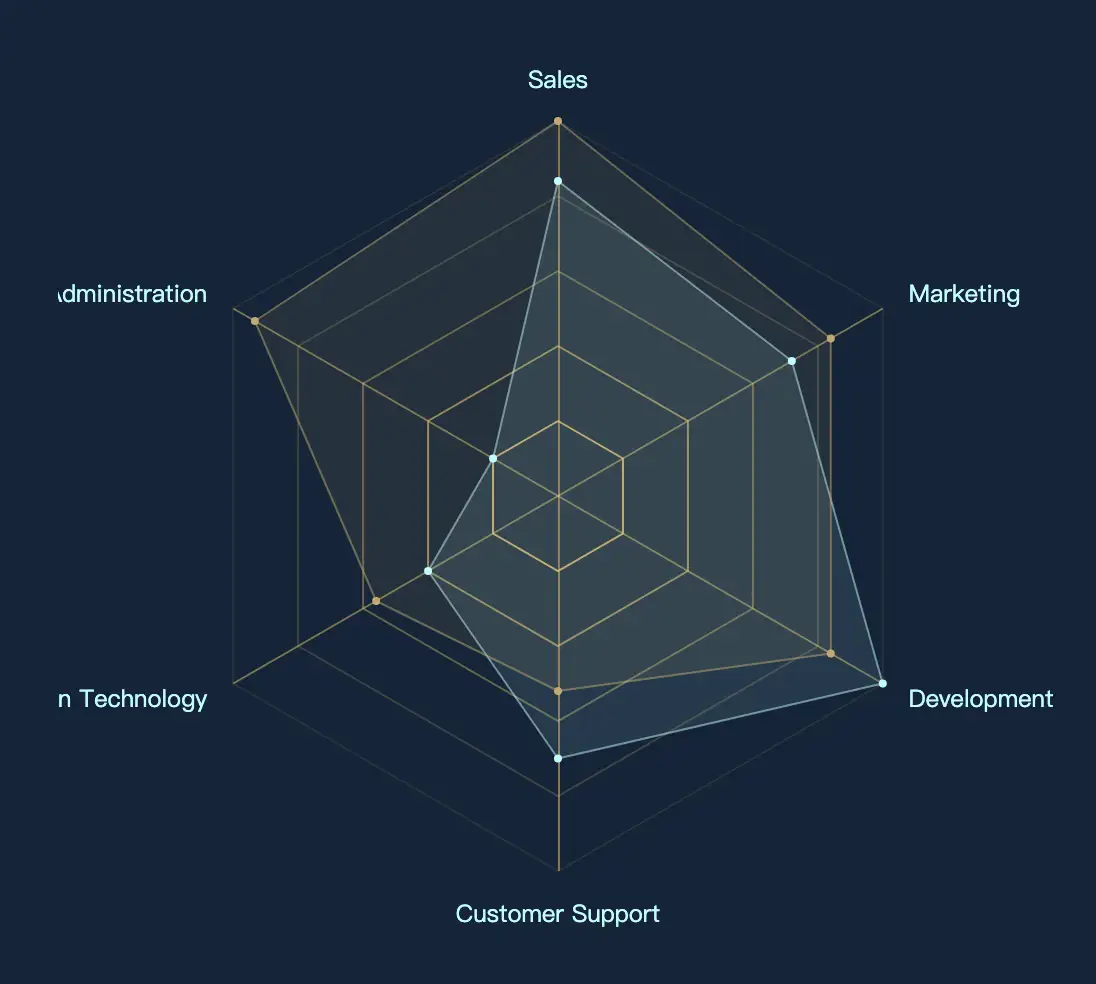
ECharts Radar Chart
ECharts Radar Chart supports global configuration and area gradient.
Preview:
Configuration
Data
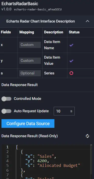
| Field | Description |
|---|---|
| x | Dimension name |
| y | Dimension value |
| s | Series |
Interaction
| Event | Description |
|---|---|
| On Click | When clicked, an event is sent, throwing relevant information (e.g., value) of the current item. |
| On Mouse Enter | When the mouse enters, an event is sent, throwing relevant information (e.g., value) of the current item. |
| On Mouse Leave | When the mouse leaves, an event is sent, throwing relevant information (e.g., value) of the current item. |
| Action | Description |
| Request Data | Re-requests data from the server. The config and options parameters thrown by upstream components are merged with the current request parameters and options parameters respectively, achieving dynamic changes to request parameters and configuration. |
| Import Data | Processes data according to the component's data access format and imports it into the component, triggering a redraw. |
| Update Component Config | Dynamically updates the component's configuration. |
| Show | Shows the component. |
| Hide | Hides the component. |
| Toggle Show/Hide | Toggles the visibility of the component. |
ECharts Funnel Chart
ECharts Funnel Chart supports global configuration, gradient, and customized carousel highlight animation.
Preview:

Configuration

Data
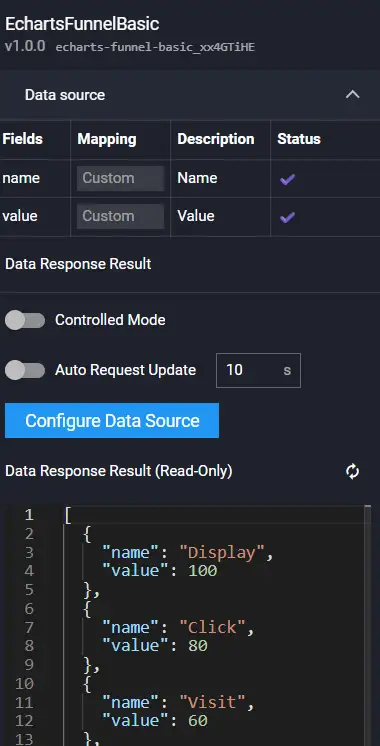
| Field | Description |
|---|---|
| name | Block name |
| value | Block value |
Interaction
Refer to ECharts Pie Chart.
ECharts Gauge
ECharts Gauge supports global configuration.
Preview:

Configuration

Data
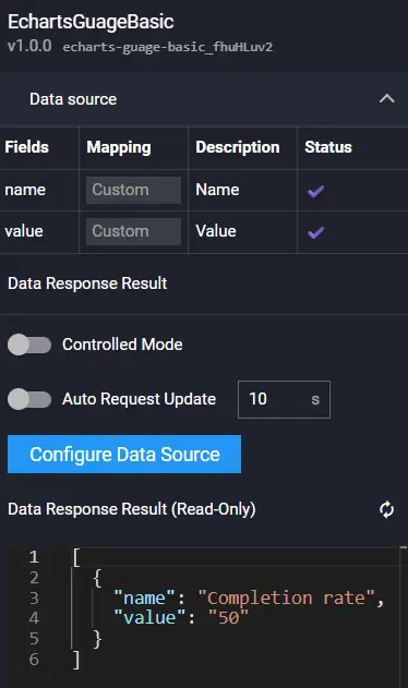
| Field | Description |
|---|---|
| name | Metric name |
| value | Metric value |
Interaction
Refer to ECharts Radar Chart.
ECharts Level Gauge
ECharts Level Gauge supports global configuration.
Preview:

Configuration
Refer to ECharts Gauge.
Data
Refer to ECharts Gauge.
Interaction
Refer to ECharts Gauge.
ECharts Clock Gauge
ECharts Clock Gauge supports global configuration, displays the current time, and does not require data input.
Preview:

Configuration

Data
No data input required.
Interaction
| Event | Description |
|---|---|
| On Click | When clicked, an event is sent, throwing relevant information (e.g., value) of the current item. |
| On Mouse Enter | When the mouse enters, an event is sent, throwing relevant information (e.g., value) of the current item. |
| On Mouse Leave | When the mouse leaves, an event is sent, throwing relevant information (e.g., value) of the current item. |
| Action | Description |
| Update Component Config | Dynamically updates the component's configuration. |
| Show | Shows the component. |
| Hide | Hides the component. |
| Toggle Show/Hide | Toggles the visibility of the component. |
ECharts Map
ECharts Map supports global configuration.
Preview:
Configuration

Data

| Field | Description |
|---|---|
| name | Region name |
| value | Region value |
Interaction
Refer to ECharts Radar Chart.
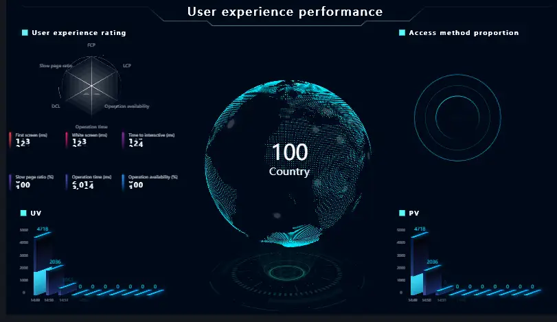
Chart1
3D Radar Chart
The 3D Radar Chart only supports data with 6 dimensions and one center value.

Configuration
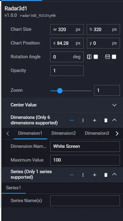
| Configuration Item | Description |
|---|---|
| Zoom | The zoom coefficient of the component, zoom range 0.1-4. |
| Center Value | Center value sequence configuration. |
| Dimension | The dimension corresponding to each sequence; this component only supports 6 dimensions. |
| Series | This component only supports one series. |
Data
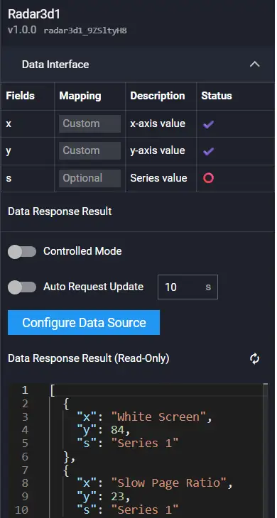
Field Description:
| Field | Description |
|---|---|
| x | x-axis coordinate value |
| y | y-axis coordinate value |
| s | Series |
Example:
[
  {
    "x": "White Screen",
    "y": 84,
    "s": "Series1"
  },
  {
    "x": "Slow Page Ratio",
    "y": 23,
    "s": "Series1"
  },
  {
    "x": "Interactive",
    "y": 77,
    "s": "Series1"
  },
  {
    "x": "Operation Time",
    "y": 65,
    "s": "Series1"
  },
  {
    "x": "Operation Availability",
    "y": 62,
    "s": "Series1"
  },
  {
    "x": "First Screen",
    "y": 97,
    "s": "Series1"
  },
  {
    "x": "Average Value",
    "y": 85,
    "s": "Series2"
  }
]
Interaction

| Event | Description |
|---|---|
| On Click | Emits a click event |
| On Mouse Enter | Emits a mouse enter event |
| On Mouse Leave | Emits a mouse leave event |
| Action | Description |
|---|---|
| Request Data | Re-requests data from the server and can include request parameters. |
| Import Data | Does not require an interface request; directly uses the callback data, imports it into the component, and the component re-renders. |
| Update Component Config | Updates the component's configuration. |
| Show | Shows the component. |
| Hide | Hides the component. |
| Toggle Show/Hide | Toggles the visibility of the component. |
3D Bar Chart
The 3D Bar Chart is suitable for time series data format and only supports one set of data. Data is displayed in groups of 10. For example: if there are 15 data points, the first 10 are displayed first, and the next 10 are displayed in the next carousel. This ensures the aesthetics of 10 bars. If there are less than ten data points, the height of the subsequent bars is 0.

Configuration
| Configuration Item | Description |
|---|---|
| Zoom | Zoom |
| Bar Face Color | Face color |
Data
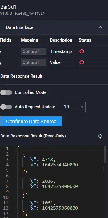
Field Description:
| Field | Description |
|---|---|
| x | x-axis coordinate value |
| y | y-axis coordinate value |
Example:
[
  {
    "y": 4718,
    "x": 1642574940000
  },
  {
    "y": 2036,
    "x": 1642575000000
  }
]
Interaction
Refer to 3D Radar Chart.
3D Pie Chart

Configuration
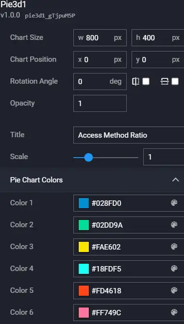
| Configuration Item | Description |
|---|---|
| Zoom | Zoom |
| Pie Chart Color | Pie chart colors, 6 colors are used in cycle |
Data
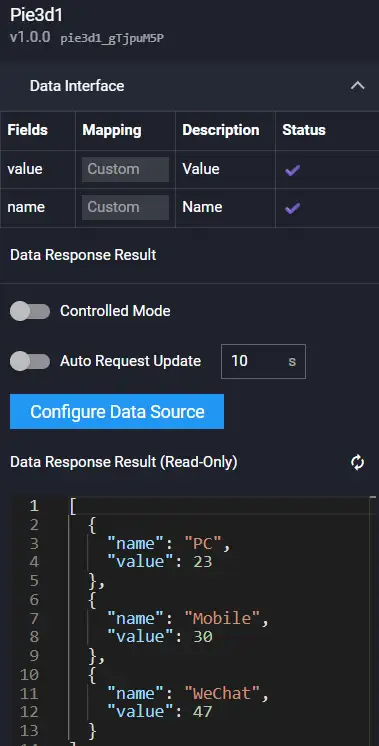
Field Description:
| Field | Description |
|---|---|
| name | Name |
| value | Value |
Example:
[
  {
    "value": 20,
    "name": "PC"
  },
  {
    "value": 30,
    "name": "Mobile"
  },
  {
    "value": 30,
    "name": "WeChat"
  }
]
Interaction
Refer to 3D Radar Chart.
3D Water Column Chart
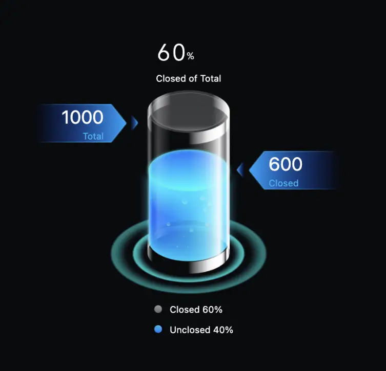
Configuration

| Configuration Item | Description |
|---|---|
| Zoom | Zoom factor |
| Total | Total |
| Info | Information |
Data
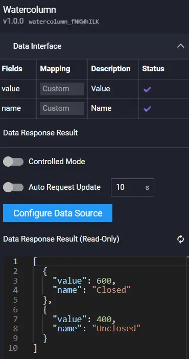
Field Description:
| Field | Description |
|---|---|
| name | Name |
| value | Value |
Example:
[
  {
    "value": 600,
    "name": "Closed"
  },
  {
    "value": 400,
    "name": "Unclosed"
  }
]
Interaction
Refer to 3D Radar Chart.
Stacked Bar Chart
This component has a fixed format (highly customized) style. The API requirements are strict: the legend must be 4, the data must be divided into two groups, and each group must contain two sets of data.

Configuration
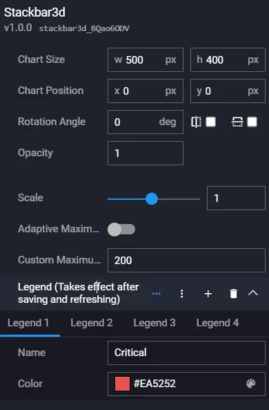
| Configuration Item | Description |
|---|---|
| Zoom | Zoom |
| Adaptive Max Value | Y-axis can adapt to the max value or specify a max value |
| Custom Max Value | Custom max value |
| Legend | Legend color configuration |
Data
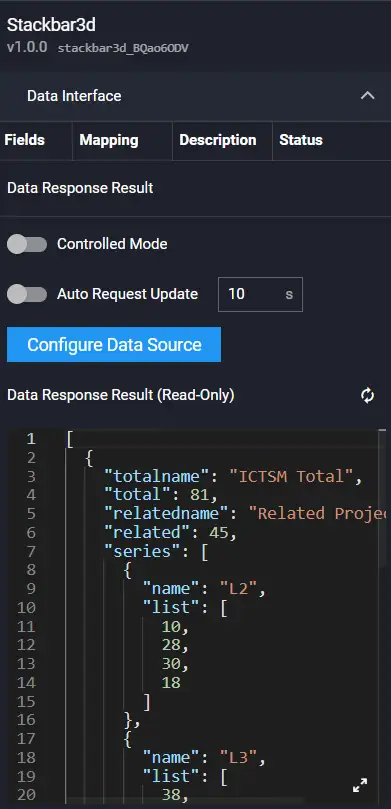
Example:
[
  {
    "totalname": "ICTSM Total",
    "total": 81,
    "relatedname": "Related Project QTY",
    "related": 45,
    "series": [
      {
        "name": "L2",
        "list": [
          10,
          28,
          30,
          18
        ]
      },
      {
        "name": "L3",
        "list": [
          38,
          38,
          44,
          34
        ]
      }
    ]
  },
  {
    "totalname": "ICTOM Total",
    "total": 94,
    "relatedname": "Related Project QTY",
    "related": 59,
    "series": [
      {
        "name": "L2",
        "list": [
          25,
          31,
          19,
          48
        ]
      },
      {
        "name": "L3",
        "list": [
          4,
          15,
          48,
          20
        ]
      }
    ]
  }
]
Interaction
Refer to 3D Radar Chart.
Stacked Bar Chart 2
This style has more flexible data configuration. The legend and data series are not fixed.

Configuration
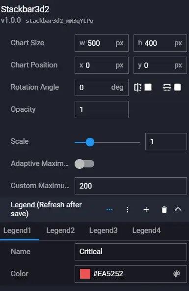
| Configuration Item | Description |
|---|---|
| Zoom | Zoom |
| Adaptive Max Value | Y-axis can adapt to the max value or specify a max value |
| Custom Max Value | Custom max value |
| Legend | Legend color configuration |
Data
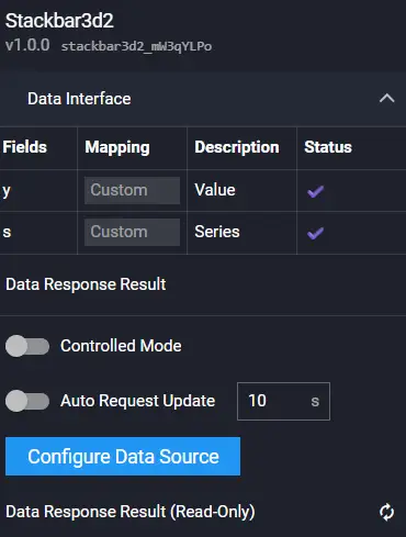
Field Description:
| Field | Description |
|---|---|
| y | y-axis coordinate value |
| s | Series |
Example:
[
  {
    "y": 20,
    "s": "L1"
  },
  {
    "y": 30,
    "s": "L1"
  },
  {
    "y": 40,
    "s": "L1"
  },
  {
    "y": 50,
    "s": "L1"
  },
  {
    "y": 30,
    "s": "L2"
  },
  {
    "y": 0,
    "s": "L2"
  },
  {
    "y": 50,
    "s": "L2"
  },
  {
    "y": 0,
    "s": "L2"
  },
  {
    "y": 30,
    "s": "L3"
  },
  {
    "y": 0,
    "s": "L3"
  },
  {
    "y": 50,
    "s": "L3"
  },
  {
    "y": 20,
    "s": "L3"
  },
  {
    "y": 30,
    "s": "L4"
  },
  {
    "y": 10,
    "s": "L4"
  },
  {
    "y": 50,
    "s": "L4"
  },
  {
    "y": 20,
    "s": "L4"
  }
]
Interaction
Refer to 3D Radar Chart.
Proportion Chart

Configuration
Data
Field Description:
| Field | Description |
|---|---|
| name | Name |
| value | Value, number type |
Example:
[
  {
    "value": 12872,
    "name": "Category A"
  },
  {
    "value": 11220,
    "name": "Category B"
  },
  {
    "value": 6410,
    "name": "Category C"
  },
  {
    "value": 6060,
    "name": "Category D"
  }
]
Interaction
Refer to 3D Radar Chart.
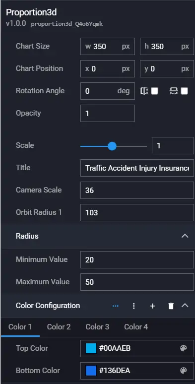
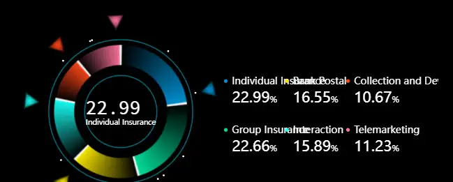
Proportion Chart 2
The component has dynamic effects. Each pie chart cycles through scaling and displays the name and percentage.

Configuration

Data
Field Description:
| Field | Description |
|---|---|
| name | Name |
| value | Value |
Example:
[
  {
    "value": 14299,
    "name": "Individual Insurance"
  },
  {
    "value": 14093,
    "name": "Group Insurance"
  },
  {
    "value": 10297,
    "name": "Bank Postal"
  },
  {
    "value": 9886,
    "name": "Interaction"
  },
  {
    "value": 6636,
    "name": "Collection and Development"
  },
  {
    "value": 6975,
    "name": "Telemarketing"
  }
]
Interaction
Refer to 3D Radar Chart.
Proportion Chart 3
Configuration
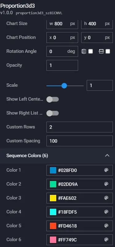
| Configuration Item | Description |
|---|---|
| Zoom | Zoom |
| Left Center Display Value | Left center display value / default display percentage |
| Right List Display Value | Right list display value / default display percentage |
| Custom Rows | Number of rows on the right |
| Custom Spacing | Spacing on the right |
| Series Color (6) | Default 6 color series |
Data
Field Description:
| Field | Description |
|---|---|
| name | Name |
| value | Value |
Example:
[
  {
    "value": 14299,
    "name": "Individual Insurance"
  },
  {
    "value": 14093,
    "name": "Group Insurance"
  },
  {
    "value": 10297,
    "name": "Bank Postal"
  },
  {
    "value": 9886,
    "name": "Interaction"
  },
  {
    "value": 6636,
    "name": "Collection and Development"
  },
  {
    "value": 6975,
    "name": "Telemarketing"
  }
]
Interaction
Refer to 3D Radar Chart.
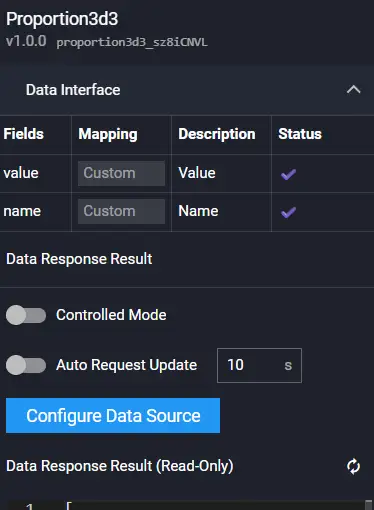
Proportion Chart 4

Configuration
Data
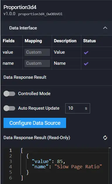
Field Description:
| Field | Description |
|---|---|
| name | Name |
| value | Value |
Example:
[
  {
    "value": 85,
    "name": "Slow Page Ratio"
  }
]
Interaction
Refer to 3D Radar Chart.
Metric Component

Configuration
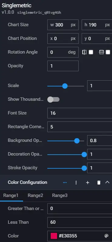
| Configuration Item | Description |
|---|---|
| Zoom | Zoom |
| Show Thousands Separator | Show thousands separator |
| Font Size | Font size |
| Rectangle Corner Radius | Rectangle corner radius |
| Background Opacity | Background opacity |
| Decoration Opacity | Decoration opacity |
| Color Configuration | Color configuration, matches color by value range |
Data
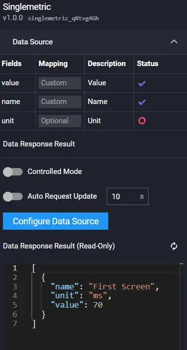
Field Description:
| Field | Description |
|---|---|
| name | Name |
| value | Value |
| unit | Unit |
Example:
[
  {
    "name": "First Screen",
    "unit": "ms",
    "value": 70
  }
]
Interaction
Refer to 3D Radar Chart.
Bubble Chart
Configuration

Data
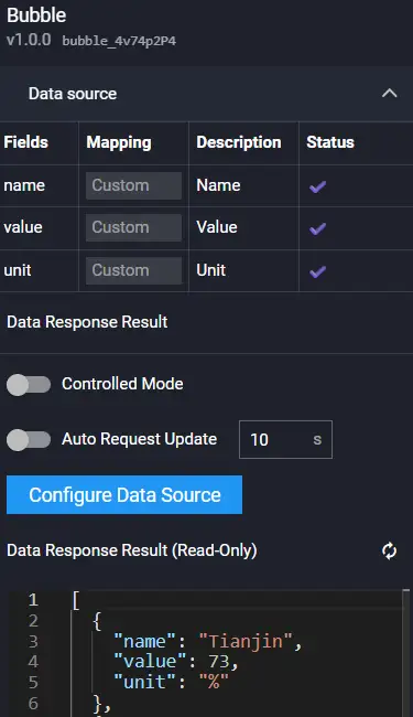
Field Description:
| Field | Description |
|---|---|
| name | Name |
| value | Value |
| unit | Unit |
Example:
[
  {
    "name": "Tianjin",
    "value": 73,
    "unit": "%"
  },
  {
    "name": "Guangdong Province",
    "value": 15,
    "unit": "%"
  }
]
Interaction
Refer to 3D Radar Chart.
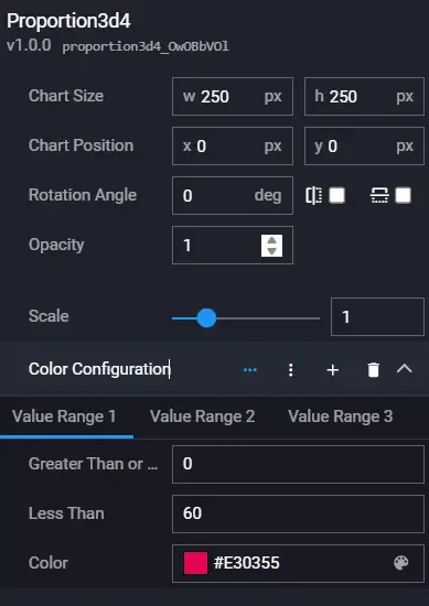
3D Gauge

Configuration

| Field | Description |
|---|---|
| Color Configuration | Value range type color configuration |
Data
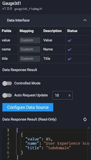
Field Description:
| Field | Description |
|---|---|
| name | Name |
| value | Value |
| title | Title |
Example:
[
  {
    "value": 85,
    "name": "User Experience Score",
    "title": "Subdomain"
  }
]
Interaction
Refer to 3D Radar Chart.
Bar Line Chart
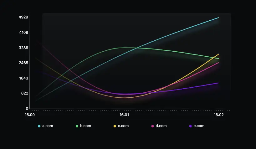
Configuration
Data
Field Description:
| Field | Description |
|---|---|
| x | Timestamp |
| y | Value |
| s | Series |
Example:
[
  {
    "y": 259,
    "x": 1644480000000,
    "s": "a.com"
  },
  {
    "y": 2987,
    "x": 1644480060000,
    "s": "a.com"
  }
]
Interaction
Refer to 3D Radar Chart.
3D Radar Chart 2

Configuration
Data
Field Description:
| Field | Description |
|---|---|
| x | x-axis coordinate value |
| y | y-axis coordinate value |
| s | Series value |
Example:
[
  {
    "x": "White Screen",
    "y": 84,
    "s": "Data One"
  },
  {
    "x": "Slow Page Ratio",
    "y": 23,
    "s": "Data One"
  },
  {
    "x": "Interactive",
    "y": 77,
    "s": "Data One"
  },
  {
    "x": "Operation Time",
    "y": 65,
    "s": "Data One"
  },
  {
    "x": "Operation Availability",
    "y": 62,
    "s": "Data One"
  },
  {
    "x": "First Screen",
    "y": 97,
    "s": "Data One"
  },
  {
    "x": "Average Value",
    "y": 85,
    "s": "Data Two"
  }
]
Interaction
Refer to 3D Radar Chart.
Metric Ratio Chart

Configuration

Data
Field Description:
| Field | Description |
|---|---|
| name | Name |
| value | Value |
| percent | Percentage |
Example:
[
  {
    "name": "Pro Total Users",
    "value": 39000,
    "percent": 65
  }
]
Interaction
Refer to 3D Radar Chart.
3D Sankey Chart

Configuration

Data
Field Description:
| Field | Description |
|---|---|
| links | Node array |
| nodes | Link array |
Example:
[
  {
    "nodes": [
      {
        "id": 0,
        "name": "node0"
      },
      {
        "id": 1,
        "name": "node1"
      },
      {
        "id": 2,
        "name": "node2"
      },
      {
        "id": 3,
        "name": "node3"
      },
      {
        "id": 4,
        "name": "node4"
      },
      {
        "id": 5,
        "name": "node5"
      },
      {
        "id": 6,
        "name": "node6"
      },
      {
        "id": 7,
        "name": "node7"
      },
      {
        "id": 8,
        "name": "node8"
      },
      {
        "id": 9,
        "name": "node9"
      },
      {
        "id": 10,
        "name": "node10"
      }
    ],
    "links": [
      {
        "source": 0,
        "target": 1,
        "value": 2
      },
      {
        "source": 0,
        "target": 2,
        "value": 3
      },
      {
        "source": 0,
        "target": 3,
        "value": 4
      },
      {
        "source": 0,
        "target": 4,
        "value": 2
      },
      {
        "source": 0,
        "target": 5,
        "value": 8
      },
      {
        "source": 1,
        "target": 6,
        "value": 5
      },
      {
        "source": 2,
        "target": 7,
        "value": 9
      },
      {
        "source": 3,
        "target": 7,
        "value": 1
      },
      {
        "source": 4,
        "target": 8,
        "value": 7
      },
      {
        "source": 5,
        "target": 9,
        "value": 2
      },
      {
        "source": 7,
        "target": 10,
        "value": 7
      },
      {
        "source": 8,
        "target": 10,
        "value": 8
      },
      {
        "source": 6,
        "target": 10,
        "value": 8
      }
    ]
  }
]
Interaction
Refer to 3D Radar Chart.
Colorful Bar Chart

Configuration

Data
Field Description:
| Field | Description |
|---|---|
| name | Name |
| value | Value |
| color | Color |
Example:
[
  {
    "name": "Revenue Department One",
    "value": 3938,
    "color": "#77E5FF"
  },
  {
    "name": "Finance Department",
    "value": 56015,
    "color": "#EDFF77"
  },
  {
    "name": "Operations Department Two",
    "value": 26046,
    "color": "#7639FF"
  },
  {
    "name": "Order Submission",
    "value": 38072,
    "color": "#88FF77"
  },
  {
    "name": "Sales Department",
    "value": 56359,
    "color": "#FF7042"
  }
]
Interaction
Refer to 3D Radar Chart.
Chart2
Gradient Bar Chart
This component is for grouped data. The legend data determines the number of data points in each group. The legend color can be defined directly through the interface or configured in the component.
The component includes two styles:


Configuration
Data
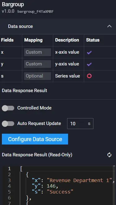
Field Description:
| Field | Description |
|---|---|
| x | x-axis coordinate value |
| y | y-axis coordinate value |
| s | Series value |
Example:
[
  {
    "x": "Revenue Department One",
    "y": 146,
    "s": "Success"
  },
  {
    "x": "Revenue Department One",
    "y": 886,
    "s": "Failure"
  },
  {
    "x": "Finance Department",
    "y": 913,
    "s": "Success"
  },
  {
    "x": "Finance Department",
    "y": 826,
    "s": "Failure"
  },
  {
    "x": "Operations Department Two",
    "y": 220,
    "s": "Success"
  },
  {
    "x": "Operations Department Two",
    "y": 950,
    "s": "Failure"
  },
  {
    "x": "Order Submission",
    "y": 832,
    "s": "Success"
  },
  {
    "x": "Order Submission",
    "y": 183,
    "s": "Failure"
  },
  {
    "x": "Sales Department",
    "y": 767,
    "s": "Success"
  },
  {
    "x": "Sales Department",
    "y": 190,
    "s": "Failure"
  }
]
Interaction
Refer to 3D Radar Chart.
3D Gauge 2

Configuration

Data
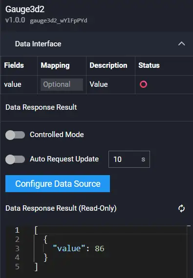
Field Description:
| Field | Description |
|---|---|
| value | Value, number type |
Example:
[
  {
    "value": 86
  }
]
Interaction
Refer to 3D Radar Chart.
Colorful Progress Bar
The number of rings is determined by the number of data entries. The color of each ring can be defined directly through the interface or configured in the component. The value is a percentage by default.
This component has two styles:

Configuration

Data
Field Description:
| Field | Description |
|---|---|
| value | Value. Default max 100 |
| name | Name |
| unit | Unit |
| color | Color |
Example:
[
  {
    "name": "Revenue Department One",
    "unit": "%",
    "value": 59,
    "color": "#2BBBFF"
  },
  {
    "name": "Finance Department",
    "unit": "%",
    "value": 23,
    "color": "#EDFF77"
  },
  {
    "name": "Operations Department Two",
    "unit": "%",
    "value": 55,
    "color": "#7639FF"
  },
  {
    "name": "Order Submission",
    "unit": "%",
    "value": 34,
    "color": "#88FF77"
  },
  {
    "name": "Sales Department",
    "unit": "%",
    "value": 80,
    "color": "#DB5A5A"
  }
]
Interaction
Refer to 3D Radar Chart.
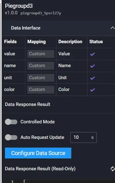
Color Bar Metric


Configuration

Data
Field Description:
| Field | Description |
|---|---|
| value | Value |
| name | Name |
| unit | Unit |
| color | Color |
Example:
[
  {
    "name": "Completed Business Count",
    "unit": "items",
    "value": 1497614,
    "color": "#77E5FF"
  },
  {
    "name": "Errored Business Count",
    "unit": "items",
    "value": 184,
    "color": "#F30B49"
  },
  {
    "name": "Error Affected User Count",
    "unit": "users",
    "value": 200,
    "color": "#FF3B3B"
  },
  {
    "name": "Average Response Time",
    "unit": "ms",
    "value": 7850,
    "color": "#15F4D1"
  }
]
Interaction
Refer to 3D Radar Chart.
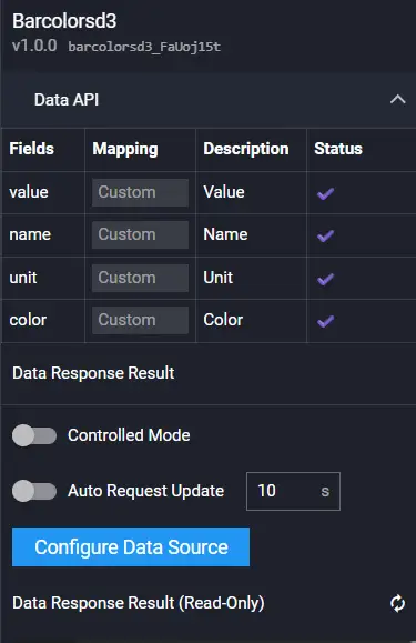
3D Proportion Chart

Configuration

Data
Field Description:
| Field | Description |
|---|---|
| name | Name |
| value | Value |
| color | Color |
Example:
[
  {
    "name": "Revenue Department One",
    "value": 4146,
    "color": "#23C8F0"
  },
  {
    "name": "Finance Department",
    "value": 1292,
    "color": "#FFDB48"
  },
  {
    "name": "Operations Department Two",
    "value": 735,
    "color": "#02F0F1",
  },
  {
    "name": "Order Submission",
    "value": 2764,
    "color": "#17CDF9"
  },
  {
    "name": "Sales Department",
    "value": 3065,
    "color": "#14AFD5"
  }
]
Interaction
Refer to 3D Radar Chart.
Core Metrics


Configuration
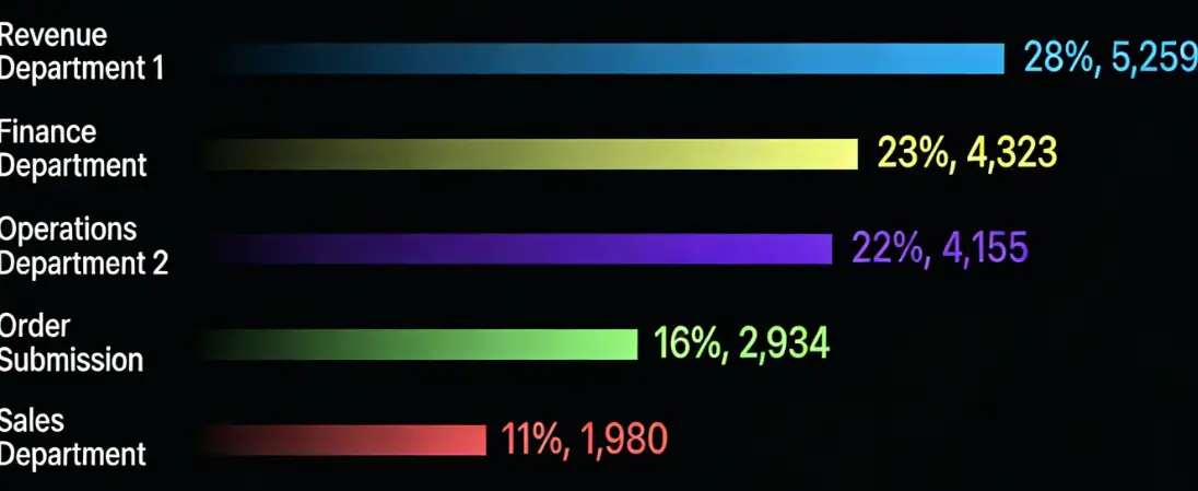
Data
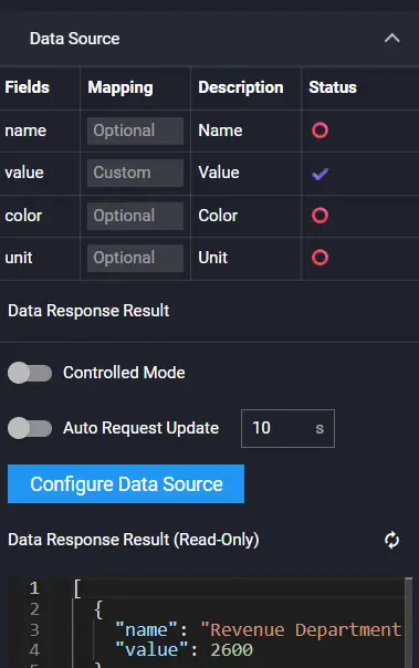
Field Description:
| Field | Description |
|---|---|
| value | Value |
| name | Name |
| unit | Unit |
| color | Color |
Example:
[
  {
    "name": "Revenue Department One",
    "unit": "",
    "value": 5259,
    "color": "#2BBBFF"
  },
  {
    "name": "Finance Department",
    "unit": "",
    "value": 4323,
    "color": "#EDFF77"
  },
  {
    "name": "Operations Department Two",
    "unit": "",
    "value": 4155,
    "color": "#7639FF"
  },
  {
    "name": "Order Submission",
    "unit": "",
    "value": 2934,
    "color": "#88FF77"
  },
  {
    "name": "Sales Department",
    "unit": "",
    "value": 1980,
    "color": "#DB5A5A"
  }
]
Interaction
Refer to 3D Radar Chart.
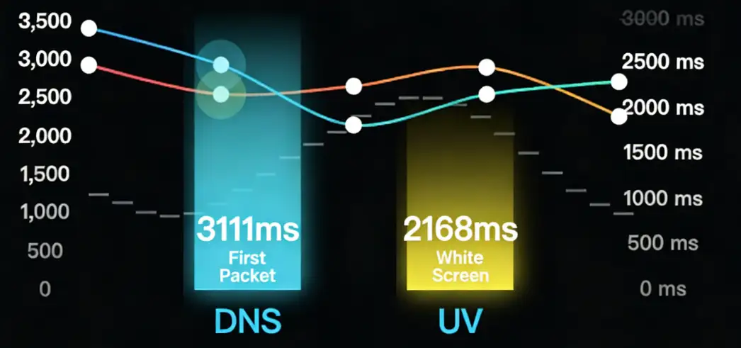
3D Bar Line Chart
Configuration

Data
Example:
[
  {
    "overview": {
      "tick": 1
    },
    "yAxis": [
      {
        "tickUnit": "times"
      },
      {
        "tickUnit": "ms",
        "opposite": true
      }
    ],
    "series": [
      {
        "name": "DNS",
        "type": "column",
        "yAxis": 0,
        "data": [
          {
            "y": 4182,
            "x": 1646644920000
          },
          {
            "y": 1178,
            "x": 1646644980000
          }
        ]
      },
      {
        "name": "UV",
        "type": "column",
        "yAxis": 0,
        "data": [
          {
            "y": 375,
            "x": 1646644920000
          },
          {
            "y": 2760,
            "x": 1646644980000
          }
        ]
      },
      {
        "name": "First Packet",
        "type": "line",
        "yAxis": 1,
        "data": [
          {
            "y": 3274,
            "x": 1646644920000
          },
          {
            "y": 2410,
            "x": 1646644980000
          }
        ]
      },
      {
        "name": "White Screen",
        "type": "line",
        "yAxis": 1,
        "data": [
          {
            "y": 4228,
            "x": 1646644920000
          },
          {
            "y": 3014,
            "x": 1646644980000
          }
         ]
      }
    ]
  }
]
Interaction
Refer to 3D Radar Chart.
3D Topology

Configuration
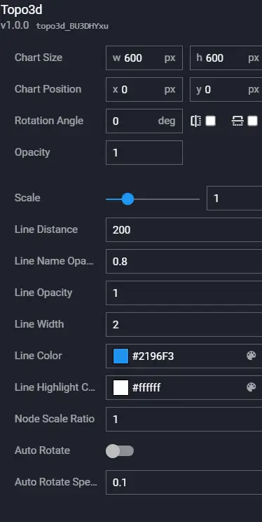
| Configuration Item | Description |
|---|---|
| Zoom | Overall component zoom |
| Connection Length | Connection length |
| Connection Name Opacity | Connection name opacity |
| Connection Line Opacity | Connection line opacity |
| Connection Line Width | Connection line width |
| Connection Line Color | Connection line color |
| Connection Line Highlight Color | Connection line highlight color |
| Node Scale Ratio | Overall scaling ratio of nodes |
| Auto Rotate | Whether to enable auto rotation |
| Auto Rotation Speed | Auto rotation speed |
Data

Field Description:
| Field | Description |
|---|---|
| links | Node array |
| nodes | Link array |
Example:
[
  {
    "nodes": [
      {
        "id": 1,
        "health": -1,
        "name": "A",
        "type": 12,
        "subType": 1,
        "fx": null,
        "fy": null,
        "fz": null,
        "scale": 1
      },
      {
        "id": 2,
        "health": 0,
        "name": "B",
        "type": 11,
        "subType": 5,
        "fx": null,
        "fy": null,
        "fz": null,
        "scale": 1
      },
      {
        "id": 3,
        "health": 1,
        "name": "C",
        "type": 14,
        "subType": 2,
        "fx": null,
        "fy": null,
        "fz": null,
        "scale": 1
      },
      {
        "id": 4,
        "health": 2,
        "name": "D",
        "type": 17,
        "subType": 45,
        "fx": null,
        "fy": null,
        "fz": null,
        "scale": 1
      },
      {
        "id": 5,
        "health": 3,
        "name": "E",
        "type": 16,
        "subType": 0,
        "fx": null,
        "fy": null,
        "fz": null,
        "scale": 1
      },
      {
        "id": 6,
        "health": 4,
        "name": "F",
        "type": 15,
        "subType": 1,
        "fx": null,
        "fy": null,
        "fz": null,
        "scale": 1
      }
    ],
    "links": [
      {
        "source": 2,
        "target": 1,
        "info": "B--A"
      },
      {
        "source": 1,
        "target": 5,
        "info": "A--E"
      },
      {
        "source": 1,
        "target": 3,
        "info": "A--C"
      },
      {
        "source": 1,
        "target": 4,
        "info": "A--D"
      },
      {
        "source": 1,
        "target": 6,
        "info": "A--F"
      }
    ]
  }
]
Interaction
Refer to 3D Radar Chart.
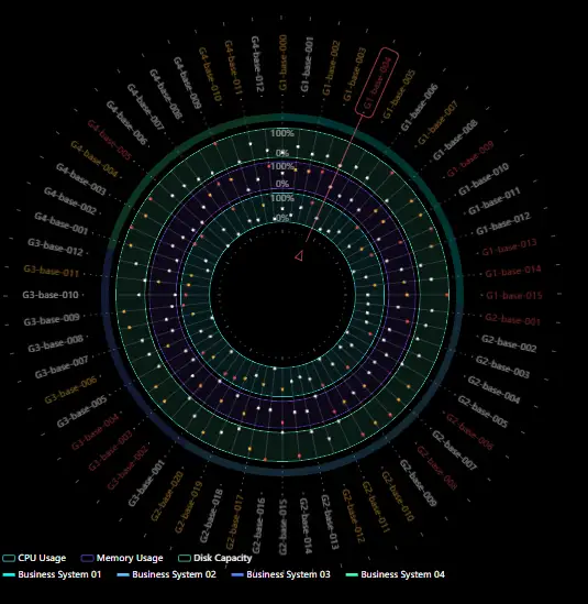
Starry Sky Ring Distribution Chart
This component includes two sets of legends and logical relationships.
Configuration
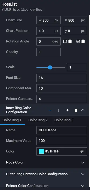
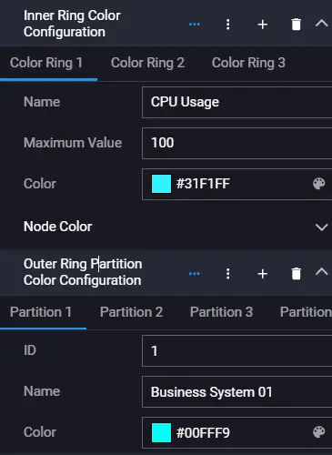
Data
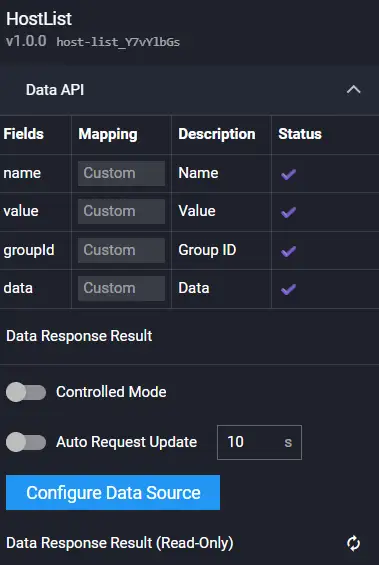
Field Description:
| Field | Description |
|---|---|
| name | Name |
| value | Value |
| groupId | Group id |
| data | Data |
Example:
[
  {
    "name": "G1-base-000",
    "groupId": 1,
    "value": 69,
    "data": [
      46,
      58,
      17
    ]
  },
  {
    "name": "G1-base-001",
    "groupId": 1,
    "value": 22,
    "data": [
      25,
      72,
      40
    ]
  }
]
Interaction
Refer to 3D Radar Chart.
Alert Fault List
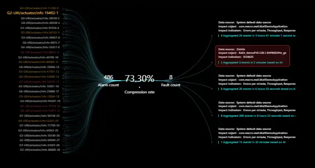
Configuration
Data
Field Description:
| Field | Description |
|---|---|
| series | Left side data |
| group | Right side group |
| infolist | Middle information |
Example:
See online example.
Interaction
Refer to 3D Radar Chart.
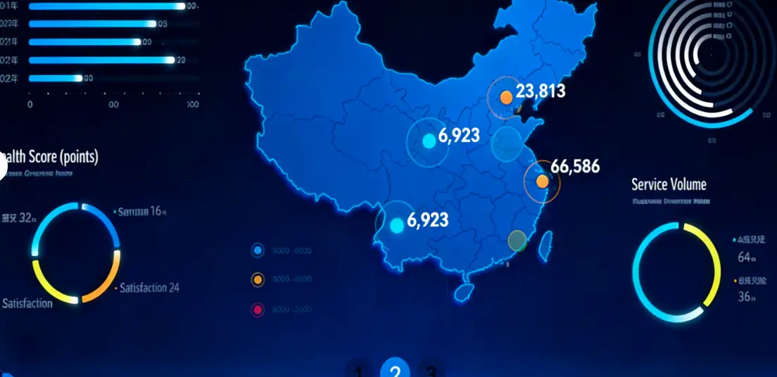
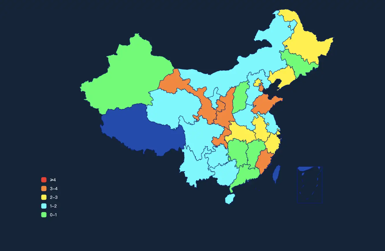
China Map 1

Configuration

Data
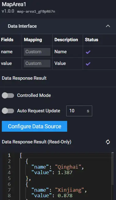
Field Description:
| Field | Description |
|---|---|
| name | Name |
| value | Value |
Example:
[
  {
    "name": "Qinghai",
    "value": 1.387,
    "left": 465.68310736145577,
    "top": 334.7239534601599
  },
  {
    "name": "Xinjiang",
    "value": 0.878,
    "left": 305.83848602150533,
    "top": 227.72608899917293
  }
]
Interaction
Refer to 3D Radar Chart.
China Map 2

Configuration

Data
Field Description:
| Field | Description |
|---|---|
| name | Name |
| value | Value |
| list | Data |
Example:
[
  {
    "name": "Qinghai",
    "value": 1.728,
    "list": [
      {
        "key": "Electronic Social Security Card Issuance Count",
        "value": "1,170,000"
      },
      {
        "key": "Employment Service Registration Count",
        "value": "223,111,022"
      }
    ]
  }
]
Interaction
Refer to 3D Radar Chart.
Scrolling List

Configuration

Data

Example:
[
  {
    "health": "General",
    "business": 39,
    "resTime": "Stuttering",
    "throughput": "24%",
    "peakThroughput": "11%"
  },
  {
    "health": "Good",
    "business": 41,
    "resTime": "Crash",
    "throughput": "19%",
    "peakThroughput": "14%"
  }
]
Interaction
Refer to 3D Radar Chart.
Carousel List
Configuration

Data

Example:
[
  {
    "id": 1,
    ... // See online example
Interaction
Refer to 3D Radar Chart.
Alert List 2

Configuration

Data
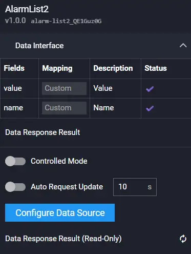
Field Description:
| Field | Description |
|---|---|
| name | Name |
| value | Value |
Example:
[
  {
    "name": "Number of Alerts Occurred",
    "value": 52019
  },
  {
    "name": "Number of Affected Applications",
    "value": 13885
  },
  {
    "name": "Number of Affected Transactions",
    "value": 47478
  },
  {
    "name": "Number of Pending Alerts",
    "value": 6534
  }
]
Interaction
Refer to 3D Radar Chart.
Pagination List

Configuration
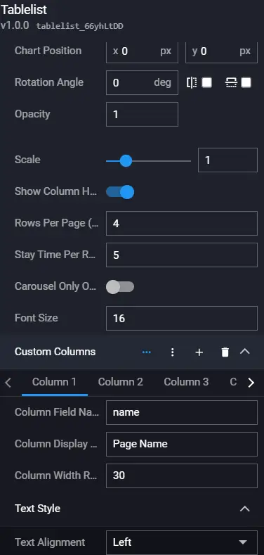
Data

Example:
[
  {
    "id": 1,
    "name": "NetEase AI Experience Center - Homepage",
    "pv": 24.24,
    "onready": 150,
    "loadtime": 286,
    "score": 98
  },
  {
    "id": 2,
    "name": "wangyiai/my/cherry",
    "pv": 11.5,
    "onready": 432,
    "loadtime": 989,
    "score": 92
  },
  {
    "id": 3,
    "name": "wangyiai/card",
    "pv": 10.89,
    "onready": 167,
    "loadtime": 176,
    "score": 89
  },
  {
    "id": 4,
    "name": "wangyiai/loopart",
    "pv": 83.12,
    "onready": 289,
    "loadtime": 327,
    "score": 72
  },
  {
    "id": 5,
    "name": "NetEase AI Experience Center - Order",
    "pv": 8.36,
    "onready": 150,
    "loadtime": 286,
    "score": 71
  },
  {
    "id": 6,
    "name": "wangyiai/about",
    "pv": 21.5,
    "onready": 132,
    "loadtime": 234,
    "score": 97
  }
]
Interaction
Refer to 3D Radar Chart.