组件开发指南
快速入门
本文主要介绍自定义组件的开发流程。
搭建环境
-
前端开发需要使用Node环境,建议使用Node 14及以上版本。安装完成后,在命令行操作界面执行
node–v命令可以查看当前安装的版本。 -
包管理器推荐使用
yarn,使用yarn -v可以查看版本�。 -
下载组件开发模板mycoms.zip文件并解压。
-
执行
yarn安装项目依赖。
项目目录
项目目录如下图所示:
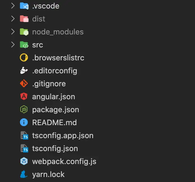
当前模板是一个简易版的Angular项目,目前还不支持其它技术栈开发,但是您可以安装自己喜欢的库,只要遵循组件开发规范即可。
创建新组件
模板内默认有两个示例组件。您可以通过自动生成方式和手动执行方式创建新的组件。
-
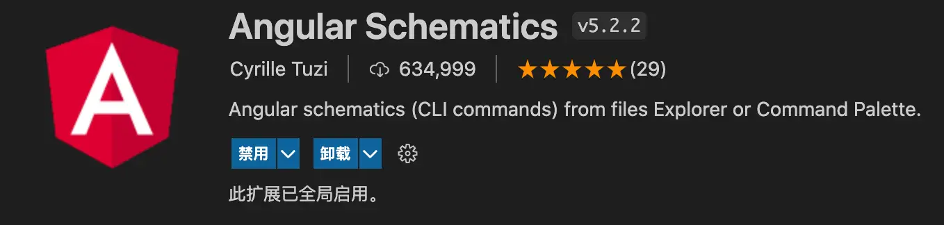
自动生成
通过 Angular 的 CLI 工具可以快速创建一个新组件,步骤如下。
-
使用 VSCode 的 Angular Schematics 插件。
-
右键选择Angular: Generate a component。
-
-
手动执行
手动输入生成组件的命令。
ng g component demo3 --change-detection OnPush --skip-tests
组件创建完成后,在 package.json 中添加新组件的路径。
"exposes": {
    "Demo1": "./src/app/demo1/demo1.component.ts",
    "Demo2": "./src/app/demo2/demo2.component.ts",
    "Demo3": "./src/app/demo3/demo3.component.ts"
 }
启动项目
运行npm run start命令可以启动当前项目,默认端口为3000,可以在package.json中修改端口号。
"start": "ng serve --port=3000",
预览组件
访问http://localhost:3000为空页面,最简单的方式是将组件添加到app.component.html中,例如:
<app-demo1></app-demo1>
但是这种方式无法测试组件的配置项以及事件交互等。
组件打包
运行npm run pack将组件打包,打包之后的组件包(默认在 dist 目录下)必须压缩为zip文件才可以上传。
线上调试
由于暂时还没有独立的组件开发平台,所以我们要借助大屏编辑器调试组件。具体操作如下:
-
在我的组件页面,添加一条新数据。
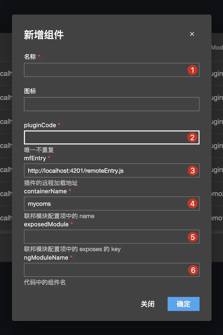
- 1:插件名称(自定义)。
- 2:插件唯一编码(自定义,一般为导出的组件名的小写形式,例如 demo1)。
- 3:开发环境的主入口(本地服务 + package.json 中的filename)。
- 4:组件容器名称(package.json 中的name,例如 mycoms)。
- 5:导出的组件(package.json 中的exposes 的key,例如 Demo3)。
- 6:组件名(新增组件的class名称,例如 Demo3Component)。
-
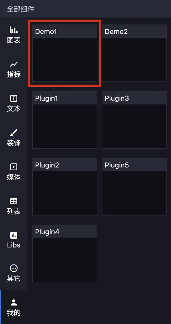
新增成功之后,在我的菜单会显示新增的组件。
-
将线上地址 `xxx/screen/design/918` 改为 `xxx/screen/dev/918`(design 改为dev)就可以进入线上调试环境了,此时将组件拖动到画布加载的是本地的组件,这样就可以调试组件配置项、数据以及交互了。
开发规范
本文主要介绍项目文件及组件的必备属性。
文件概览
对于package.json,只需要关注以下属性。
{
  "name": "mycoms",
  "version": "1",
  "description": "我的组件包",
  "filename": "remoteEntry.js",
  "exposes": {
    "Demo1": "./src/app/demo1/demo1.component.ts",
    "Demo2": "./src/app/demo2/demo2.component.ts"
  },
  …
}
组件模板为单包多组件,每次创建一个新的组件之后,必须手动在exposes中定义要导出的组件路径。
组件目录如下:

默认组件为html、css、ts分离。
组件属性
| 属性 | 类型 | 描述 | |
|---|---|---|---|
| 基础 | attr | ComponentAttr | 组件的基本属性,包括宽高、透明度、翻转等。 |
| 样式 | config | GuiConfigs | 组件样式的 GUI 配置项。 |
| options | ComponentOptions | 组件样式的默认值,GUI 表单可以改变 options。 | |
| 数据 | apis | ComponentApis | 组件数据的 API 配置,包括处理方法及字段定义。 |
| data | ComponentData | 组件的静态数据,也是初始化数据。 | |
| 交互 | events | ComponentEvents | 组件可触发的事件。 |
| actions | ComponentActions | 组件可执行的动作(函数)。 |
组件钩子
| 钩子函数 | 类型 | 说明 |
|---|---|---|
| init | () => void | 组件初始化时被调用。 |
| destroy | () => void | 组件销毁时被调用。 |
| render | (data: any, options?: any) => void | 组件的数据渲染方法,在 apis 属性中定义。 |
| updateOptions | (options: any) => void | GUI 配置项更新时调用。 |
| resize | (width?: number, height?: number) => void | 组件尺寸变更时调用。 |
配置控件
本文主要介绍GUI 控件的使用规范。
基本用法
GUI本质是一套动态表单,通过JSON数据渲染出组件的配置项。GUI有很多的控件类型,通过组合可以构造出任意数据结构。每一个控件都有一个独有的type类型。
以下是一个最基本的配置案例。
config: GuiConfigs = {
  width: {
    name: '宽度',
    type: 'number',
    default: 1920,
    description: '',
    suffix: 'px',
  },
  height: {
    name: '高度',
    type: 'number',
    default: 1080,
    description: '',
    suffix: 'px',
  },
};
渲染效果如下:

通过上面的GUI配置可以获得如下options:
{
  width: 1920,
  height: 1080,
}
GUI 的配置主要是用对象数据格式组织的,这样可以有效防止出现重复 key,配置中的key对应options中的key。只要修改了表单控件,options的值就会立即更新(文本输入控件只有移开焦点才会更新)。
控件概览
| 分类 | type | 说明 |
|---|---|---|
| 基础控件 | text | 文本输入框,string 类型。 |
| number | 数字输入框,number 类型。 | |
| select | 下拉选择框,只支持单选。 | |
| combobox | 组合下拉框,支持单选多选搜索等。 | |
| radio | 单选框。 | |
| checkbox | 复选框,array 类型。 | |
| buttonToggle | 按钮开关,支持单选多选,可设置文字、图标、图片。 | |
| switch | 开关,boolean 类型。 | |
| slider | 滑动条,number 类型。 | |
| fill | 颜色控件,支持纯色和渐变。 | |
| hidden | 隐藏输入框,input 类型为 hidden。 | |
| image | 图片上传。 | |
| video | 视频上传。 | |
| codearea | 代码编辑器。 | |
| 组合控件 | group | 组合,object 类型。 |
| inline | 行内组合,object 类型。 | |
| tabs | 标签组,array 类型。 | |
| menu | 菜单,object 类型。 |
说明:有些控件的数据输出格式是一样的,主要是 UI 显示效果不同,例如select 和radio。一般而言,如果 options 的数量小于 5 个,优先选用radio,其它场景两者可以相互替换。
关于具体控件的使用方法,请参见控件详情。
控件详情
Text
配置项:
| 字段 | 含义 | 类型 | 是否必填 |
|---|---|---|---|
| type | 控件类型 | string | 是 |
| name | 标签名称 | string | 是 |
| default | 默认值 | string | 否 |
| prefix | 前缀文本 | string | 否 |
| suffix | 后缀文本 | string | 否 |
示例:
config: GuiConfigs = {
  text: {
    name: '文本',
    type: 'text',
    default: '我是默认值',
    prefix: '前缀',
    suffix: '后缀',
  },
};

Number
配置项:
| 字段 | 含义 | 类型 | 是否必填 |
|---|---|---|---|
| type | 控件类型 | string | 是 |
| name | 标签名称 | string | 是 |
| default | 默认值 | string | 否 |
| prefix | 前缀文本 | string | 否 |
| suffix | 后缀文本 | string | 否 |
| min | 最小值 | number | 否 |
| max | 最大值 | number | 否 |
| step | 步进值 | number | 否 |
示例:
config: GuiConfigs = {
  number: {
    name: '数值',
    type: 'number',
    default: '123',
    prefix: '$',
    suffix: '.00',
  },
};

Select
配置项:
| 字段 | 含义 | 类型 | 是否必填 |
|---|---|---|---|
| type | 控件类型 | string | 是 |
| name | 标签名称 | string | 是 |
| default | 默认值 | string | 否 |
| prefix | 前缀文本 | string | 否 |
| suffix | 后缀文本 | string | 否 |
| options | 选项列表 | array | 否 |
| useFont | 是否渲染字体 | boolean | 否 |
示例:
config: GuiConfigs = {
  font: {
    name: '字体',
    type: 'select',
    default: 'SimSun',
    options: [
      { value: 'Microsoft Yahei', label: '微软雅黑' },
      { value: 'SimHei', label: '黑体' },
      { value: 'SimSun', label: '宋体' },
      { value: 'fangsong', label: '仿宋' },
      { value: 'KaiTi', label: '楷体' },
      { value: 'Arial', label: 'Arial' },
      { value: 'fantasy', label: 'Fantasy' },
],
    useFont: true,
  },
};


Combobox
配置项:
| 字段 | 含义 | 类型 | 是否必填 |
|---|---|---|---|
| type | 控件类型 | string | 是 |
| name | 标签名称 | string | 是 |
| default | 默认值 | string | 否 |
| prefix | 前缀文本 | string | 否 |
| suffix | 后缀文本 | string | 否 |
| options | 选项列表 | array | 否 |
| multiple | 是否多选 | boolean | 否 |
| bindValue | value 映射 | string | 否 |
| bindLabel | label 映射 | string | 否 |
单选示例:
config: GuiConfigs = {
  search: {
    name: '搜索',
    type: 'combobox',
    options: [
      { value: 1, label: 'Apple' },
      { value: 2, label: 'Lemon' },
      { value: 3, label: 'Lime' },
      { value: 4, label: 'Orange', disabled: true },
      { value: 5, label: 'Strawberry' },
    ],
  },
};

多选示例:
config: GuiConfigs = {
  search: {
    name: '搜索多项',
    type: 'combobox',
    multiple: true,
    options: [
      { value: 1, label: 'Apple' },
      { value: 2, label: 'Lemon' },
      { value: 3, label: 'Lime' },
      { value: 4, label: 'Orange', disabled: true },
      { value: 5, label: 'Strawberry' },
    ],
  },
};

Radio
配置项:
| 字段 | 含义 | 类型 | 是否必填 |
|---|---|---|---|
| type | 控件类型 | string | 是 |
| name | 标签名称 | string | 是 |
| default | 默认值 | string | 否 |
| options | 选项列表 | array | 否 |
示例:
config: GuiConfigs = {
  alignRadio: {
    name: '对齐方式',
    type: 'radio',
    default: 'left',
    options: [
      { label: '左对齐', value: 'left', col: 50 },
      { label: '居中对齐', value: 'center', col: 50 },
      { label: '右对齐', value: 'right', col: 50 },
    ],
  },
};

Checkbox
配置项:
| 字段 | 含义 | 类型 | 是否必填 |
|---|---|---|---|
| type | 控件类型 | string | 是 |
| name | 标签名称 | string | 是 |
| default | 默认值 | string | 否 |
| options | 选项列表 | array | 否 |
示例:
config: GuiConfigs = {
  checkbox: {
    name: '复选框',
    type: 'checkbox',
    options: [
      { value: 'option1', label: '选项一' },
      { value: 'option2', label: '选项二' },
      { value: 'option3', label: '选项三' },
      { value: 'option4', label: '选项四' },
    ],
  },
};

ButtonToggle
配置项:
| 字段 | 含义 | 类型 | 是否必填 |
|---|---|---|---|
| type | 控件类型 | string | 是 |
| name | 标签名称 | string | 是 |
| default | 默认值 | string | 否 |
| options | 选项列表 | array | 否 |
| useIcon | 是否使用图标 | boolean | 否 |
文本按钮示例
config: GuiConfigs = {
  align: {
    name: '对齐方式',
    type: 'buttonToggle',
    options: [
      { value: 'left', label: '左对齐', col: 50 },
      { value: 'center', label: '居中对齐', col: 50 },
      { value: 'right', label: '右对齐', col: 50 },
      { value: 'top', label: '上对齐', col: 50 },
      { value: 'bottom', label: '下对齐', col: 50 },
    ],
  },
};

图标按钮示例
图标库:https://materialdesignicons.com/
config: GuiConfigs = {
  alignIcon: {
    name: '对齐方式',
    type: 'buttonToggle',
    useIcon: true,
    options: [
      { value: 'left', label: '左侧', src: 'format_align_left' },
      { value: 'center', label: '居中', src: 'format_align_center' },
      { value: 'right', label: '右侧', src: 'format_align_right' },
    ],
  },
};

图片按钮示例
config: GuiConfigs = {
  direction: {
    name: '移动方向',
    type: 'buttonToggle',
    useIcon: true,
    options: [
      {
        value: 'left',
        label: '左侧',
        src: 'https://img.icons8.com/stickers/2x/chevron-left.png',
      },
      {
        value: 'right',
        label: '右侧',
        src: 'https://img.icons8.com/stickers/2x/chevron-right.png',
      },
      {
        value: 'up',
        label: '上侧',
        src: 'https://img.icons8.com/stickers/2x/chevron-up.png',
      },
      {
        value: 'down',
        label: '下侧',
        src: 'https://img.icons8.com/stickers/2x/chevron-down.png',
      },
    ],
  },
};

Switch
配置项:
| 字段 | 含义 | 类型 | 是否必填 |
|---|---|---|---|
| type | 控件类型 | string | 是 |
| name | 标签名称 | string | 是 |
| default | 默认值 | string | 否 |
示例:
config: GuiConfigs = {
  switch: {
    name: '开关',
    type: 'switch',
  },
};

Slider
配置项:
| 字段 | 含义 | 类型 | 是否必填 |
|---|---|---|---|
| type | 控件类型 | string | 是 |
| name | 标签名称 | string | 是 |
| default | 默认值 | string | 否 |
| prefix | 前缀文本 | string | 否 |
| suffix | 后缀文本 | string | 否 |
| min | 最小值 | number | 否 |
| max | 最大值 | number | 否 |
| step | 步进值 | number | 否 |
示例:
config: GuiConfigs = {
  slider: {
    name: '透明度',
    type: 'slider',
    step: 0.1,
    min: 0,
    max: 1,
  },
};

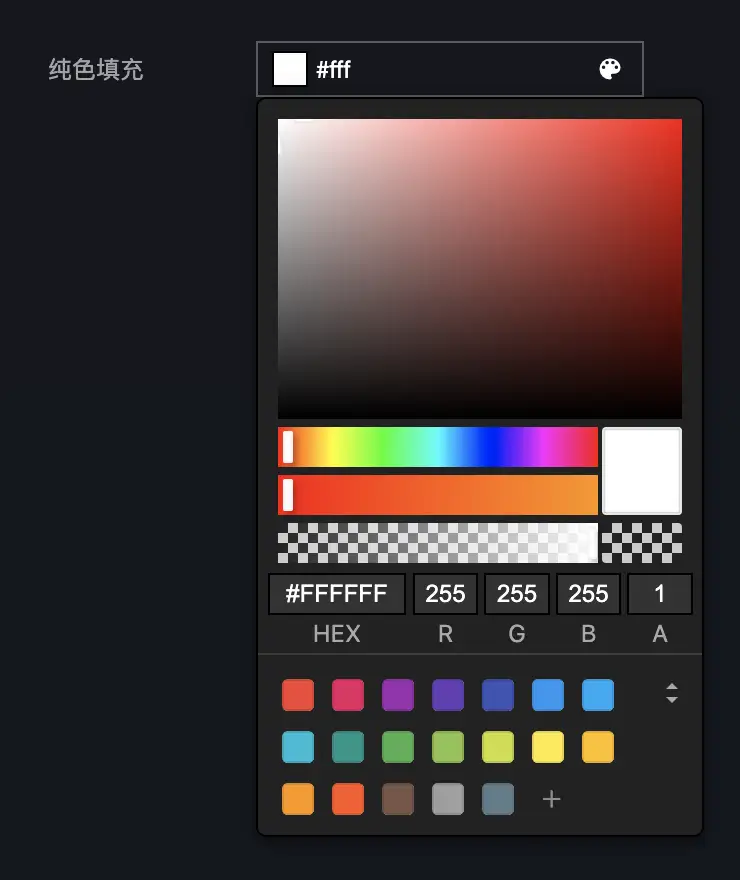
Fill
配置项:
| 字段 | 含义 | 类型 | 是否必填 | 备注 |
|---|---|---|---|---|
| type | 控件类型 | string | 是 | |
| name | 标签名称 | string | 是 | |
| default | 默认值 | string | 否 | |
| mode | 填充模式 | 'flat' | 'gradient' | 否 | 默认 flat |
纯色填充
示例:
config: GuiConfigs = {
  flat: {
    name: '纯色填充',
    type: 'fill',
    default: '#fff,
  },
};
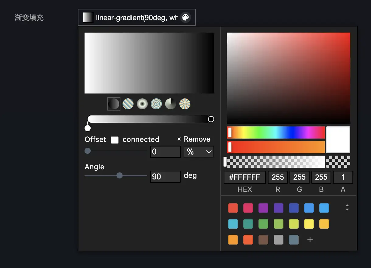
渐变填充
渐变控件的默认值为 CSS 语法,支持线性渐变、径向渐变、锥形渐变。
说明:如果要在图表中使用渐变,可能需要手动解析渐变值,更好的做法是使用不同控件的组合。
示例:
config: GuiConfigs = {
  gradient: {
    name: '渐变填充',
    type: 'fill',
    mode: 'gradient',
    default: 'linear-gradient(90deg, white 0%, black 100%)',
  },
};
Hidden
配置项:
| 字段 | 含义 | 类型 | 是否必填 |
|---|---|---|---|
| type | 控件类型 | string | 是 |
| name | 标签名称 | string | 是 |
| default | 默认值 | 任意 | 否 |
示例:
config: GuiConfigs = {
  hiddenInput: {
    name: '隐藏值',
    type: 'hidden',
    default: 100,
  },
};
Image
配置项:
| 字段 | 含义 | 类型 | 是否必填 |
|---|---|---|---|
| type | 控件类型 | string | 是 |
| name | 标签名称 | string | 是 |
| default | 默认值 | string | 否 |
示例:
config: GuiConfigs = {
  image: {
    name: '上传封面',
    type: 'image',
    default: 'https://interactive-examples.mdn.mozilla.net/media/cc0-images/grapefruit-slice-332-332.jpg',
  },
};

Video
配置项:
| 字段 | 含义 | 类型 | 是否必填 |
|---|---|---|---|
| type | 控件类型 | string | 是 |
| name | 标签名称 | string | 是 |
| default | 默认值 | string | 否 |
示例:
config: GuiConfigs = {
  video: {
    name: '上传视频',
    type: 'video',
    default: 'https://interactive-examples.mdn.mozilla.net/media/cc0-videos/flower.mp4',
  },
};

Codearea
Codearea 控件基于monaco-editor封装。
配置项:
| 字段 | 含义 | 类型 | 是否必填 | 备注 |
|---|---|---|---|---|
| type | 控件类型 | string | 是 | |
| name | 标签名称 | string | 是 | |
| default | 默认值 | string | 否 | |
| height | 编辑器高度 | string | 否 | |
| editorOptions | 编辑器配置项 | object | 否 | 官网文档 |
示例:
config: GuiConfigs = {
  codearea: {
    name: '代码编辑器',
    type: 'codearea',
    height: '200px',
    editorOptions: {
      language: 'javascript',
    },
  },
};

Group
Group 用于将多个控件组合在一起,控件 UI 为手风琴样式。
配置项:
| 字段 | 含义 | 类型 | 是否必填 |
|---|---|---|---|
| type | 控件类型 | string | 是 |
| name | 标签名称 | string | 是 |
| children | 子组件 | object | 否 |
示例:
config: GuiConfigs = {
  group: {
    name: '分组',
    type: 'group',
    children: {
      display: {
        name: '显示',
        type: 'switch',
        default: true,
      },
      stepper: {
        name: '步进器',
        type: 'slider',
        default: 1,
      },
    },
  },
};

数据:
{
  group:{
    display: true,
    stepper: 1
  }
}
Inline
Inline用于行内编组,组件可以指定col设置宽度。
配置项:
| 字段 | 含义 | 类型 | 是否必填 |
|---|---|---|---|
| type | 控件类型 | string | 是 |
| name | 标签名称 | string | 是 |
| children | 子组件 | object | 否 |
示例:
config: GuiConfigs = {
  inline: {
    type: 'inline',
    name: '行内组',
    children: {
      width: {
        name: '宽度',
        type: 'number',
        default: 1920,
        suffix: 'px',
        col: 50,
      },
      height: {
        name: '高度',
        type: 'number',
        default: 1080,
        suffix: 'px',
        col: 50,
      },
      angle: {
        name: '角度',
        type: 'select',
        default: '0',
        options: [
          { value: '0', label: '水平' },
          { value: '45', label: '斜角' },
          { value: '90', label: '垂直' },
        ],
        col: 50,
      },
      amount: {
        name: '数量',
        type: 'number',
        default: 0,
        min: 0,
        step: 1,
        col: 50,
      },
    },
  },
};

数据:
{
  inline:{
    width: 1920,
    height: 1080,
    angle: '0',
    amount: 0
  }
}
Tabs
Tabs用于展示数组以及实现匿名数组的动态增减,可以任意嵌套,实现非常复杂的数据结构。
配置项:
| 字段 | 含义 | 类型 | 是否必填 | 备注 |
|---|---|---|---|---|
| type | 控件类型 | string | 是 | 可能需要配合 tab 类型一起使用。 |
| name | 标签名称 | string | 是 | |
| children | 子组件 | object|array | 否 | |
| template | 动态增减的模板 | object | 否 | |
| addable | 是否允许增减 | boolean | 否 |
基础数组
数组的每一项都不相同。
示例:
config: GuiConfigs = {
  tabs: {
    name: '固定数组',
    type: 'tabs',
    default: [
      {
        fullname: {
          firstName: '张',
          lastName: '三',
        },
      },
      { switch: true },
    ],
    children: [
      {
        name: 'tab1',
        type: 'tab',
        children: {
          fullname: {
            name: '全名',
            type: 'inline',
            children: {
              firstName: {
                type: 'text',
                name: '姓',
                col: 50,
              },
              lastName: {
                type: 'text',
                name: '名',
                col: 50,
              },
            },
          },
        },
      },
      {
        name: 'tab2',
        type: 'tab',
        children: {
          switch: {
            name: '开关',
            type: 'switch',
          },
        },
      },
    ],
  },
};

数据:
{
  tabs: [
	{
		fullname: {
		firstName: '张',
		lastName: '三'
	  }
	},
	{
		switch: true
	}
  ]
}
动态数组
如果数组项都是相同的,则可以使用动态增减的配置,模板内的name支持EJS表达式。
示例:
config: GuiConfigs = {
  tabs: {
    name: '动态数组',
    type: 'tabs',
    default: [
      { seriesName: '第一产业' },
      { seriesName: '第二产业' }
    ],
    template: {
      name: '系列 <%= i + 1 %>',
      children: {
        seriesName: {
          type: 'text',
          name: '系列名',
        },
      },
    },
  },
};

数据:
{
  tabs: [
	{
		seriesName: '第一产业'
	},
	{
		seriesName: '第二产业'
	}
  ]
}
基础数组(基础数据)
示例:
config: GuiConfigs = {
  tabs: {
    name: '基础数组(基础数据)',
    type: 'tabs',
    children: [
      {
        type: 'text',
        name: '系列名',
      },
      {
        type: 'switch',
        name: '开关',
      },
    ],
  },
};

数据:
{
	tabs: ['123',true]
}
动态数组(基础数据)
示例:
config: GuiConfigs = {
  tabs: {
    name: '动态数组(基础数据)',
    type: 'tabs',
    default: ['123', '456'],
    template: {
      name: '系列 <%= i + 1 %>',
      type: 'text',
    },
  },
};

数据:
{
	tabs: ['123','123']
}
嵌套的基础数组(基础数据)
示例:
config: GuiConfigs = {
  tabs: {
    name: '嵌套的基础数组(基础数据)',
    type: 'tabs',
    children: [
      {
        type: 'tabs',
        name: 'level1',
        children: [
          {
            type: 'text',
            name: 'level2',
          },
          {
            type: 'number',
            name: 'level2',
          },
        ],
      },
      {
        type: 'switch',
        name: '开关',
      },
    ],
  },
};

数据:
{
  tabs: [
	[1, 2],
	true
  ]
}
嵌套的动态数组(基础数据)
示例:
config: GuiConfigs = {
  tabs: {
    name: '动态数组嵌套(基础数据)',
    type: 'tabs',
    default: [['123']],
    template: {
      name: 'level1 <%= i + 1%>',
      type: 'tabs',
      template: {
        name: 'level2 <%= i + 1%>',
        type: 'text',
      },
    },
  },
};

数据:
{
  tabs: [
	[123, 456],
	[123, 456],
  ]
}
Menu
菜单是更高一级的分组组件,支持无限层级,主要用于组织数据,使用场景较少。
| 字段 | 含义 | 类型 | 是否必填 | 备注 |
|---|---|---|---|---|
| type | 控件类型 | string | 是 | 需要配合menuItem类型一起使用。 |
| name | 标签名称 | string | 是 | |
| children | 子组件 | object | 否 |
示例:
config: GuiConfigs = {
  menu: {
    name: '菜单',
    type: 'menu',
    children: {
      menuA: {
        name: '菜单A',
        type: 'menuItem',
        children: {
          size: {
            type: 'inline',
            name: '屏幕大小',
            children: {
              width: {
                name: '宽度',
                type: 'number',
                default: 1920,
                suffix: 'px',
                col: 50,
              },
              height: {
                name: '高度',
                type: 'number',
                default: 1080,
                suffix: 'px',
                col: 50,
              },
            },
          },
          align: {
            name: '对齐方式',
            type: 'buttonToggle',
            options: [
              { value: 'left', label: '左对齐', col: 50 },
              { value: 'center', label: '居中对齐', col: 50 },
              { value: 'right', label: '右对齐', col: 50 },
              { value: 'top', label: '上对齐', col: 50 },
              { value: 'bottom', label: '下对齐', col: 50 },
            ],
          },
          angle: {
            name: '角度',
            type: 'select',
            default: '0',
            options: [
              { value: '0', label: '水平', src: 'horizontal' },
              { value: '45', label: '斜角', src: 'incline' },
              { value: '90', label: '垂直', src: 'vertical' },
            ],
          },
        },
      },
      menuB: {
        name: '菜单B',
        type: 'menu',
        children: {
          menuB1: {
            name: '菜单B1',
            type: 'menuItem',
            children: {
              text: {
                name: '文本',
                type: 'text',
                default: 'Hello',
              },
              slider: {
                name: '透明度',
                type: 'slider',
                step: 0.1,
                min: 0,
                max: 1,
              },
            },
          },
          menuB2: {
            name: '菜单B2',
            type: 'menuItem',
            children: {
              display: {
                name: '显示',
                type: 'switch',
                default: true,
              },
              stepper: {
                name: '步进器',
                type: 'number',
                default: 1,
              },
            },
          },
        },
      },
    },
  },
};


数据:
{
  menu: {
	menuA: {
          align: "left",
		  angle: "0",
		  size: {
            height: 1080
			width: 1920,
		}
	},
	menuB: {
         menuB1: {
            slider: 1,
			text: "Hello"
		},
		menuB2: {
            display: true,
			stepper: 1
		}
	}
  }
}